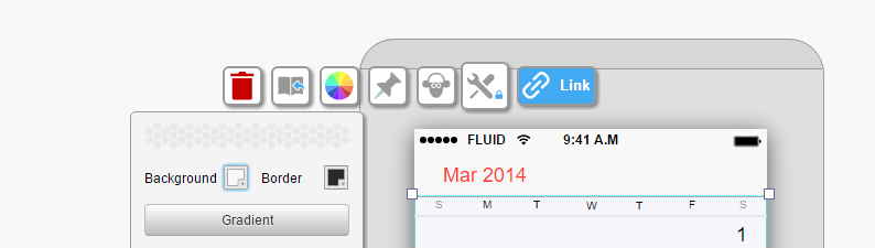
The pin/unpin button is always visible in the widget menu. Click it to get the dropdown options.
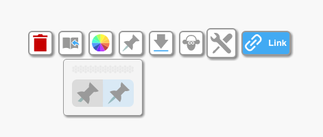
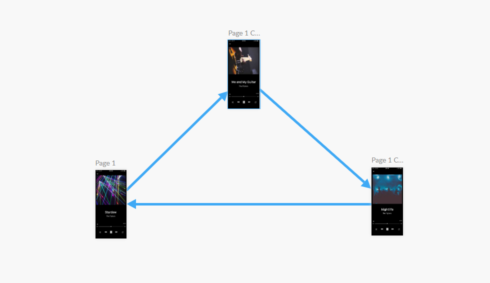
You may have created a scrolling page and you want to have a widget float over the page and stay in view while you scroll the page in preview mode. Use the pinned/unpinned option to control what moves with the page.
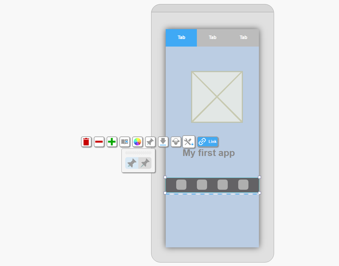
Any widget can be fixed on top of a long/scrolling page (‘pinned’) or allowed to move with the scrolled page (‘unpinned’).
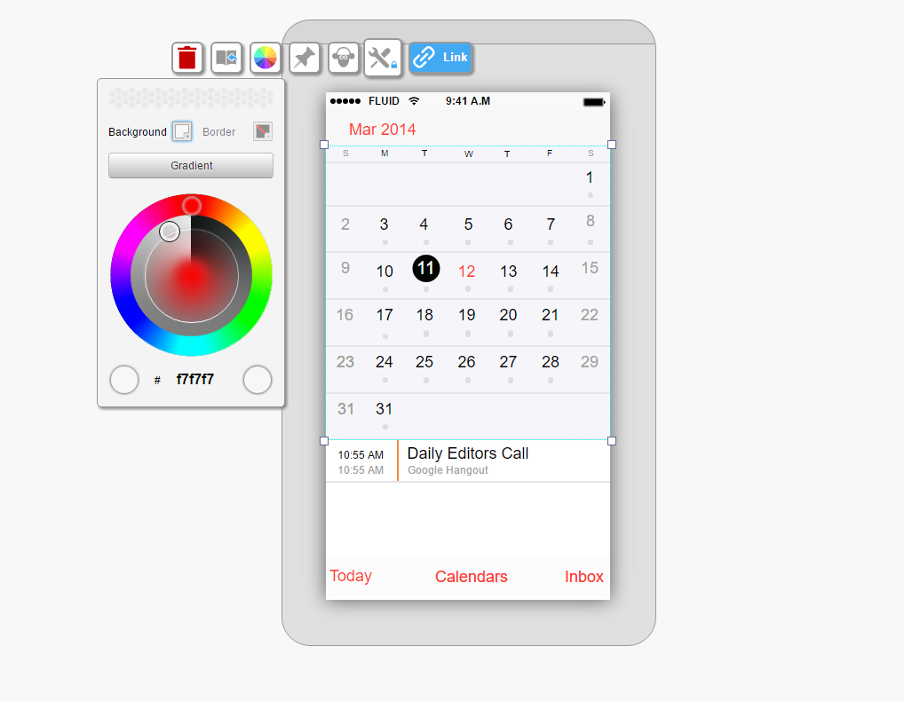
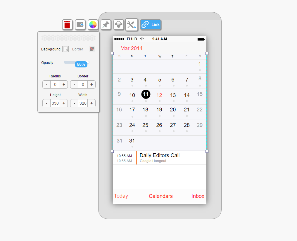
The background and border properties menu is used to set the non-text properties of a widget, including:
Tip: Use the background and border icons to toggle between color editing and all of the other editing options.
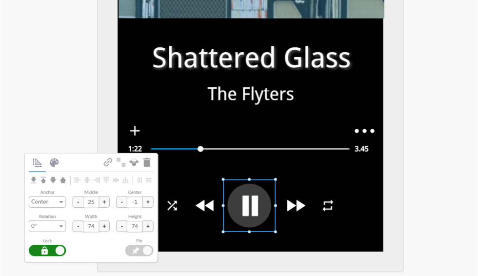
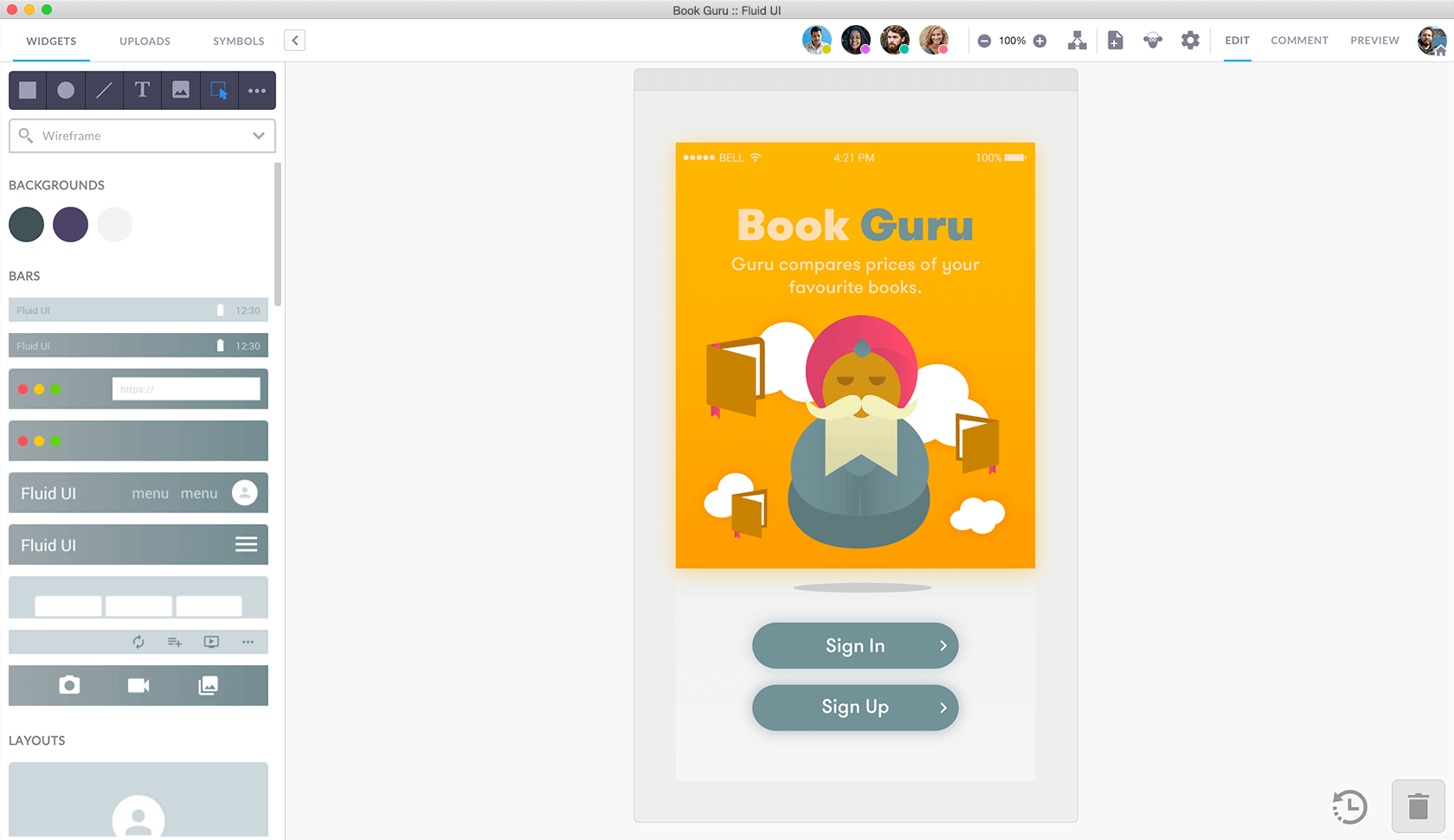
Using the widget menu to edit your widgets
Click on a widget to access the widget menu.
Use the tool icon inside the menu to move the menu around your screen.
Clicking the widget menu tool icon will expand/collapse the menu
Some buttons on the widget menu can be expanded to show even more options.
The widget menu will always be visible on screen when a widget is selected. When no widget is selected, the page menu will be showing and the widget menu will be hidden.
The first time you drag the widget menu it will move to the location you choose.
Dragging it a second time will cause it to switch to best guess mode. This will make it centre over whatever widget you have selected.
Drag it once again and it will stay in the location you chose. You’ll see the little blue lock icon on it when it is in locked mode. It won’t move around unless you drag it again.
You can change almost anything about your widgets and make unique designs to reuse over and over. Discover all of the options available in the widget menu.
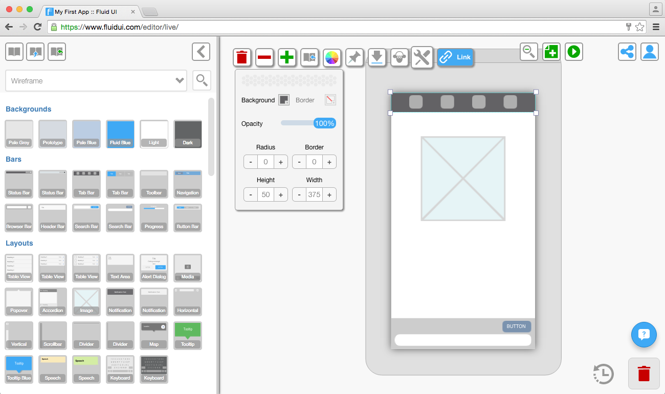
The background and border properties menu is used to set the non-text properties of a widget, including:
Tip: Different widgets have different customizable options. For example, you can change the color of some widgets but not others and some of the larger card widgets cannot be resized.
Use the background and border icons to toggle between color editing and all of the other editing options.