Sharing your preview with colleagues, stakeholders, users and investors is now easier than ever with Fluid UI.
We will show you how to achieve this in a few easy steps.
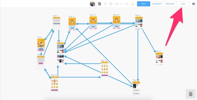
To share a live preview you simply open your project and in the top right corner you will see a tab marked ‘Live’. Just click on this tab to open Live presentation.
When you click on Live you will be taken into the Live Preview. You will be able to annotate the screens using the quick bar in the top left corner. To move on to the next screen you simply click the screen.
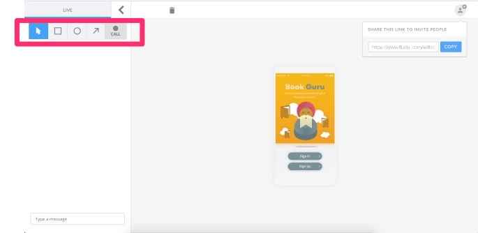
Once in Live Preview you will be able to click through the prototype. Simply click on the screen to move through the flow.
You can also invite others to the Live Preview by clicking on the Live Preview URL:
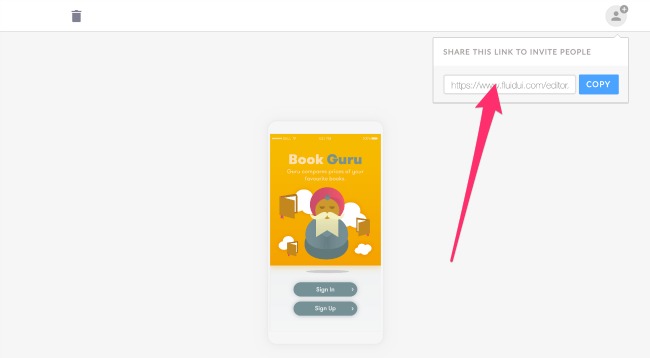
When your audience clicks on the URL they will be asked to join the presentation after entering a user name and email. Your audience do not need to have Fluid accounts to view and take part in the presentation but this allows you to identify them when they are making contributions:
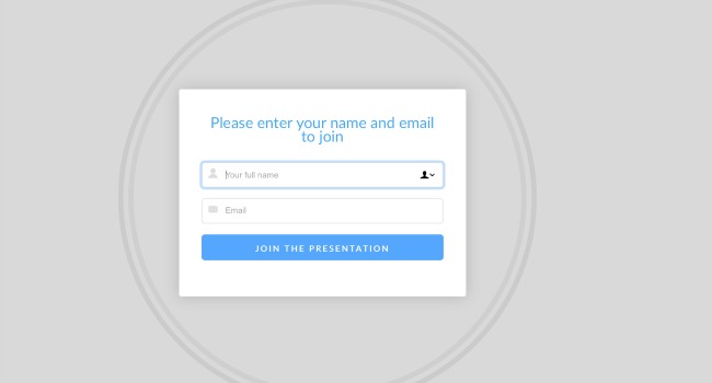
When the user enters their details they will be visible in the top of the preview and will be able to view all of the interactions and to chat with you and others.
![]()
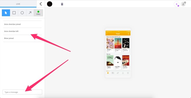
To make text comments simply type in the comment section where all users will be able to take part in the discussion.
The four steps in designing a prototype in Fluid UI are: creating pages, adding widgets, adding links and previewing.
Next: Read our quick guide to using Fluid UI for the first time and create great prototypes in record time.
Article tbc.
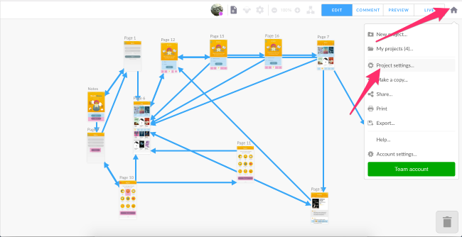
The project settings allows you to control all areas of your project from setting the resolution of each screen to cloning projects to managing your projects.
You will locate the Project settings in the Home menu. Simply click on the Home menu and select Project settings.
Once you select project settings you will be taken to the Project settings dialogue screen. From this dialogue you will be able to control all settings as they relate to your project.
You will be able to perform simple edits, such as changing the name of the project:
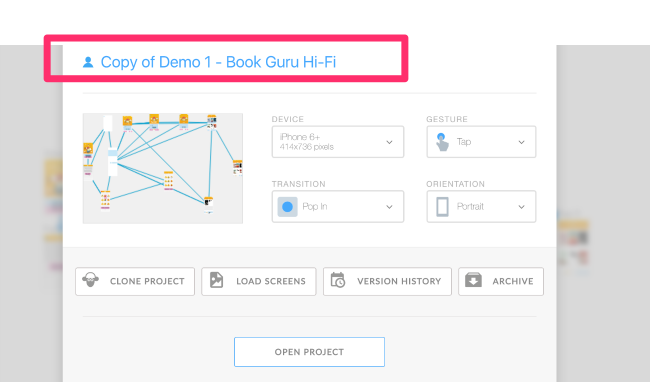
You will be able to set and alter all of the settings related to your project:
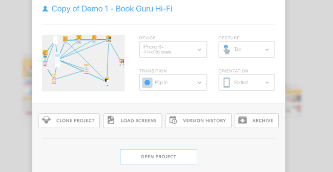
Read the introductory tutorial and learn how to create a new project, then create some pages in that project and add widgets from the library. Finally add links between widgets and pages to create an interactive prototype before you preview your prototype to see the end result. Not convinced yet? See why you should prototype.
Select any widget or hotspot and use the blue ‘link’ icon on the right hand side of the widget menu. The screen will zoom out to your entire project. Click again to drop the link on the page you want to link to.

You can drop the link onto another page, or on the buttons that appear on the side of the canvas. These include, new, clone, start page, previous page and URL.
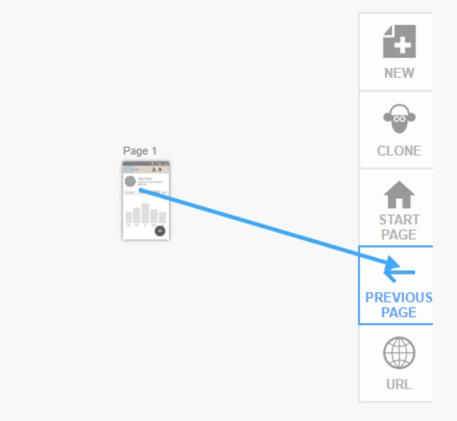
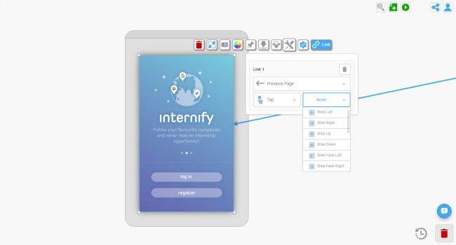
Once a link is created, you can click on the widget it is linked from and the link settings menu will appear in the tool bar. You can access the links gestures and transitions from here or alternatively, hover over a link and a circle with an arrow will pop up. If you click on this you will be given gesture and transition options as well.
If you started linking by accident, just drop that link anywhere on the canvas, the editor will automatically refocus on your original page and delete the link.
Clicking on a link when zoomed in will bring you to the link’s source or destination depending on which direction the link is pointing towards.
The default gesture and transition can be set in project settings.
When previewing, links will work as an interactive prototype, allowing you to click through your mockup.
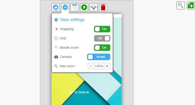
Turn snapping on or off: snapping is useful for automatically aligning widgets.
Turn the grid on or off: use the grid’s slider to change the number of pixels in each square of the grid.
Turn the magic mouse zoom on or off: magic mouse zoom lets you use the mouse to zoom in on pages when in project mode (zoomed out to view all pages together). Place the pointer over a page and scroll the mouse to zoom in on that page.
Select your Fluid UI camera settings: set the camera controls to either smart or fixed.
Change the zoom level to suit the size of your monitor’s screen. 100% will fit the page to your screen.
Next: Read about the Fluid UI camera controls and how to use them to speed up your workflow.
Setting up gestures and transitions in your project.
Next: Have a look at how to use hotspots to create high fidelity mockups.

Find the controls for snapping and grid in view settings accessible from the page menu.

Use the grid to align your widgets to the nearest pixel. Change the size of the grid’s squares to the right number of pixels for your project.
Next: Read about changing the view settings and managing the Fluid UI camera controls to speed up your workflow.

The first project you created or the last project you worked on will automatically open once you are in the editor. Click open in the home menu to view all of your own projects and shared projects.
The project that is currently open will be highlighted light blue in the open projects dialogue box.
Filter, sort and search for projects in the projects filter.

Copy, share, project settings and delete

Copy or clone entire projects
If you need to test out another direction with your app but don’t want to have to redo all of your work just clone the whole project and keep the old version while you work on the new.
This is also great for when you want to send a version to a client but need to keep working on it in the mean time.
Share a project
Manage project settings
Delete a project

The terms we use in Fluid UI to reference the different menus, modes and contexts in the editor.
Editing: Where you edit your project. The project canvas and screenflow is visible and pages can be clicked on.
Previewing: Where your project can be previewed. Accessed by clicking the preview button or loading a project in preview mode. The prototype can be clicked through as an actual app complete with gestures and transitions.
Project context: When the project is fully zoomed out and the library is hidden. All your pages and links can be seen in this view.
Page context: When the page is focused but no widget is selected. You can click on any widget to select it and move to widget context and the page menu and library are visible allowing you to add more widgets to the active page..
Widget context: When a widget is selected. The widget menu is visible.
Widget context: When a text widget is being edited. Double click on text to enter this mode.
The canvas is the background in which you create and position your pages. A Fluid UI projects starts off with a blank canvas. When zoomed in to page or widget context, clicking on the canvas will zoom you back out to the project context. By creating pages and linking them together, you create a storyboard for your design.
The active page is the page currently selected when in page context. It is surrounded by the page frame. Only one page can be active at a time - when clicking on widgets in the library, they are added to this page.
The page frame is the grey area around the active page which contains the page menu. Clicking on the page frame will bring you to the page context. You can also start a drag select from the page frame to select multiple widgets, which will bring you to the widget context.
Trash is the bin in the bottom right corner of the editor.
Learn how to create, manage, clone, delete, archive, save and restore projects and project versions. Change the default settings including orientation, set up gestures and animations in your project. Finally, change the splash screen and app icons.
Uploading images and using hotspots to create high fidelity prototypes, incorporating your own branding and logo.
Fluid UI contains over 2,500 different widgets available in 16+ libraries for iOS, Android, Windows and wireframe. They are accessed from the library on the left of your screen after you click on a page.
Click on a widget in the library. It will be added to the active page in a suitable location.
Drag a widget from the library to a page. It will be added to the page where you drop it.
Widgets on pages can be cloned (ctrl-d/cmd-d) and copied/pasted (ctrl-c/ctrl-v) to the same page or to different pages.
Select any widget on any page by clicking it. The widget menu will be visible and will allow you to edit the widget’s properties.
Shift+click will add or remove a widget from a selection.
Click-dragging from the page frame or page background to select multiple widgets at once.
Ctrl-a or cmd-a selects all widgets on the active page.
Some widgets are comprised of multiple parts. A second click will select the sub-part which can be edited and styled independently.
See moving, resizing and aligning widgets for how to get widgets where you want them. You may also want to turn on snapping or the grid in the page settings.
Check out backgrounds and borders and editing text for more on building these parts of your design. Once you are happy with your widgets, consider saving them to your custom design patterns for future reuse.
Widgets can be grouped. Widgets added from your save patterns library will be grouped by default.
See how to upload your own images.
Select your widget(s) and press delete (backspace on Mac), or click delete on the widget menu or drag them to the trash.
Not too exciting this section, but some widgets have unique features associated with them to help you build your prototype, and it’s worth documenting how they work:
Backgrounds automatically expand to fill the background. They don’t get selected by default in an area-select (though they can be click-selected). They can’t be moved either.
Tables can have segments added and removed from them.
Hotspots are special widgets that show in a translucent colour when editing, but are invisible when previewing. You can add links to them and the links will work correctly. See more about using hotspots.
Text widgets are widgets that have text in them. The text can be edited by double clicking the widget. See more about editing text widgets.
Finished adding all the widgets you want to your pages? Add links, gestures and transitions to make your prototype interactive - or just continue with the introductory tutorial.
Learn how to share and collaborate with your team. Share projects and project copies, export projects and use notes.
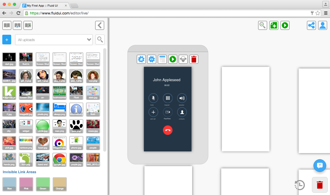
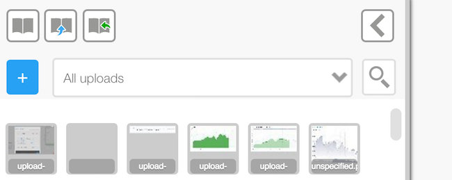
Hotspot are found in the uploads library at the bottom under all of your uploads.
Uploading your own images and using invisible links
These links are visible on your page when creating your prototype, but don’t show in preview mode.
They let you link a particular part of an image to another page without having to chop up the uploaded image.
Usually you would use a button widget to link to the next page, here you will be using an image of a button with an invisible link area over it. This will link to the next page. It is useful if you want to link from more than one area on an image. If you want to link from the whole image you can do this too in the normal way.
Learn more about how you can validate your product ideas using Fluid UI, making sure you get real customer feedback. Once you are happy with your concept, learn how you can integrate your results into your company and how you can get your app developed.
Table widgets are a special type of widget that can have rows or columns added to them. Once a table widget is selected, the add and remove segment buttons will appear in the widget menu.
The Add Segment and Remove Segment options let you change the number of rows in the widget by adding or deleting rows.
Click once on the widget to select the whole thing and click another time to select the segment you want to work on.
Manage your account: See our plans page, then if necessary upgrading to a different account type, pausing (cancelling billing), getting receipts and managing the rest of your team.
Learn all about navigating the canvas using the Fluid UI camera controls. Use view settings to turn on/off snapping and grid. Find out what keyboard shortcuts are available in Fluid UI.

Receive a preview link lets you send a preview link to an email address.
Receive a complete copy sends the whole project to another Fluid UI user’s account. They can open this project and edit it, this is good for team work on a project. Users can send versions back and forth and work on the same project.

Tip: The sharing button is next to the home menu, it will be visible once you make a page and add a widget.
Fluid UI uses an infinite canvas to provide incredible flexibility when creating prototypes. The camera defaults to the best settings for most projects, though at times you may want to take control of how the three zoom levels work for your project. This section explains how the canvas and zooming works and how to change the settings to improve your productivity for specific projects.
There are two ‘Autoscaling’ of images options, this will help you fit images to your screens quickly and easily.
These options will appear in the context menu as soon as you click on an image that you have uploaded.
![]
‘Expand to Fit’ allows you to expand a small uploaded image to the width/height of the page you’re working on.
‘Display 100%’ will resize an image widget to the original size of the uploaded image file.