The library has 3 tabs:
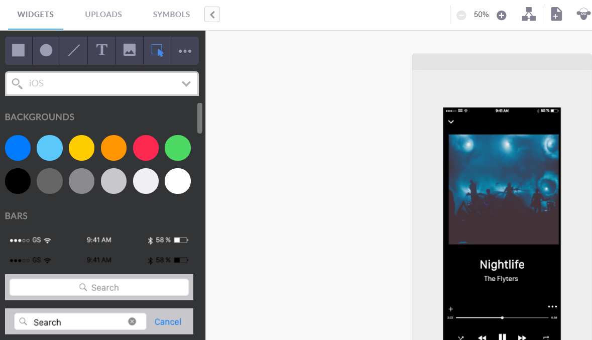
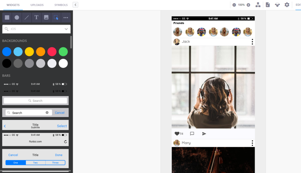
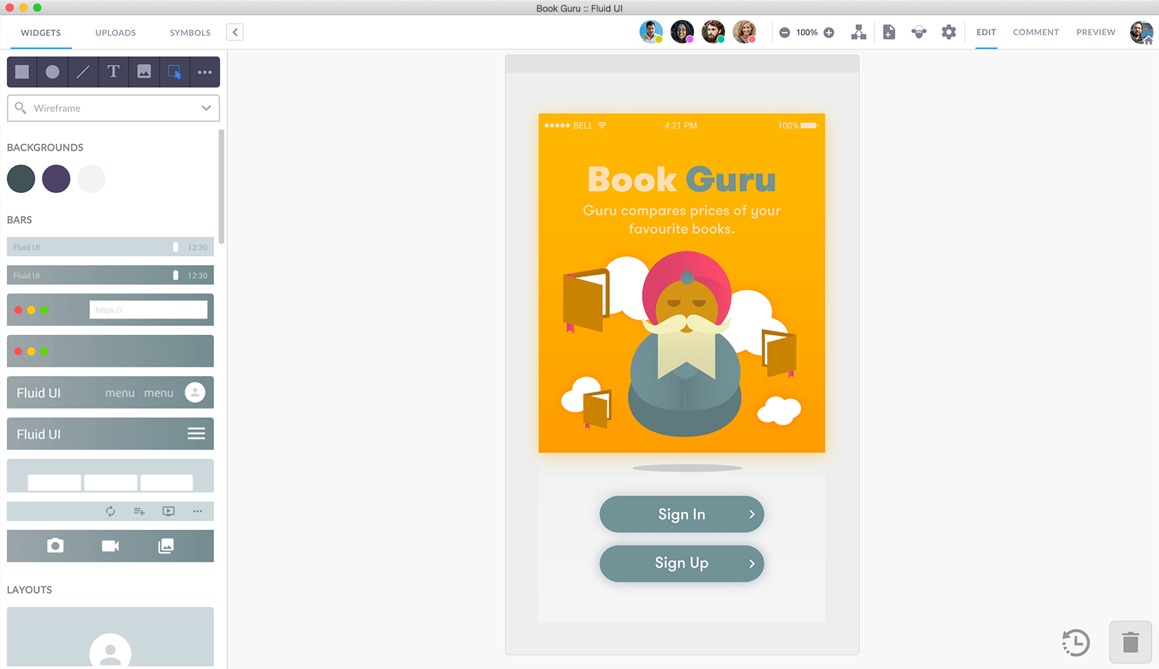
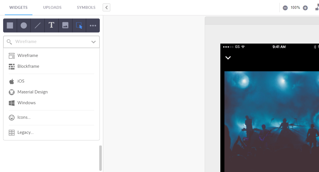
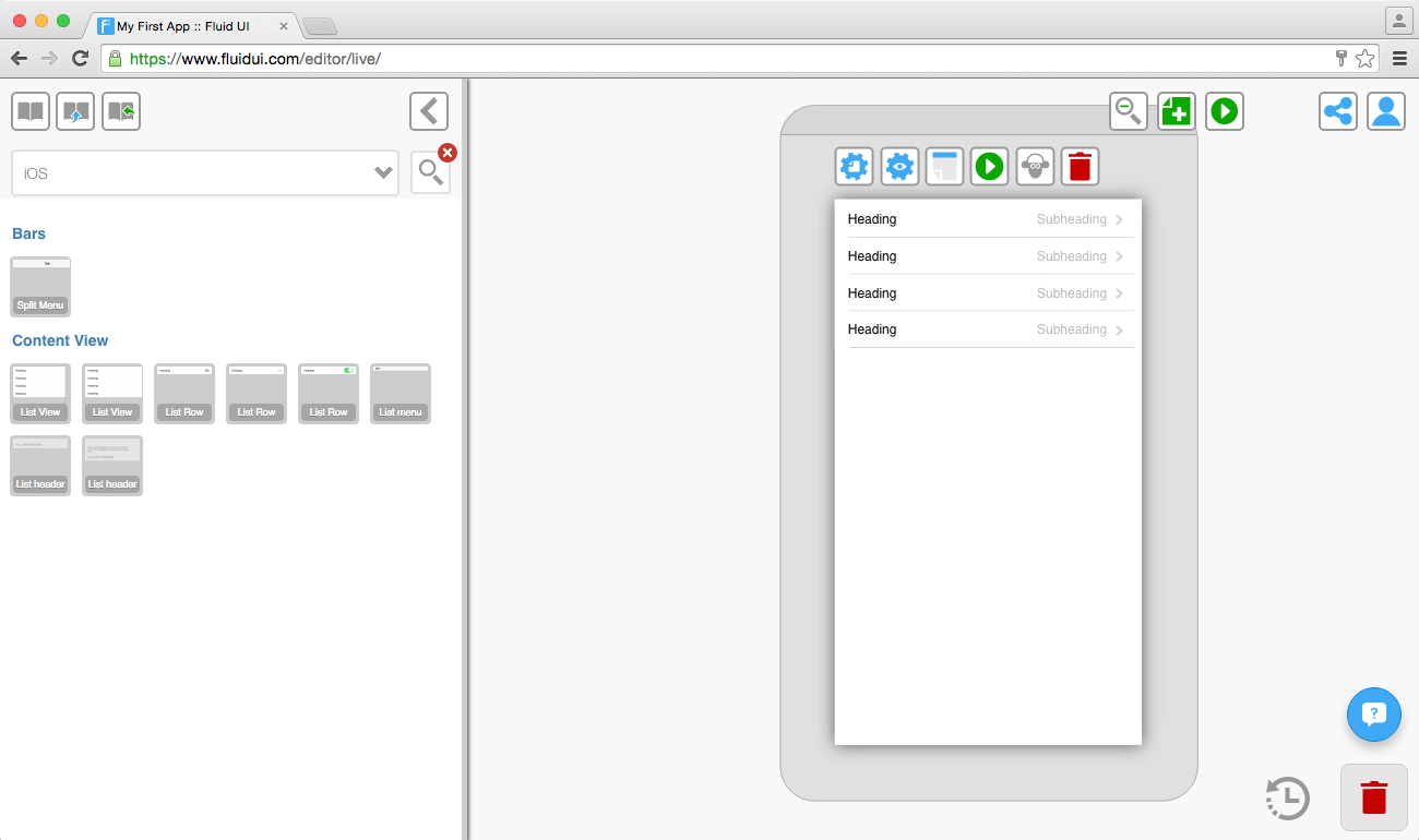
The widget libraries include dedicated libraries for iOS, Android, Windows, wearables and website wireframing.
By default the ‘wireframe’ library is selected, this is a good option if you don’t want to worry about the exact device you are prototyping for, but just want to get a good overall feel for how your app’s UI will flow.
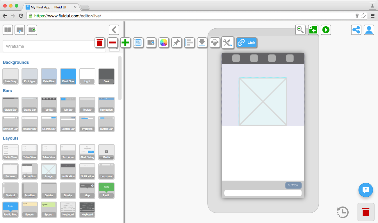
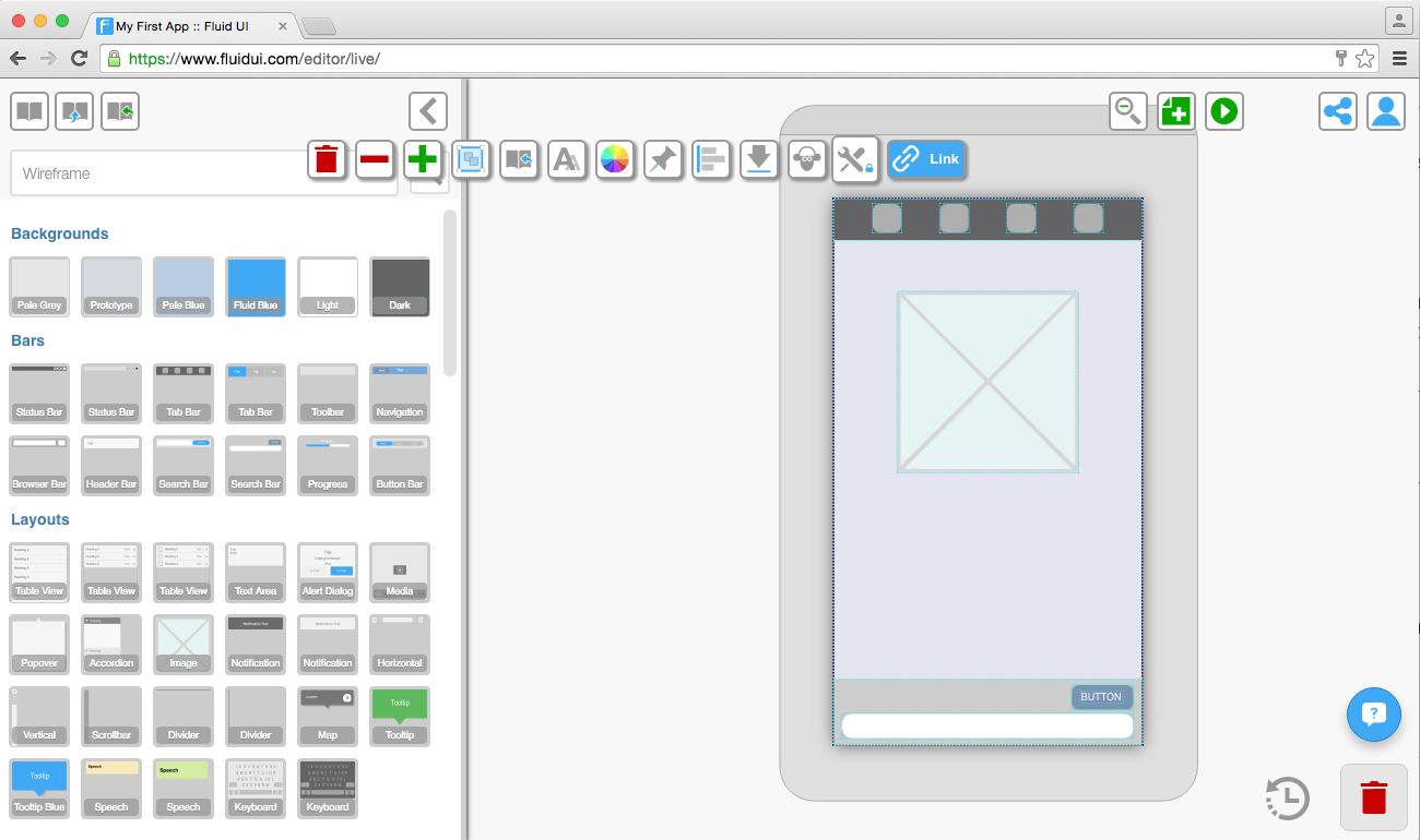
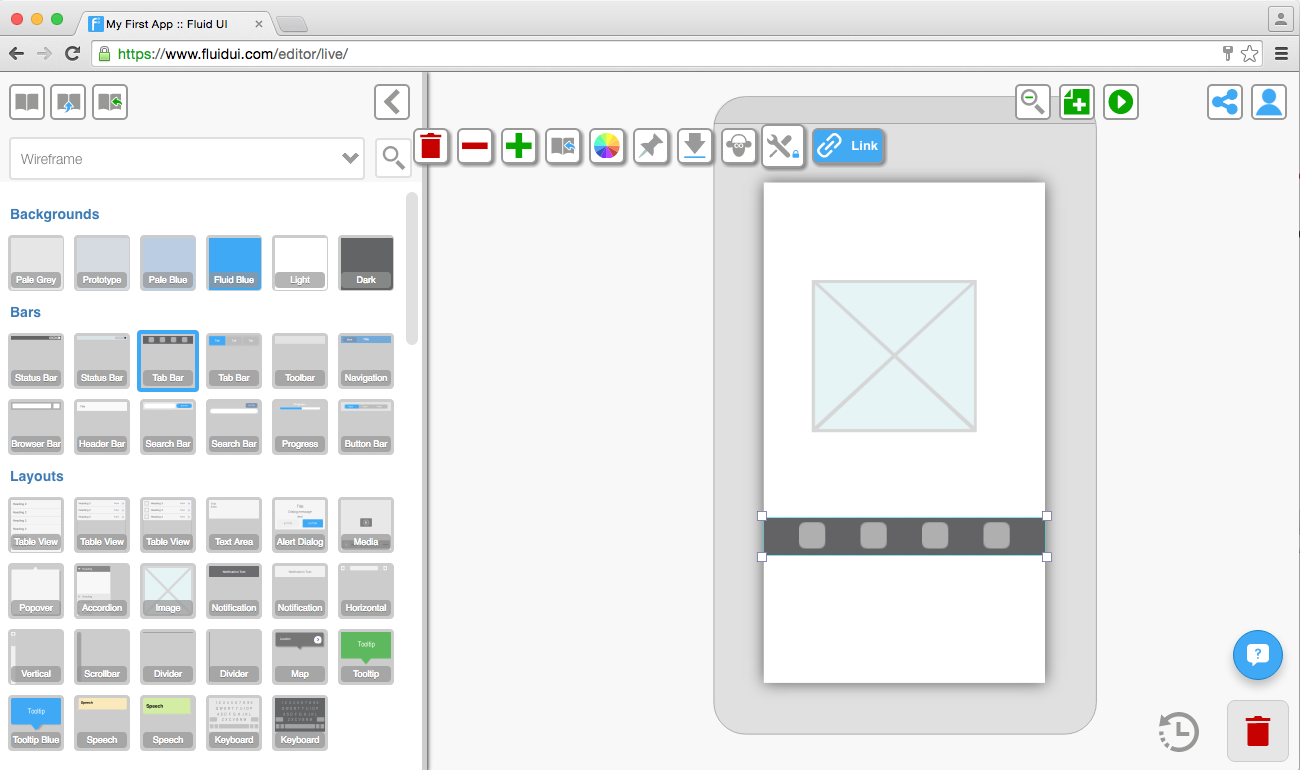
To access the libraries, click on any page and the library will open on the left of the editor. Select your chosen library from the widget library drop-down menu and start designing.
Tip: You can close the widget library if you’re not using it to give yourself a bit more space.
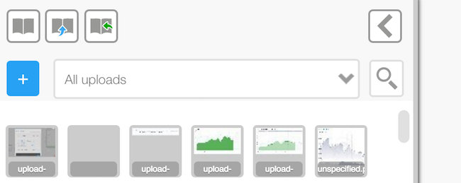
Upload your own images from Photoshop or the web and make high fidelity prototypes.
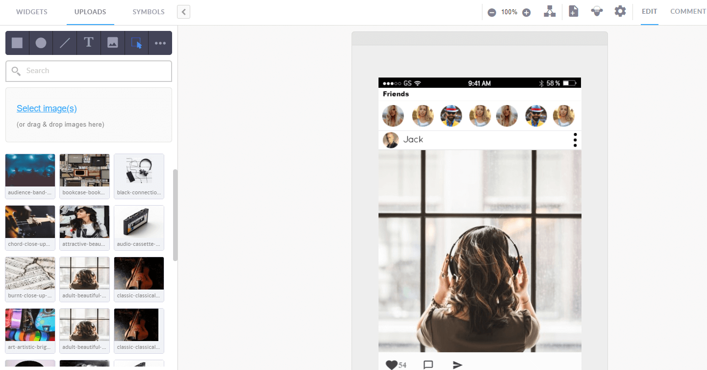
You can either drag and drop the images into the editor window, or use the ‘Select image’ button in the uploads section to search your computer’s hard drive for an image.
You should always make sure your images are ‘saved for web’ using a program like Photoshop or one of the free online image editors.
When you keep your image files as small as possible the editor will load quicker and previewing will be much quicker.
Edit and resize the images like any other widget.
Tip: You need to have a paid (solo) account in order to upload your own images.
Symbols will speed up your design process for every project.
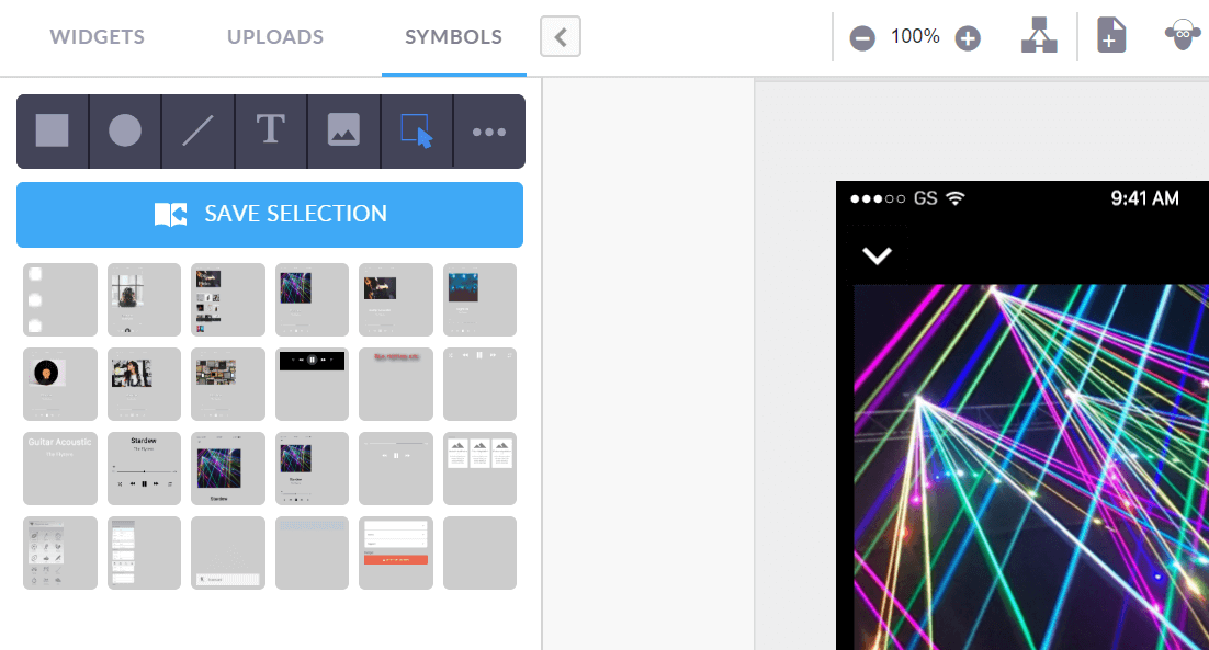
Reusable designs are stored in your symbol library.
Save whole screens and use them in other projects.
Save your customised widgets and cards ready for quick access when you need to mock up a similar project.
To delete a symbol, drag it to the red trash bin in the bottom right of the screen.
Tip: You can access all of your saved symbols from any project.
There are two ways to add widgets to you page:
1. A single click
A single click on a widget will add it to the selected page. The widget will automatically be placed on an area of the page that the editor predicts it belongs.
For example: A header item will go in the header section of the page. You can move it by dragging and dropping it somewhere else.
2. Drag and drop
Dragging a widget from the library and dropping it on any page (selected or not) will add that widget to the page at the location it is dropped.
The smart menu allows you to use shapes and symbols very quickly when designing. To use it click on a shape and click and drag on the page to create a new widget.
Use the smart menu to:
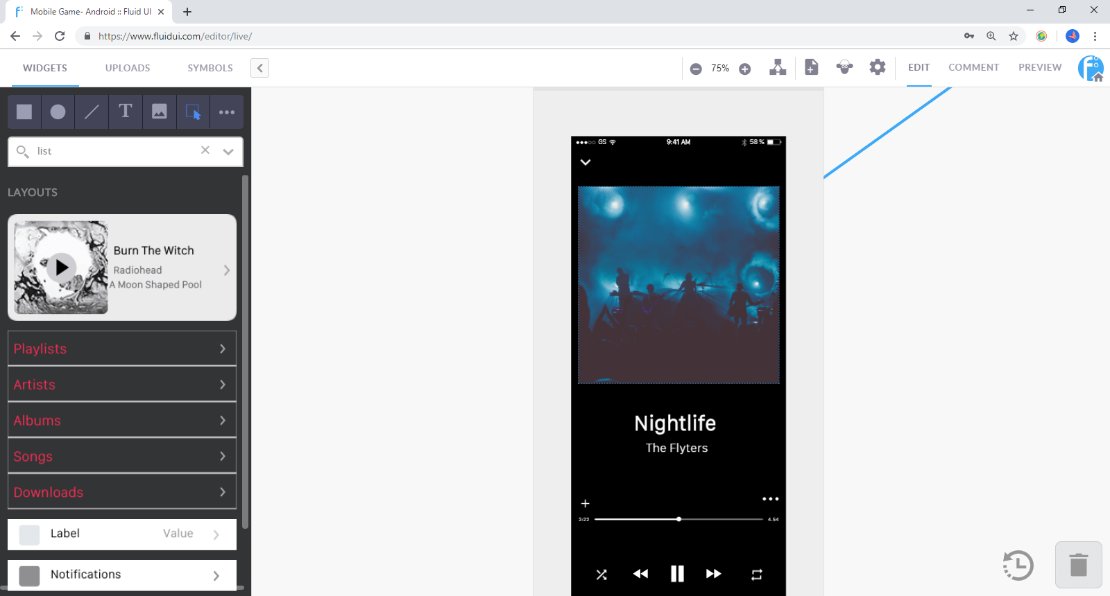
Use the library search function to find widgets by type. For example type ‘list’ into the search bar to bring up all of the list widgets in that library.
Selecting multiple widgets: Start dragging on the page frame (the dark grey area around the selected page) or on an area that does not already contain a widget other than the background.
All widgets that are contained in the blue box after dragging will be selected.
Use the group icon to create a group, and when a group is selected, you can ungroup them with the ungroup icon.
Tip: Groups will be clearly indicated by a border when selected. In order to edit widgets in a group, they must be ungrouped first.
##
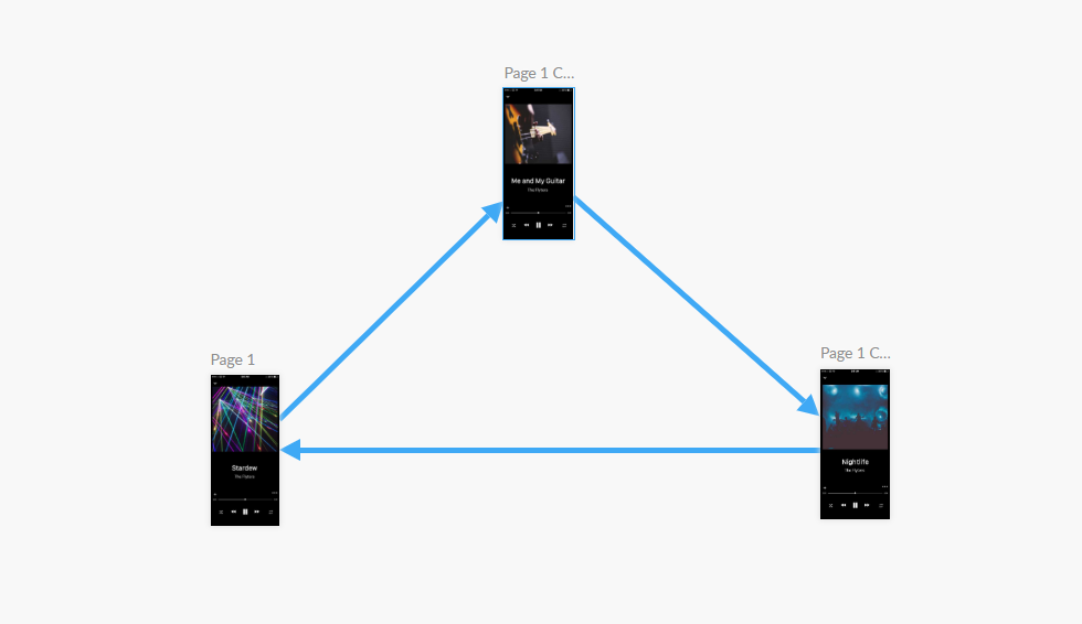
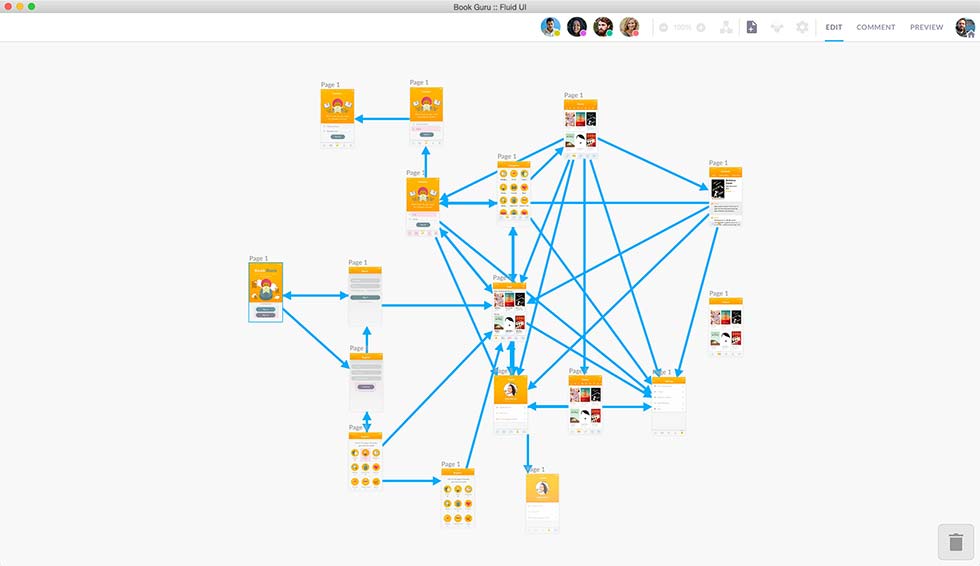
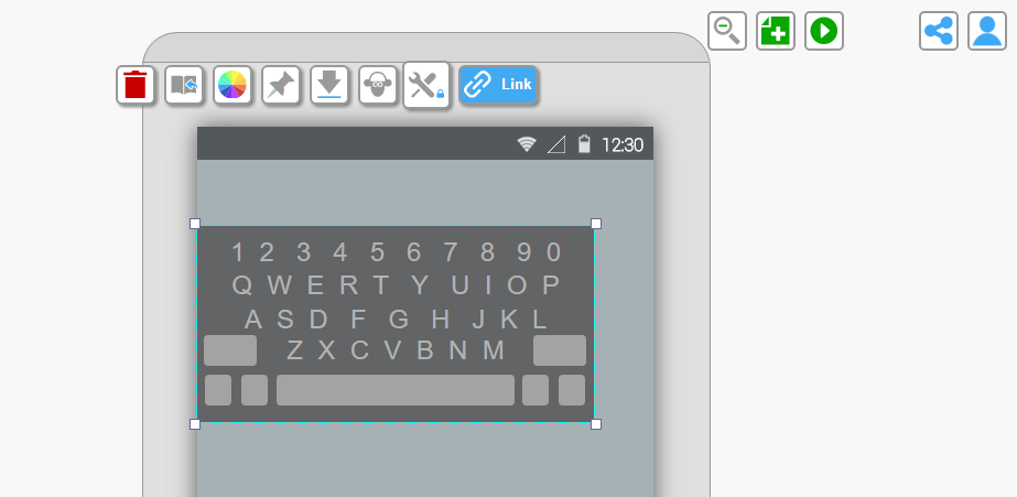
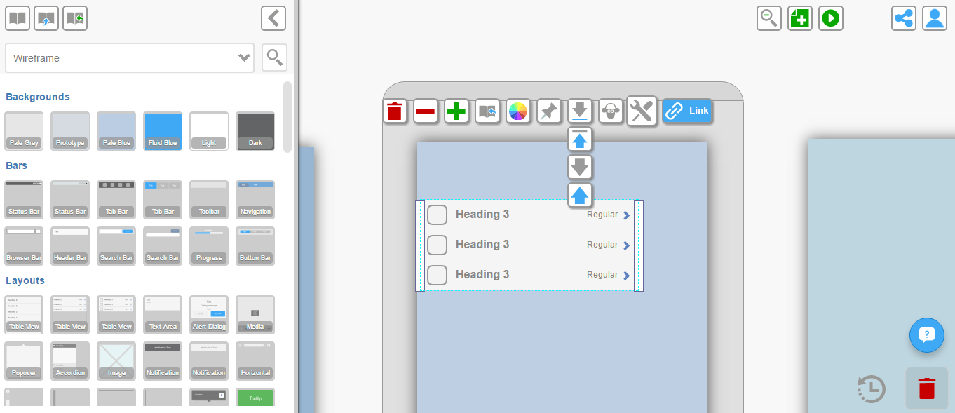
Hotspots are widgets that are visible on your page when creating your prototype, but don’t show in preview mode (unless you choose to show them in preview settings).
They let you link a particular part of an image to another page without having to chop up the uploaded image.
To use a hotspot, add one from the library and select the link button to add a link from that widget.
Hotspots are useful if you want to link from more than one area on an image. If you want to link from the whole image you can do this too with a normal link.
##
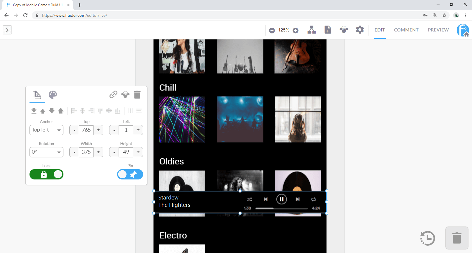
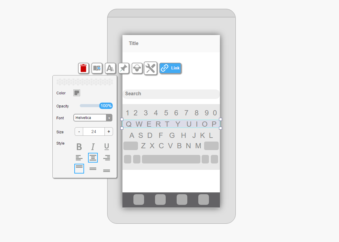
Click on a widget to access the widget menu.
Move the menu around your screen by clicking and dragging the white area of the menu.
The widget menu will always be visible on screen when a widget is selected. When no widget is selected the widget menu will be hidden.
Depending on the type of widget selected there are different tabs at the top of the menu which open general settings, colour settings and text settings.
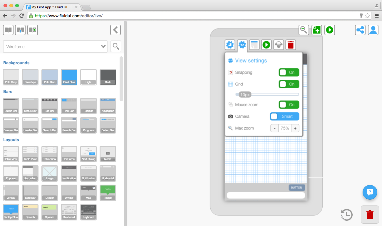
Use the grid view in view settings to align widgets pixel by pixel. You can set the number of pixels in each square in the grid.
The snap to grid option will also help align widgets to the nearest pixel.
Use your keyboard’s arrow keys to align widgets by moving pixel by pixel.
Select two or more widgets and the vertical/horizontal align icons will appear in the widget menu.
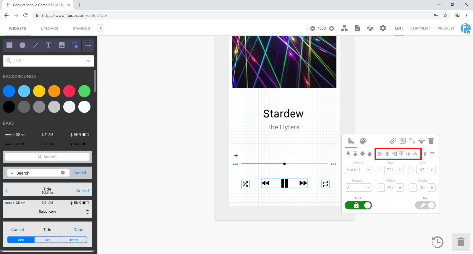
There are 6 options in total:
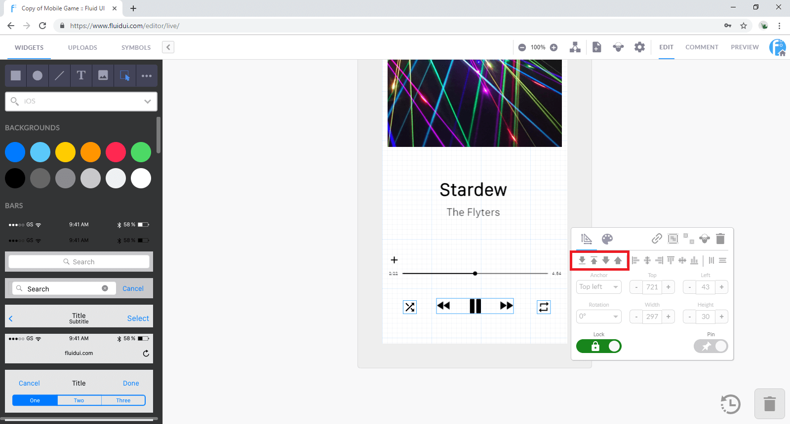
Select any widget or widget group and use the arrows to send them to front or back.
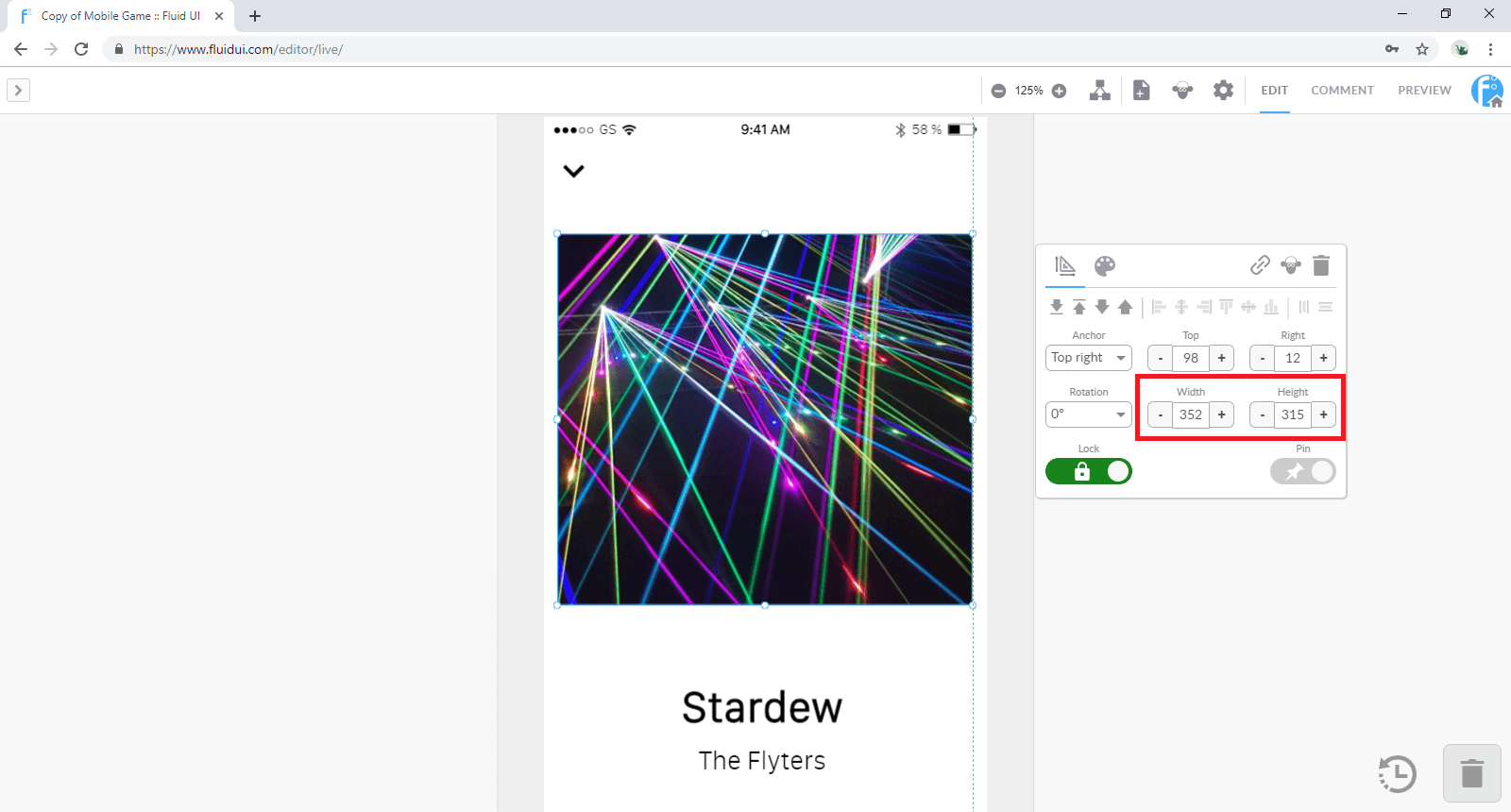
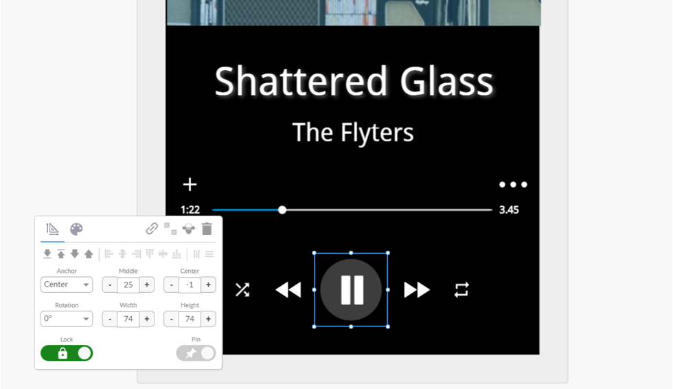
Widgets can be resized by dragging from one of the 4 corners or the sides of the widgets.
All resizable widgets have a clear box/outline indicator.
Holding down shift will maintain the aspect ratio of a widget while resizing it.
To get the size of your widget pixel perfect you can use the resizing tool. simply chose the height and width that you desire.
Tip: Some larger widgets cannot be resized as they are fitted to the size of your page and the device type you are designing for.
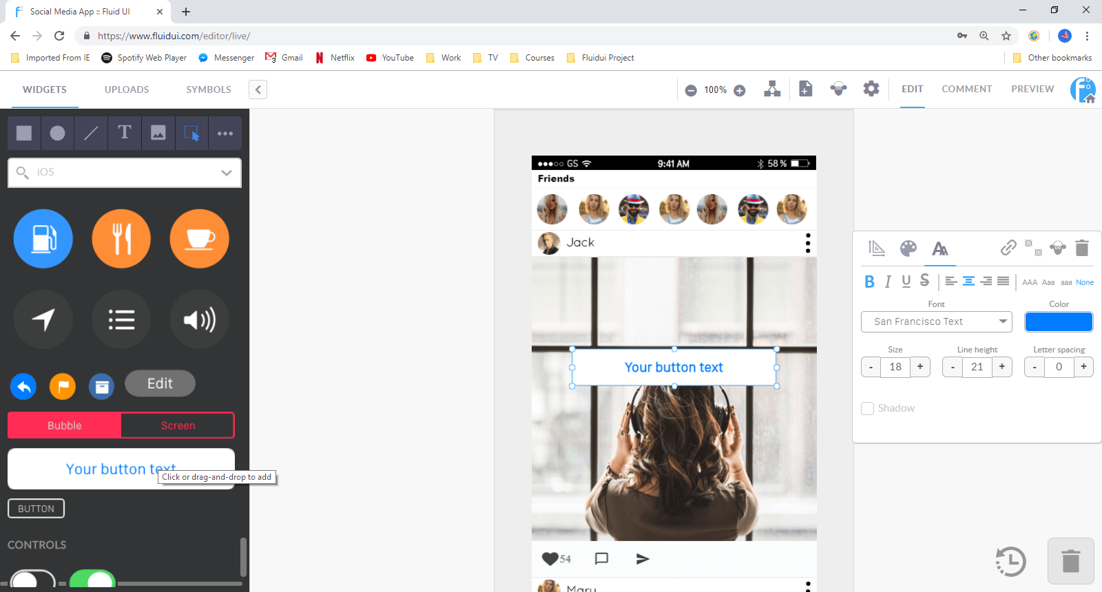
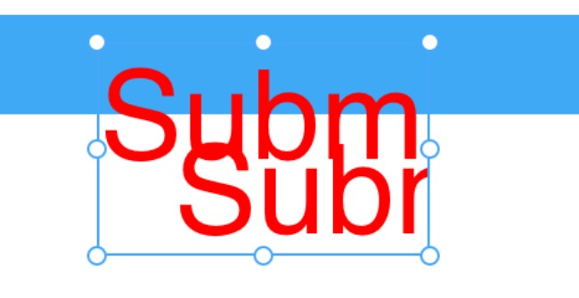
Click on any text to edit it. If you want to increase the size of the box that the text is contained in, drag from any of the box’s corners.
The text edit submenu is found in the widget menu and will appear as soon as you click on a piece of text. The menu lets you change the:
Tip: Remember to drag the text box as you make the text bigger so it is aligned as you want it to be. If you don’t make the box bigger some of text may be hidden.
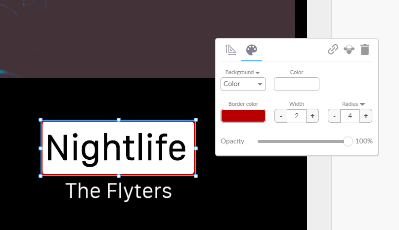
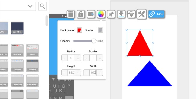
The background and border properties menu is used to set the non-text properties of a widget, including:
Tip: Different widgets have different customisation options. For example, you can change the colour of some widgets but not others and some of the larger card widgets cannot be resized.
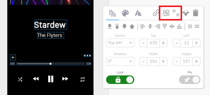
The pin/unpin button is in the widget menu.

You may have created a scrolling page and you want to have a widget float over the page and stay in view while you scroll the page in preview mode. Use the pinned/unpinned option to control what moves with the page.
Any widget can be fixed on top of a long/scrolling page (‘pinned’) or allowed to move with the scrolled page (‘unpinned’).
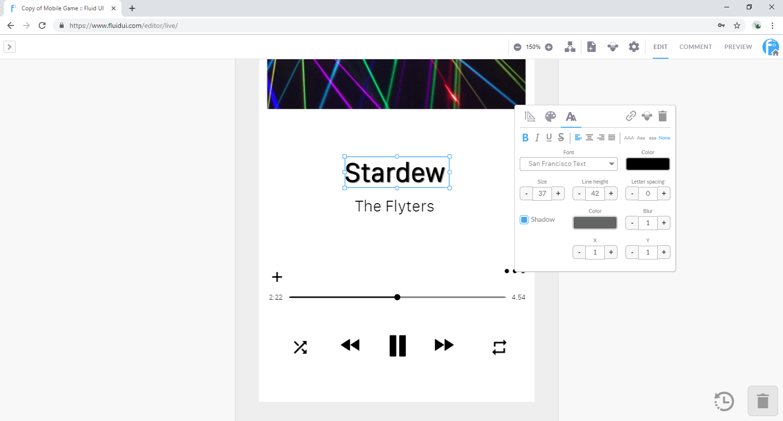
The text editing menu allows you to control all aspects of the text style.
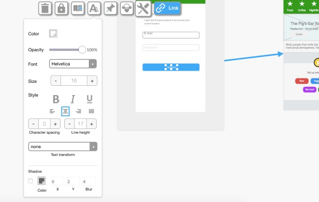
The standard features can be found in this menu:
There are also advanced text editing features which allow you to enhance your design.
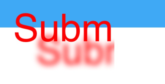
To add shadow to your text you need to click the box beside Shadow and then chose the colour that you would like to use.
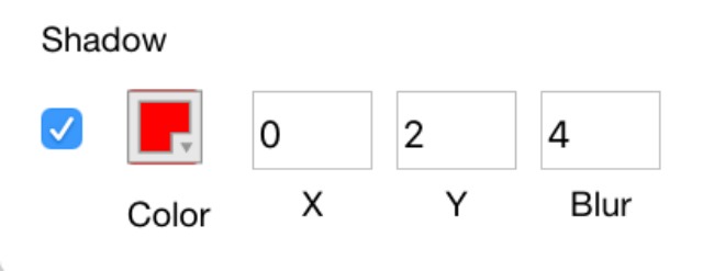
You can also move the shadow along the x/y axis simply by adjusting those specific settings.
You can then also add more or less blur by placing a value for blur.
Uploading your own images and using invisible links
Hotspots are widgets that are visible on your page when creating your prototype, but don’t show in preview mode (unless you choose to show them in preview settings).
They let you link a particular part of an image to another page without having to chop up the uploaded image.
To use a hotspot, add one from the library and select the link button to add a link from that widget.
Hotspots are useful if you want to link from more than one area on an image. If you want to link from the whole image you can do this too with a normal link.
My uploads and introducing invisible links
You can either drag and drop the images into the editor window, or use the plus button in the uploads section to search your computer’s hard drive for an image.
You should always make sure your images are ‘saved for web’ using a program like Photoshop or one of the free online image editors.
When you keep your image files as small as possible the editor will load quicker and previewing will be much quicker also.
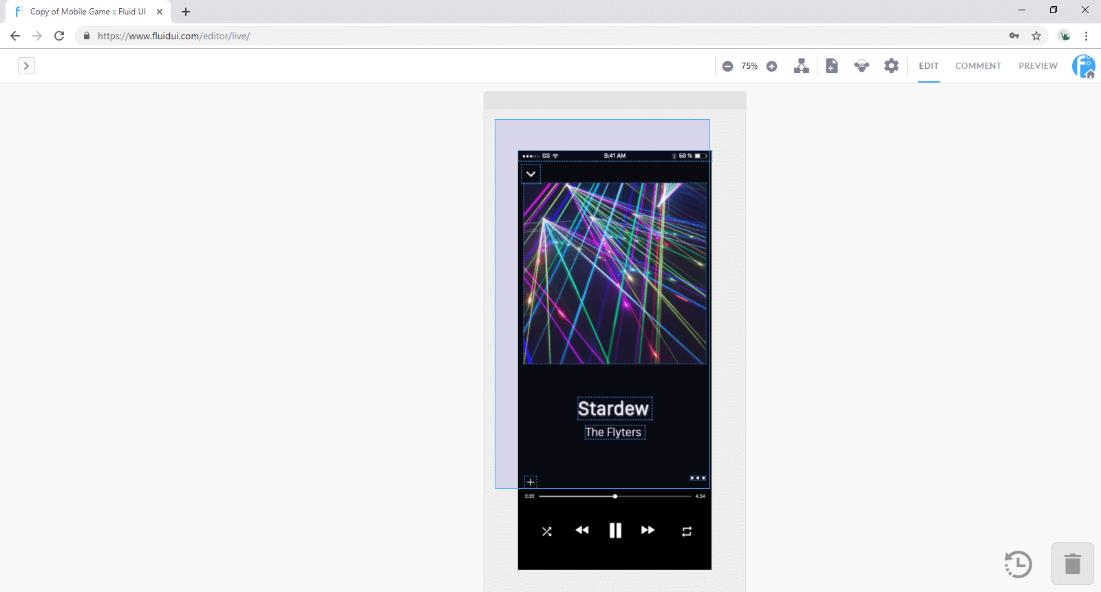
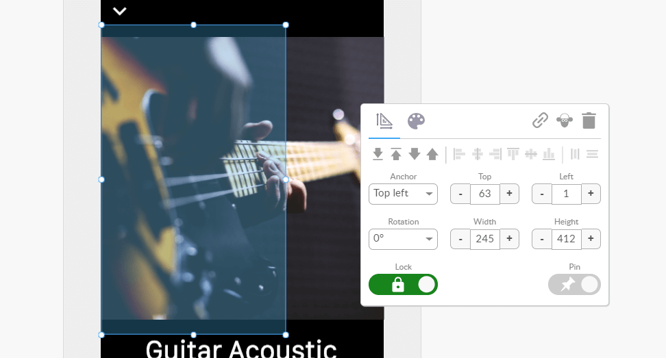
There are two ‘Autoscaling’ of images options, this will help you fit images to your screens quickly and easily. These options will appear in the widget menu as soon as you click on an image that you have uploaded.
‘Expand to Fit’ allows you to expand a small uploaded image to the width/height of the page you’re working on.
‘Display 100%’ will resize an image widget to the original size of the uploaded image file.
Tip:
You need to have a paid (solo) account in order to upload your own images.
Click on any text to edit it. If you want to increase the size of the box that the text is contained in, drag from any of the box’s corners.
The text edit submenu will appear as soon as you click on a piece of text. The menu lets you change the:
Tip: Remember to drag the text box as you make the text bigger so it is aligned as you want it to be. If you don’t make the box bigger some of text may be hidden.
Widgets can be resized by dragging from one of the 4 corners or the sides of the widgets.
All resizable widgets have a clear box/outline indicator.
Holding down shift will maintain the aspect ratio of a widget while resizing it.
To get the size of your widget pixel perfect you can use the resizing tool. simply chose the height and width that you desire.
Tip: Some larger widgets cannot be resized as they are fitted to the size of your page and the device type you are designing for.
Use the grid view in view settings to align widgets pixel by pixel. You can set the number of pixels in each square in the grid.
The snap to grid option will also help align widgets to the nearest pixel.
Use your keyboard’s arrow keys to align widgets by moving pixel by pixel.
Automatic alignment
Select two or more widgets and the vertical/horizontal align icons will appear in the widget menu.
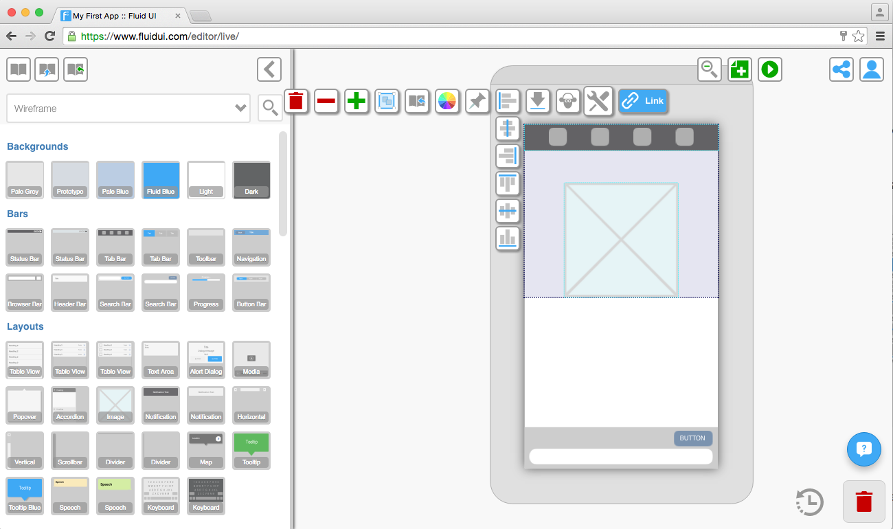
There are 6 options in total:
Align Left - aligns the widgets/groups to the left.
Align Right - aligns the widgets/groups to the right.
Align Center - aligns the widgets/groups to the center.
Align Top - aligns the widgets/groups to the top of the selection.
Align Middle - aligns each widget to the middle of the selection.
Align Bottom - aligns the widgets/groups to the bottom of the selection.
Select any widget or widget group and use the arrows to send them to front or back.
Send to Front - places the selected widget behind all others on the page.
Send to Back - places the selected widget in front of all others on the page.
Send Backwards - moves a widget behind the previous widget.
Send Forwards - moves a widget in front of the one above.
You can define the alignment and z-depth for a widget from the widget menu and in using pinned widgets (often used in conjunction with scrolling pages)
Click on widgets to select them.
Select components of widgets and edit them, such as text or boxes inside a menu widget.
Widgets can be grouped to move/copy/paste/align them together.
Start dragging on the page frame (the dark grey area around the selected page) or on an area that does not already contain a widget other than the background.
All widgets that are contained in the blue box after dragging will be selected.
Use the group icon to create a group, and when a group is selected, you can ungroup them with the ungroup icon.
Tip: Groups will be clearly indicated by a border when selected. In order to edit widgets in a group, they must be ungrouped first.
There are two ways to add widgets to you page:
1. A single click
A single click on a widget will add it to the selected page. The widget will automatically be placed on an area of the page that the editor predicts it belongs.
For example: A header item will go in the header section of the page. You can move it by dragging and dropping it somewhere else.
2. Drag and drop
Dragging a widget from the library and dropping it on any page (selected or not) will add that widget to the page at the location it is dropped.
Use the library search function to find widgets by type. For example type ‘tables’ into the search bar to bring up all of the table widgets in that library.
Tip: You can close the widget library if you’re not using it to give yourself a bit more space.
1. Pre-built widgets
The widget libraries include dedicated libraries for iOS, Android, Windows, wearables and website wireframing.
By default the ‘wireframe’ library is selected, this is a good option if you don’t want to worry about the exact device you are prototyping for, but just want to get a good overall feel for how your app’s UI will flow.
2. Uploaded widgets
Upload your own images from Photoshop or the web and make high fidelity prototypes.
3. Saved design patterns
Save design patterns, screens and customized widgets to use again and again.
Tip: To access the libraries, click on any page and the library will open on the left of the editor. Select your chosen library from the widget library dropdown menu and start designing.