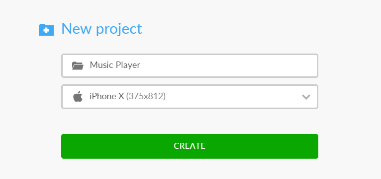
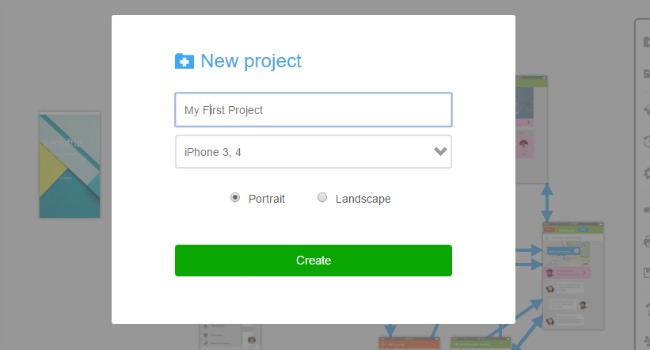
Your first project will be created automatically when you sign up.
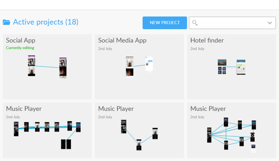
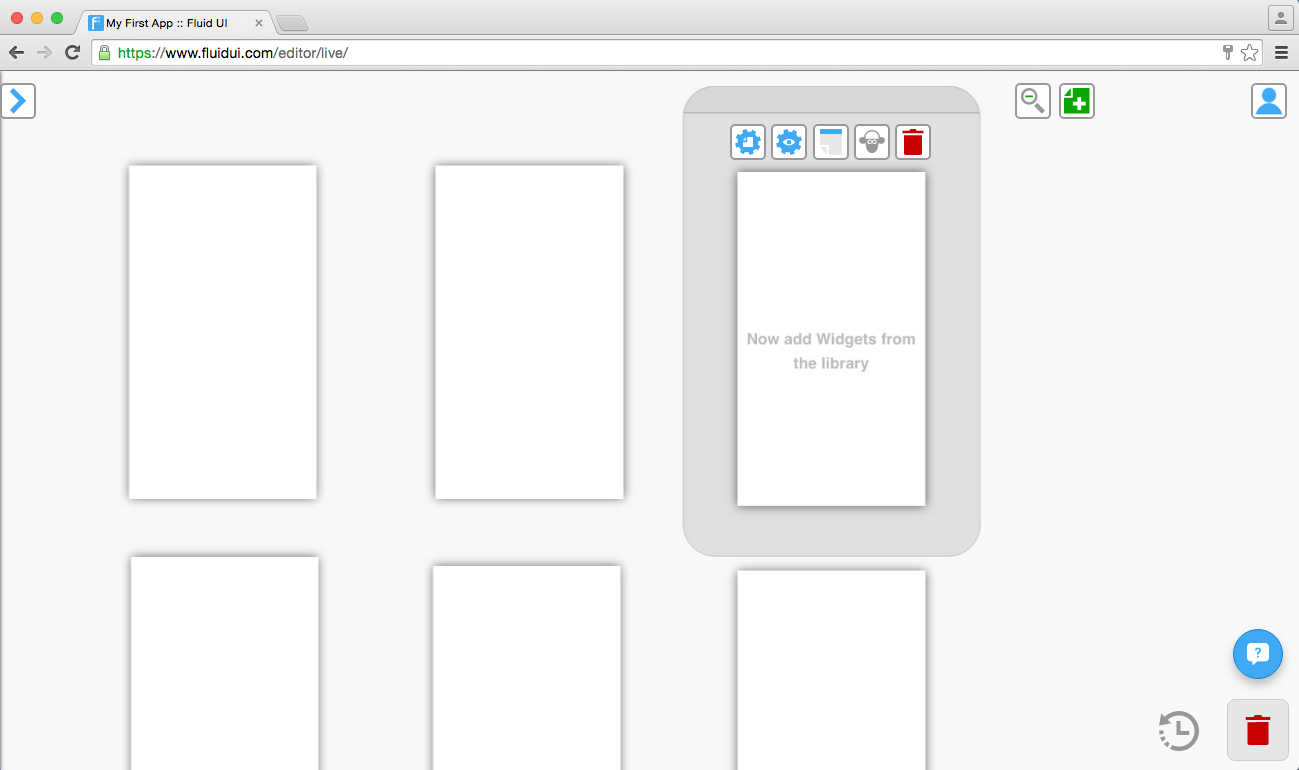
Each project starts with a blank canvas from which your idea can grow. You can start designing the second you are signed in.
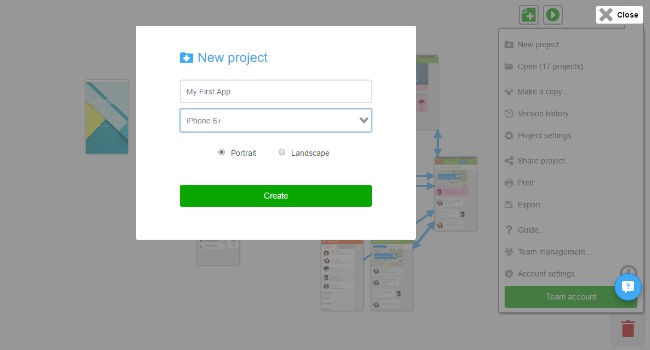
You can create additional projects by clicking “New project” in the home menu.
To create a page:
See more aboutadding, cloning and deleting pages and changing their settings in the page menu.
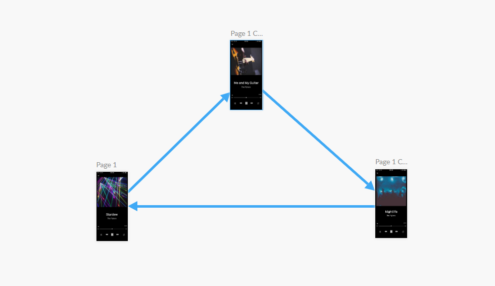
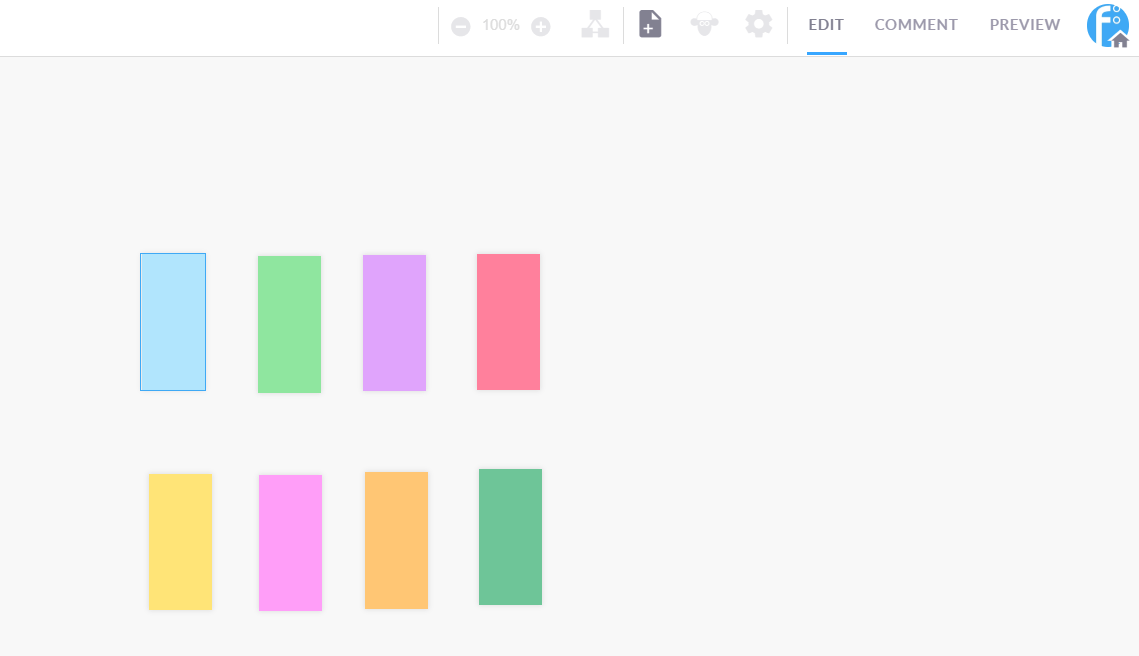
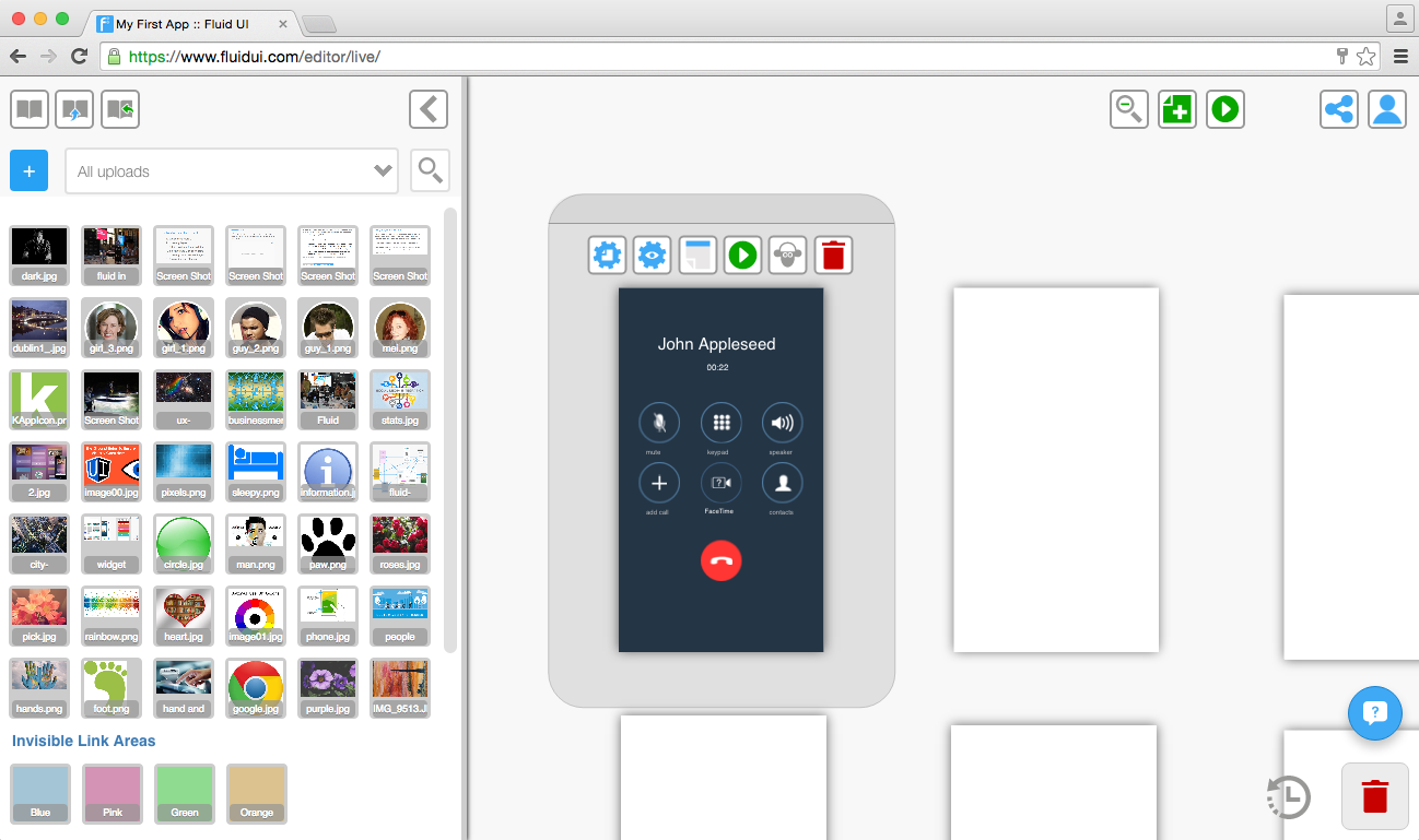
Add any number of widgetsfrom your library and edit widget properties to create the look and feel you need for your project.

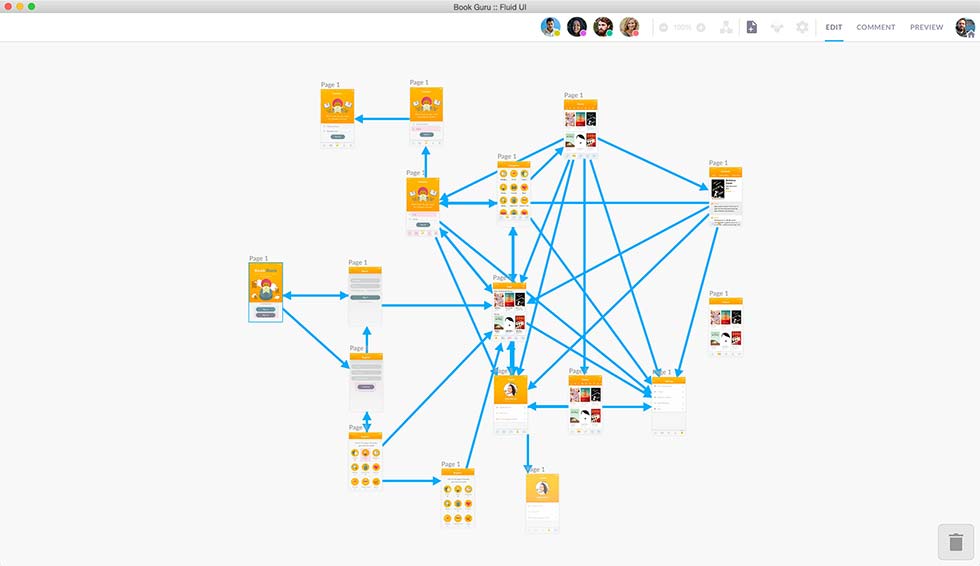
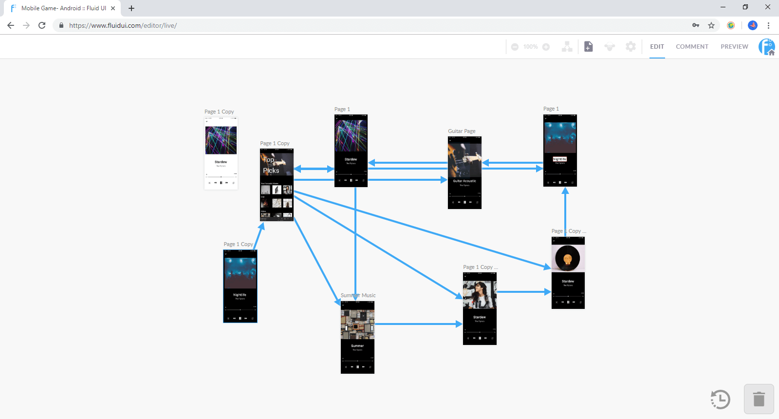
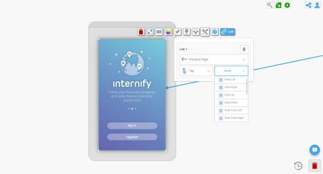
The final design step is tolink your widgets to your pages to create an interactive, playable storyboard for your prototype.
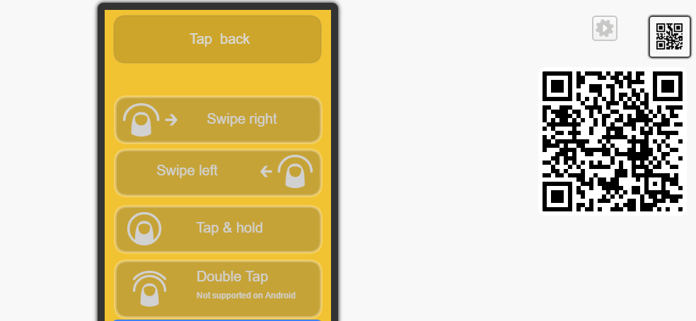
Once a link is created, you can set the gestures and transitions assigned to them and delete them. You can also set the default gestures and transitions for your project in the project settings.
Once you’ve added a few pages, widgets and links, test out your app in the browser by clicking on the Preview button.
Download the Android or iOS player apps to test the app live on your device.
Continue editing until you have your first version of your prototype, then…
An idea without feedback is like a tree without roots. Getting feedback on your prototype is the next step and must come from two sources - your project stakeholders and your users. Get their feedback, then iterate in an agile fashion until you have your final solution.
Your first project will be created and already open when you sign up.

To create a second or further project:
Fluid UI automatically saves your work both locally and online every few minutes as well as every time you click the preview button - there is no need to specifically save or manage projects.
The only way your data will be deleted is if you ask us to delete it. We store data for inactive accounts for up to a year. After a year of an account being inactive you will receive an email warning you that your account is going to be deleted. If the account is active it will not be deleted ever.
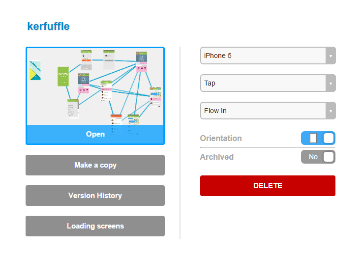
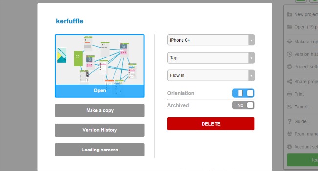
To change a project name,
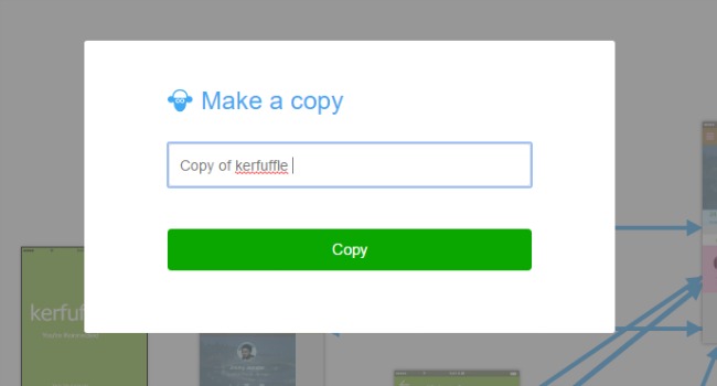
Copy a project by:
You can then change the name of the copied project. The original and copied projects are now in your active projects. The copy will automatically open and your original can be accessed by clicking ‘My projects…’ in Home menu.
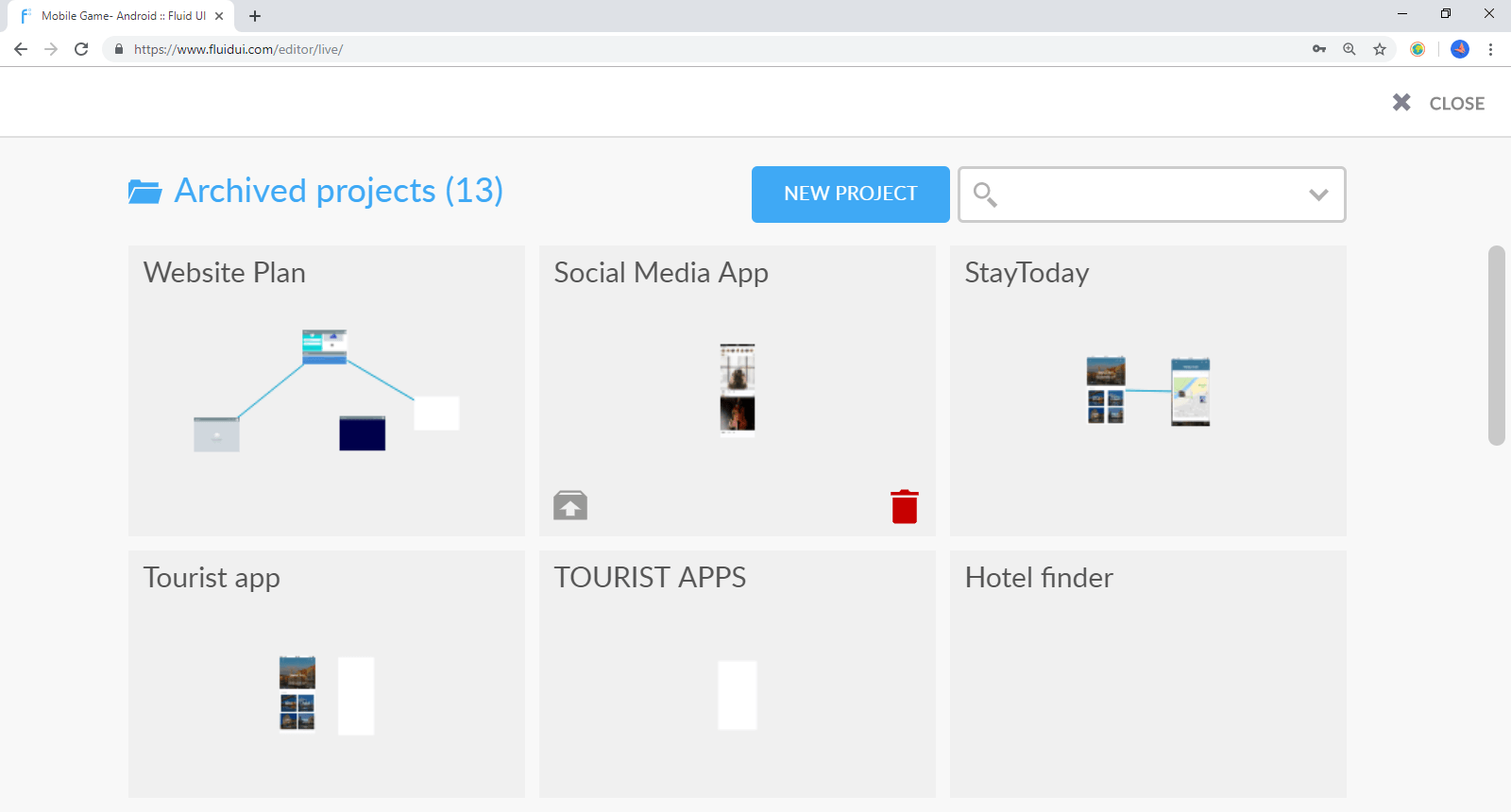
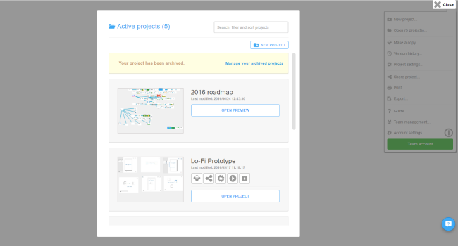
How to archive a project
You can archive a project by:
Why archive projects?
You can then manage your archived projects, delete or restore them in the future.
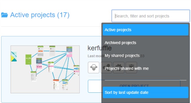
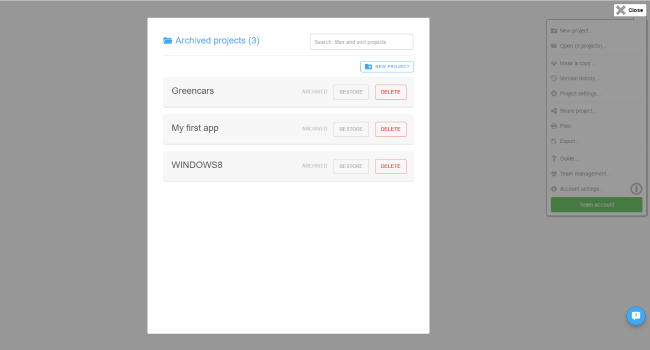
How to access archived projects
Go to Active projects and then use the filter in the search bar to find all of your archived projects.
A project needs to be archived before it can be deleted. Follow the steps above to archive the project. Go to ‘Archived projects’ and click the bin to delete the project permanently.

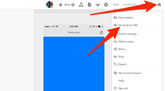
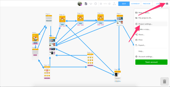
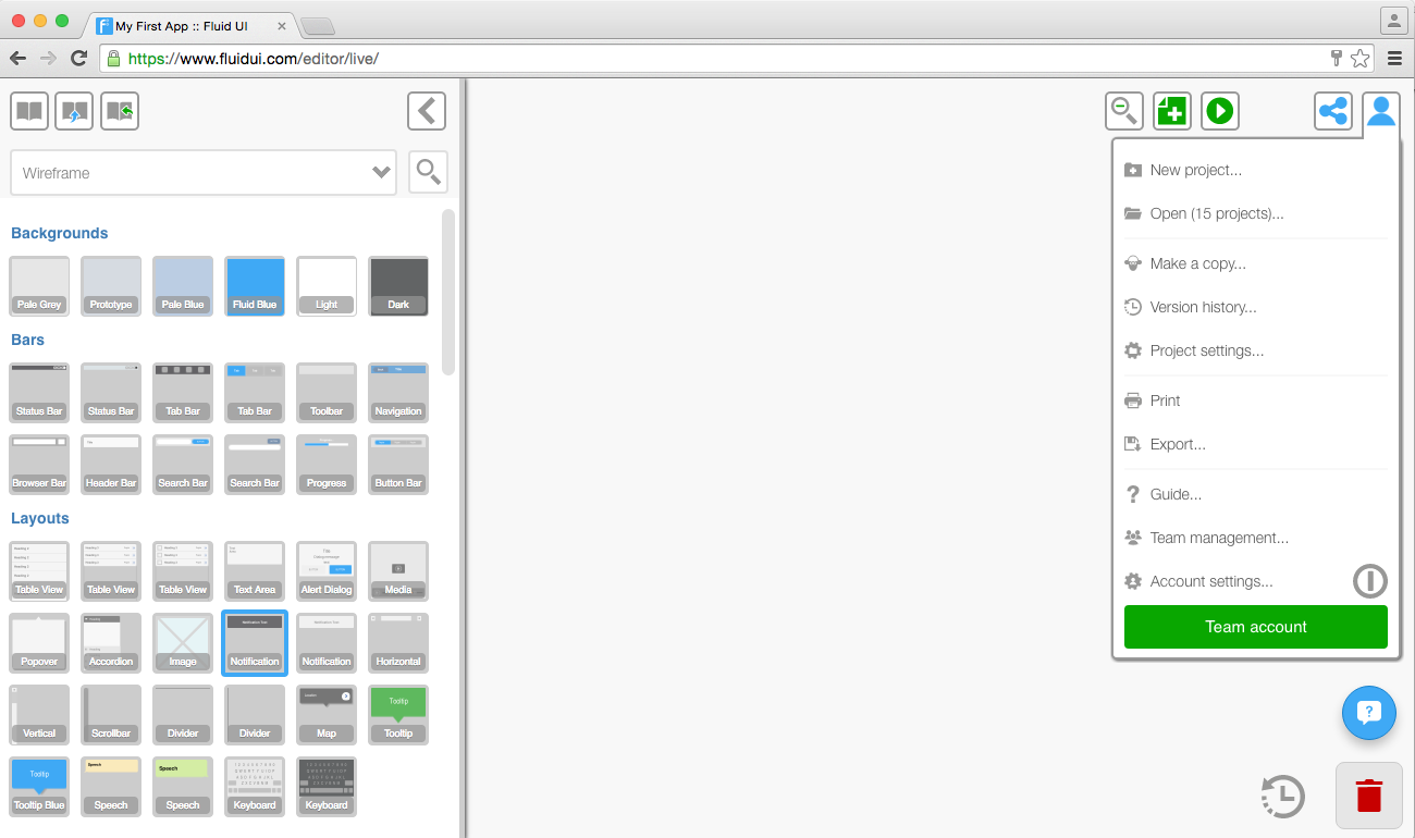
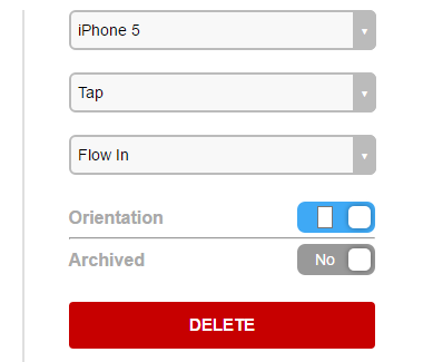
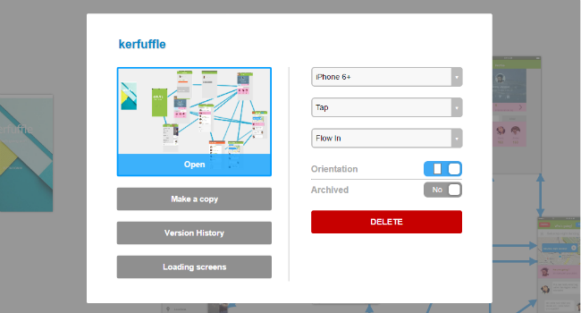
Click on the home icon to access project options and settings.
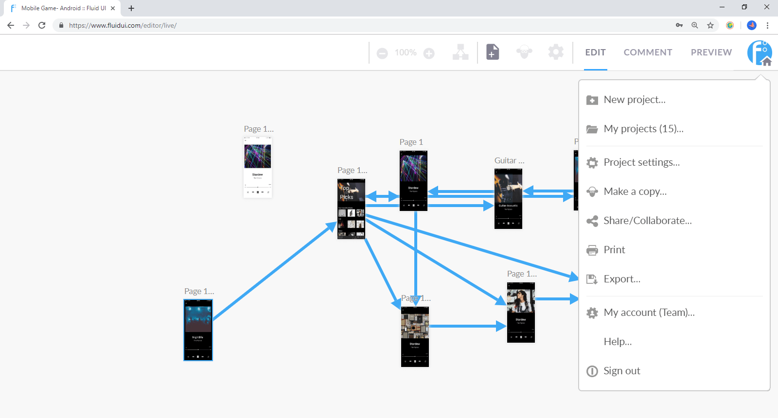
From here you can:
Use project settings to:
Set the transition and gesture you want to have in your app. This will mean that each new link you create will automatically be set to the default transition and gesture you have chosen.
You can also change the gestures and transitions for individual links.
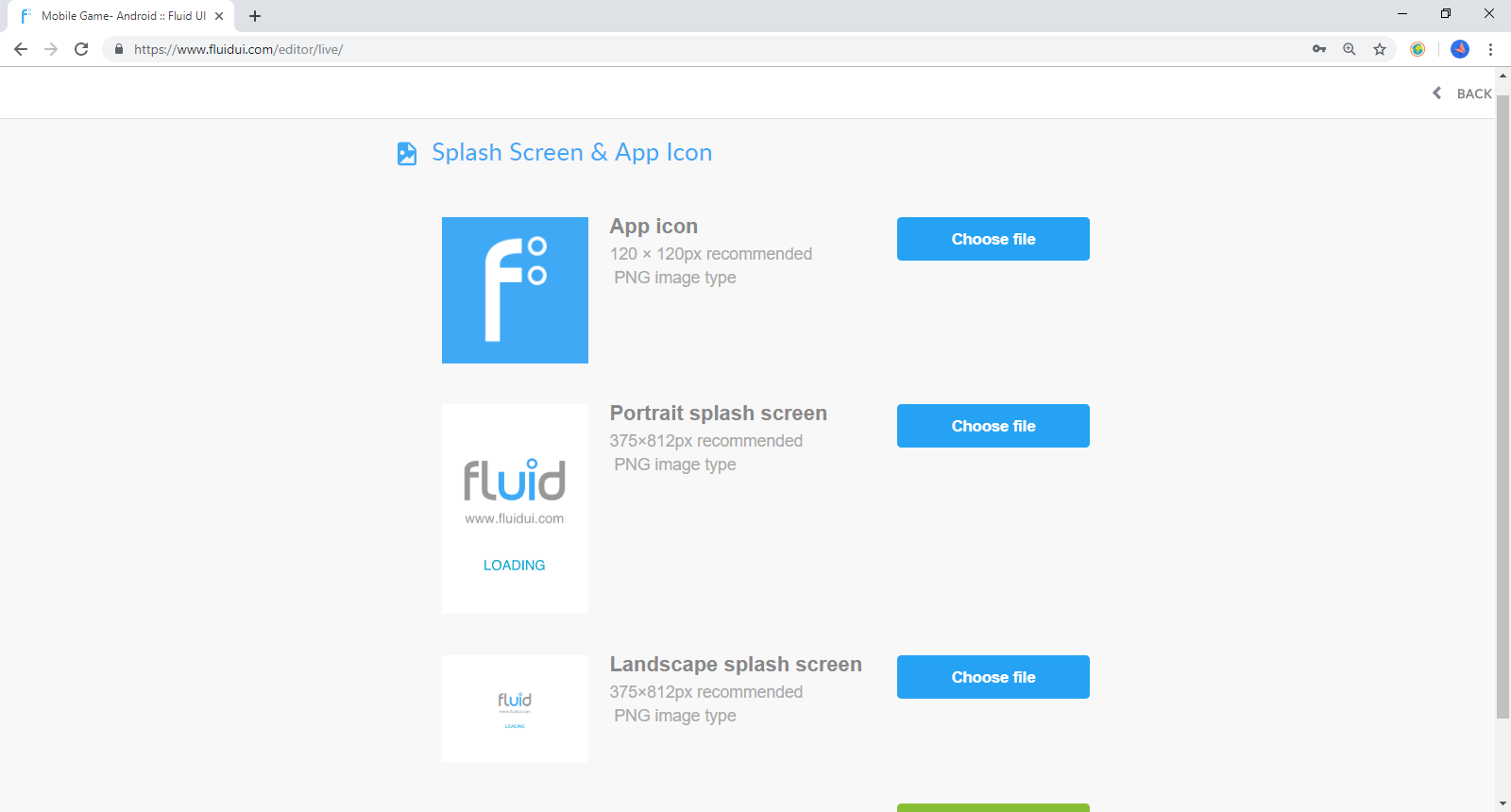
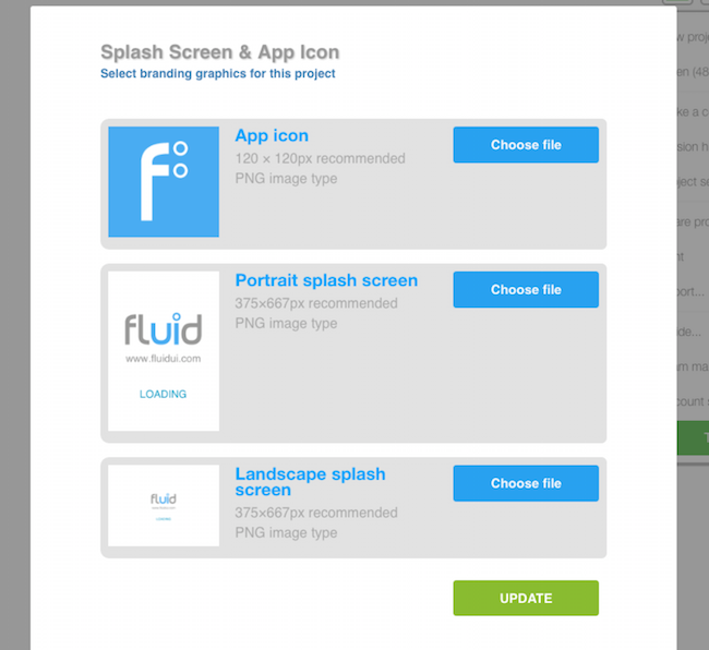
You’ll find the options for uploading your own splash screen and icon in the project settings menu.
There are 3 ways to create a page with Fluid UI:
Once created, pages can be moved around the canvas to create a storyboard for your prototype.
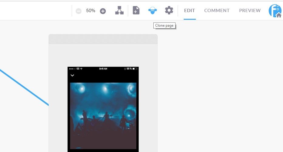
You can clone a page by clicking the sheep in the top bar.
You can delete a page by:
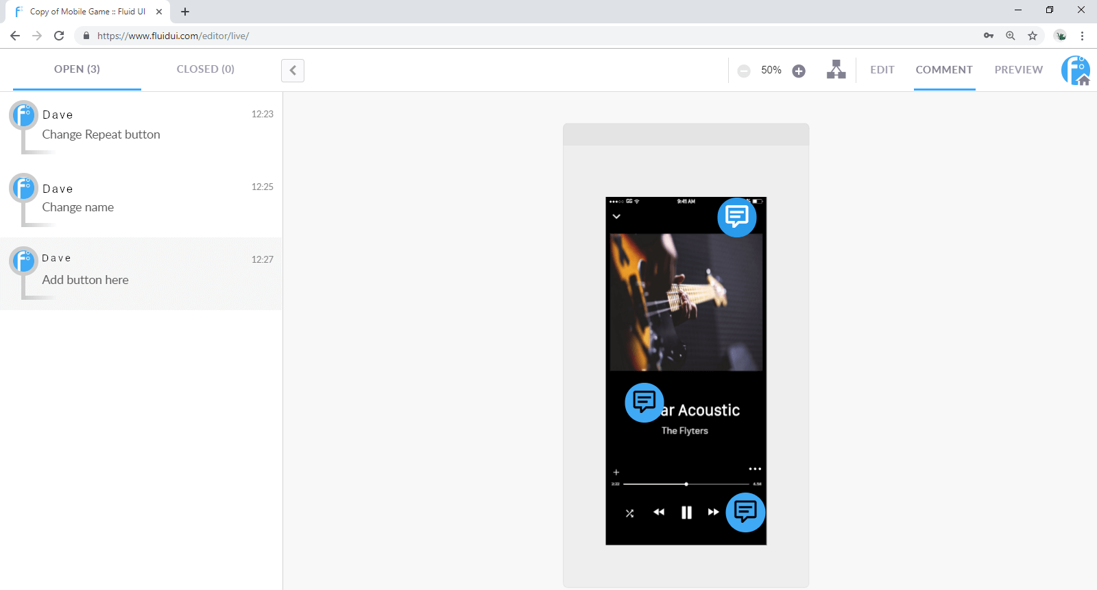
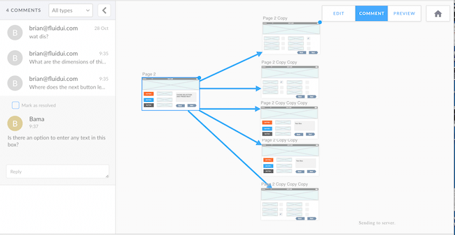
Click on the comment tab in the top bar. Here you can add your own comments and view comments made by collaborators.
To add a comment:

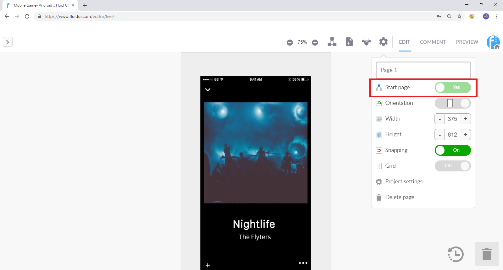
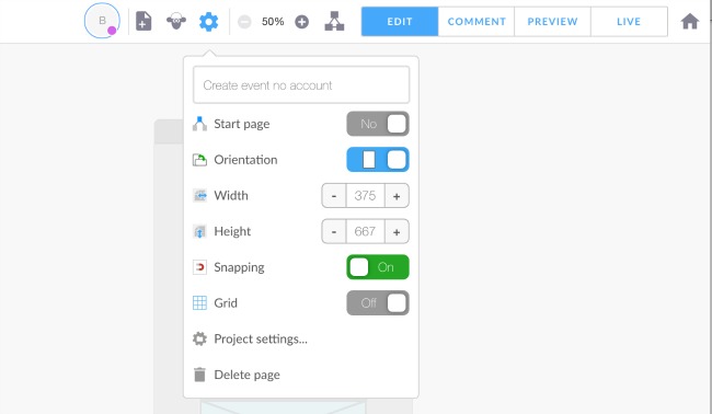
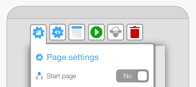
You can set any page in your prototype to the start page by focusing on that page and clicking the “Start page” switch in the page settings menu. Only one page can be the start page.
You can also click the preview button on any screen to preview starting with that particular page so you don’t need to navigate from the start page each time (this option is available once the page has widgets on it).
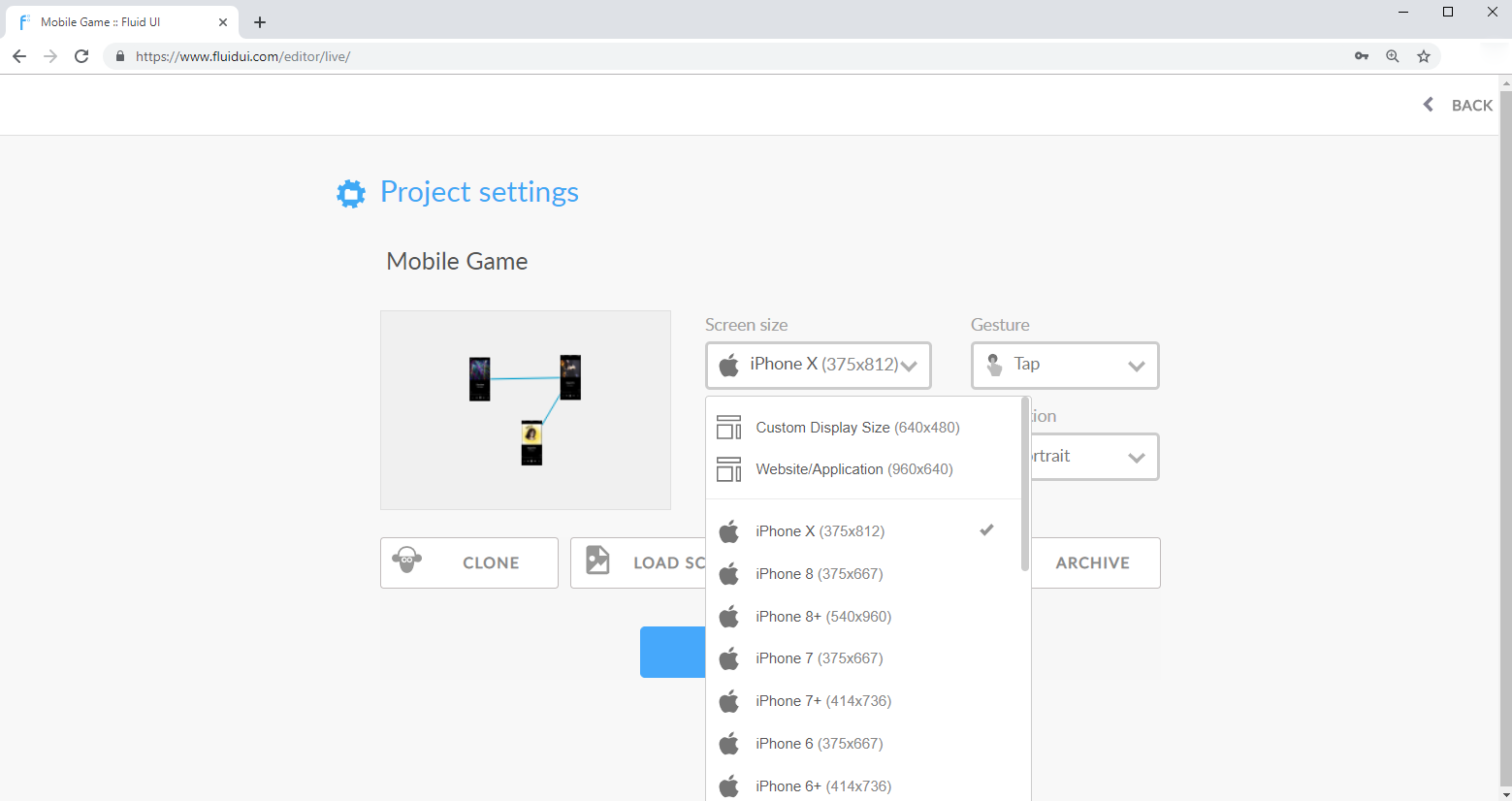
Choose your default screen orientation and resolution when you are creating a new project. You can also choose a custom size if your size is not in the presets.
Use project settings which is in the home menu to change the device orientation as well as the default gestures and transitions for your project.
Find out more about project settings
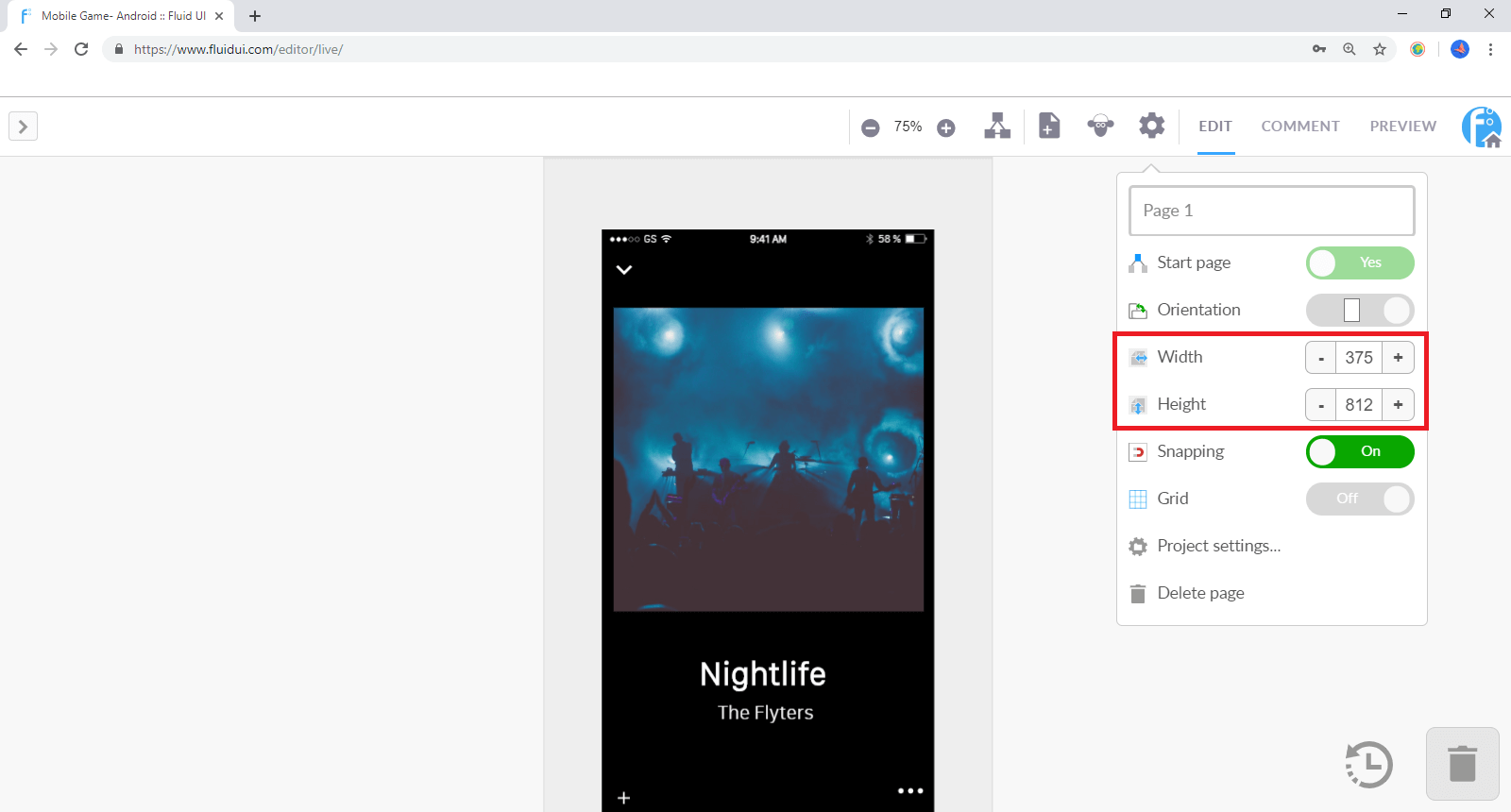
Increasing the page width or height in the page menu will automatically cause any pages to scroll (horizontally, vertically or both) when you preview.
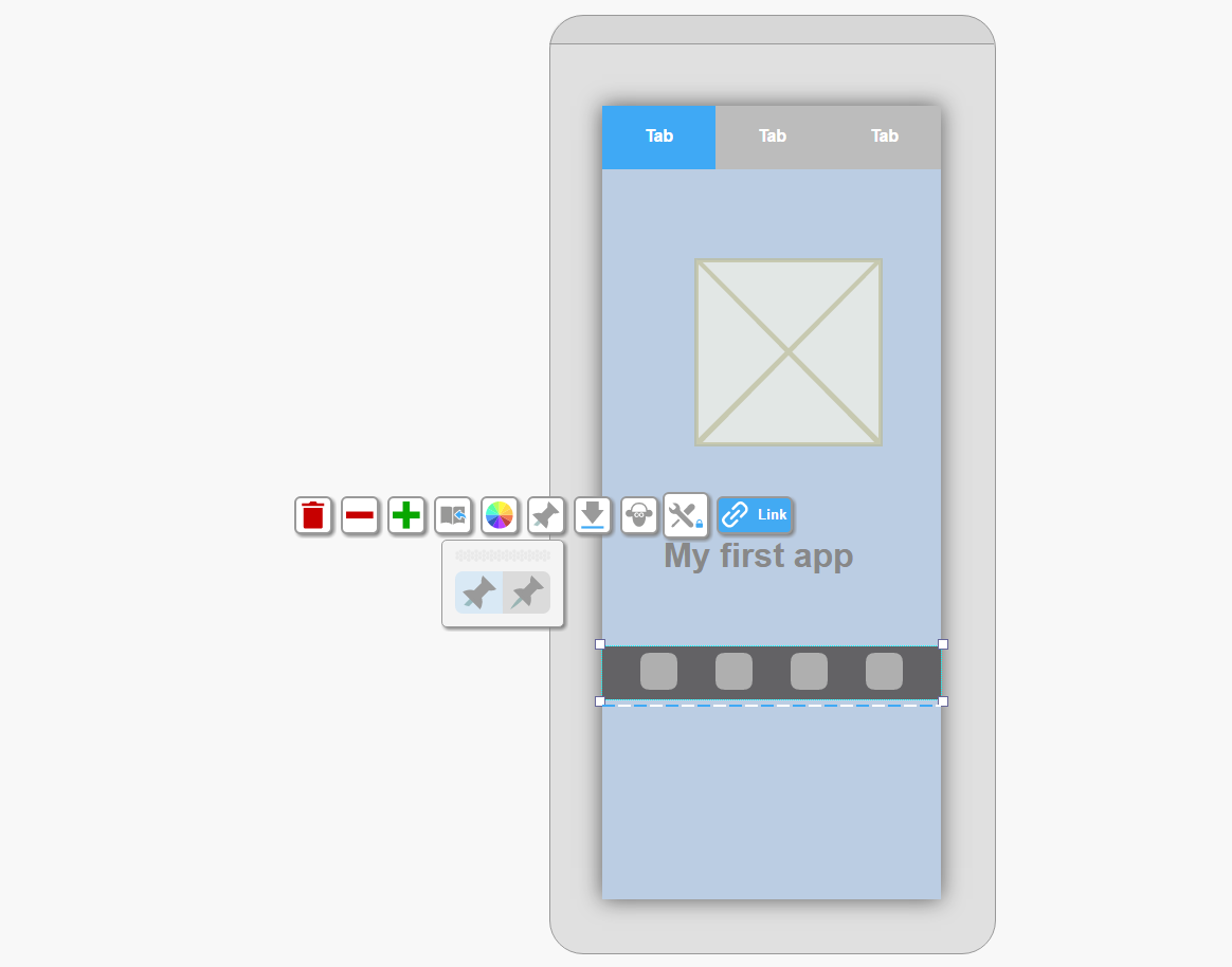
Pinned widgets are frequently used with scrolling pages to make some content static while other content scrolls.
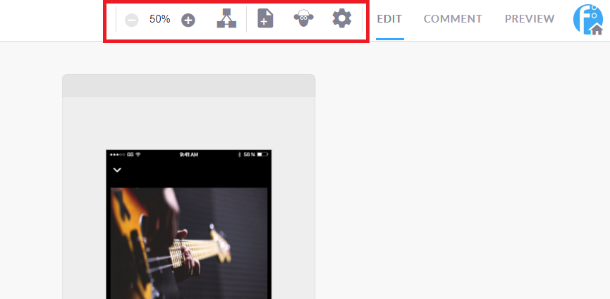
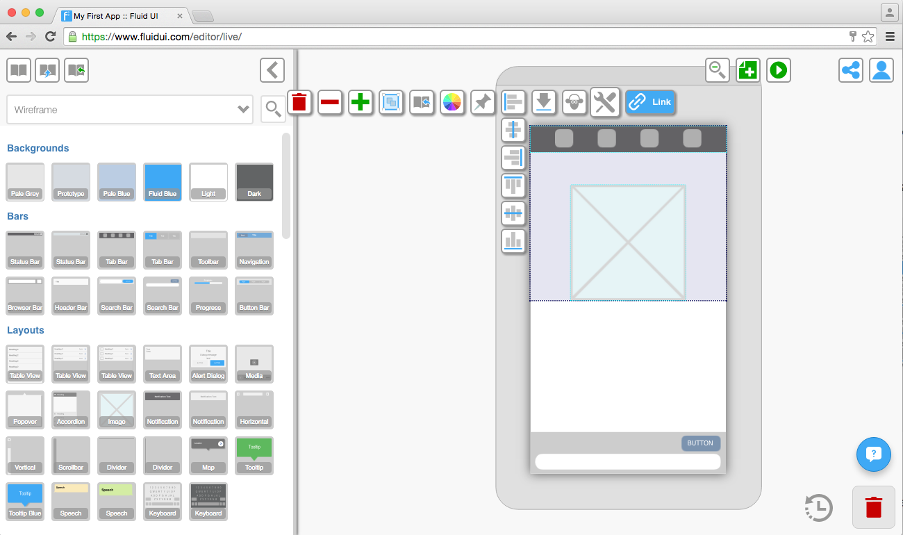
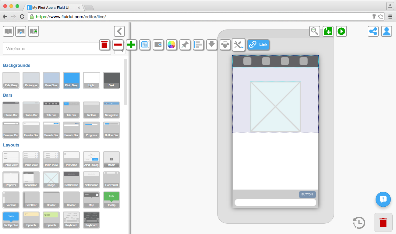
The top bar which is found at the top of the editor contains a number of features.
When we talk about screens in Fluid UI we are talking about the device screen you are designing for. You can read all about choosing the right screen resolution for your app design here.
You can choose which device screen resolution you are designing for when you create a new project and by choosing project settings in the home menu.
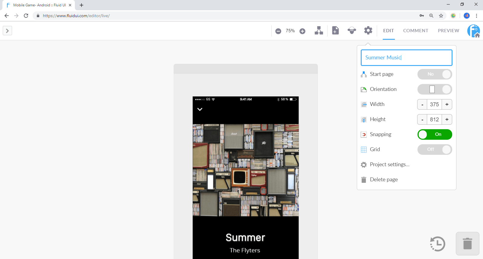
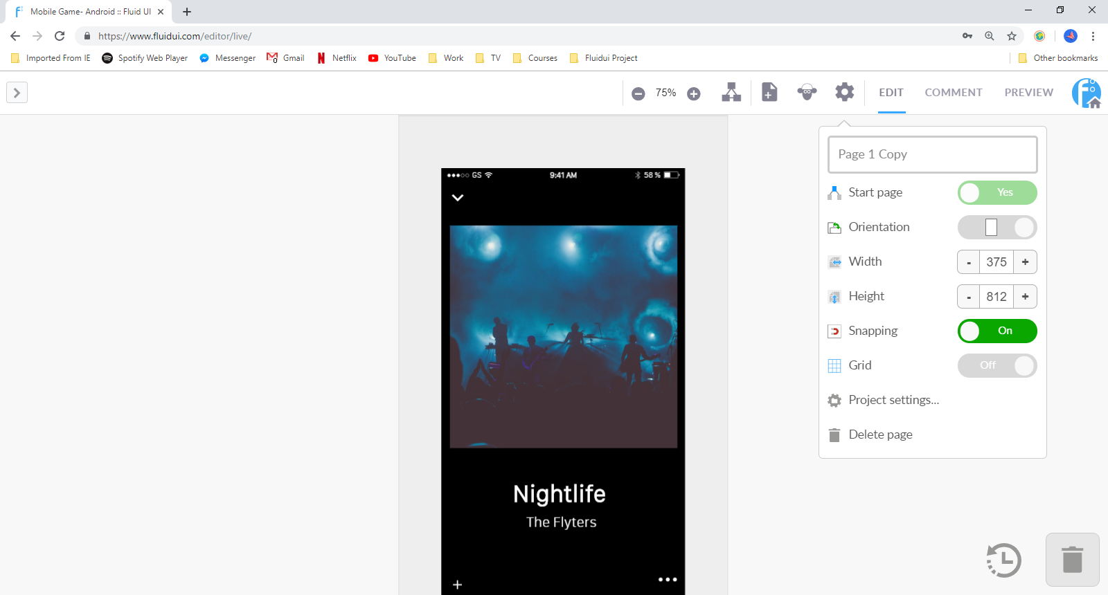
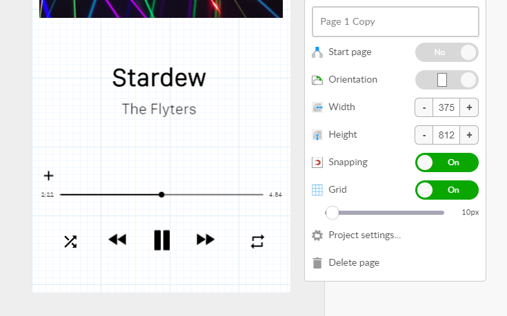
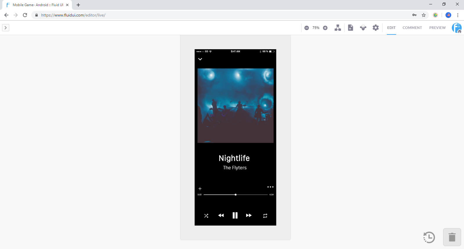
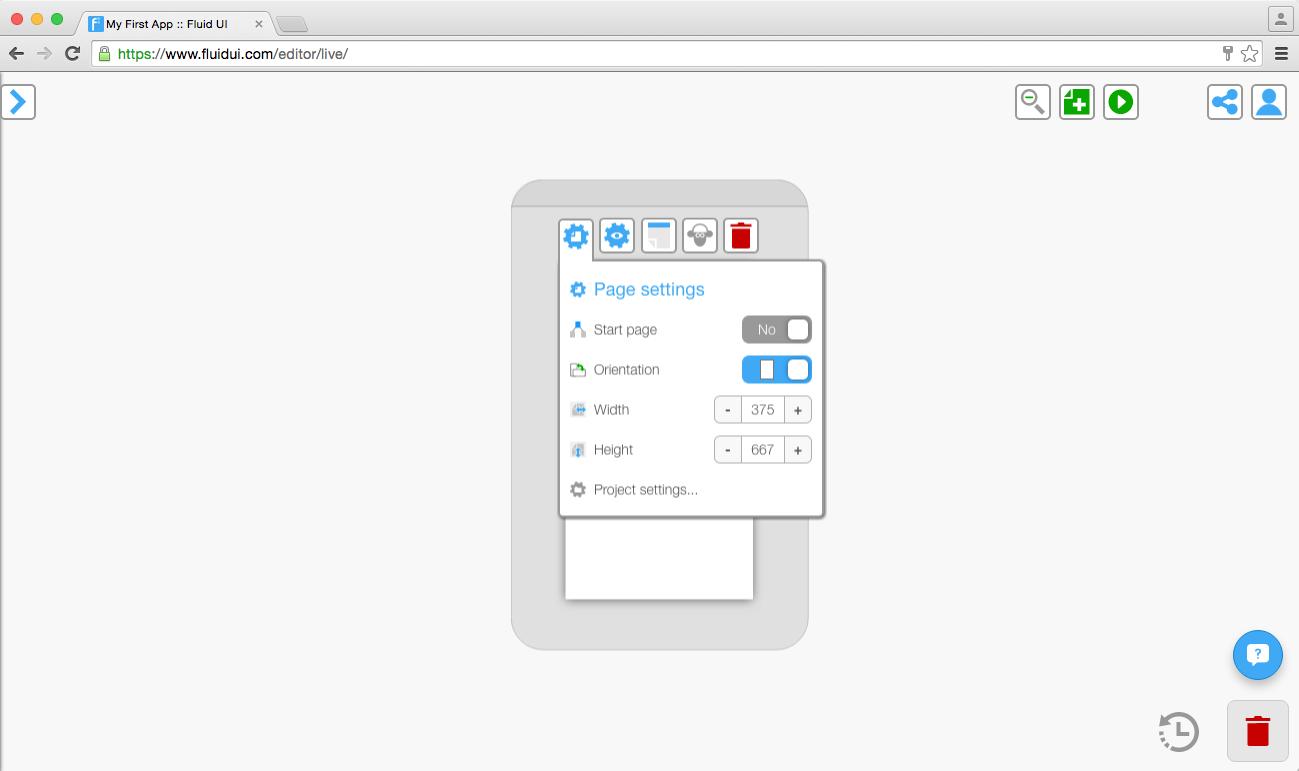
A page in your project corresponds to a page in the app you are designing. You can change the page’s height, width, orientation and set it as the starting page for when you’re previewing your app prototype.
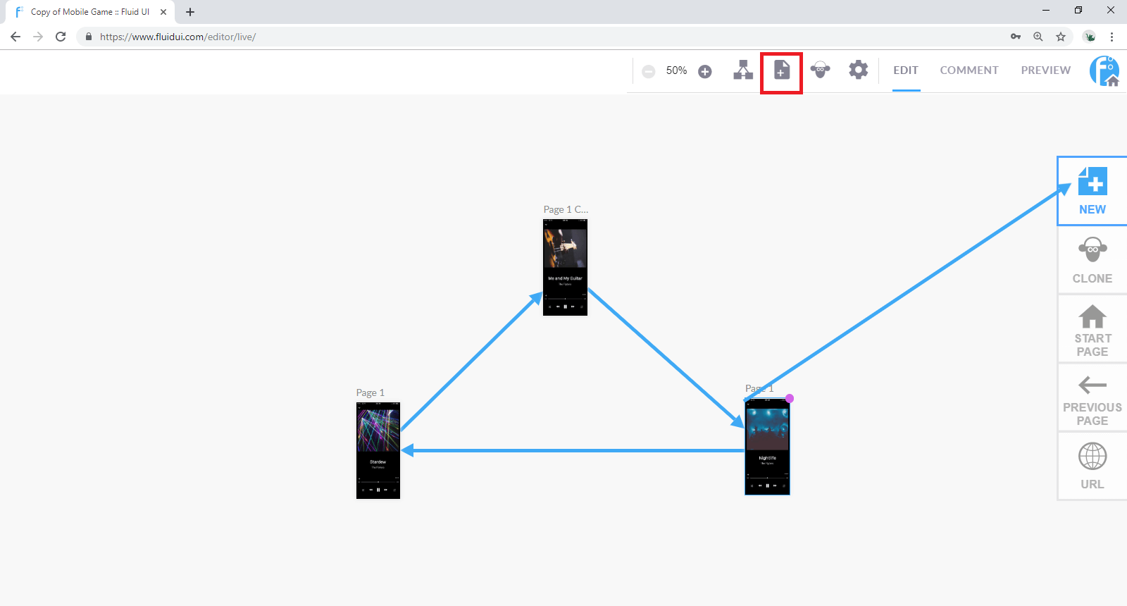
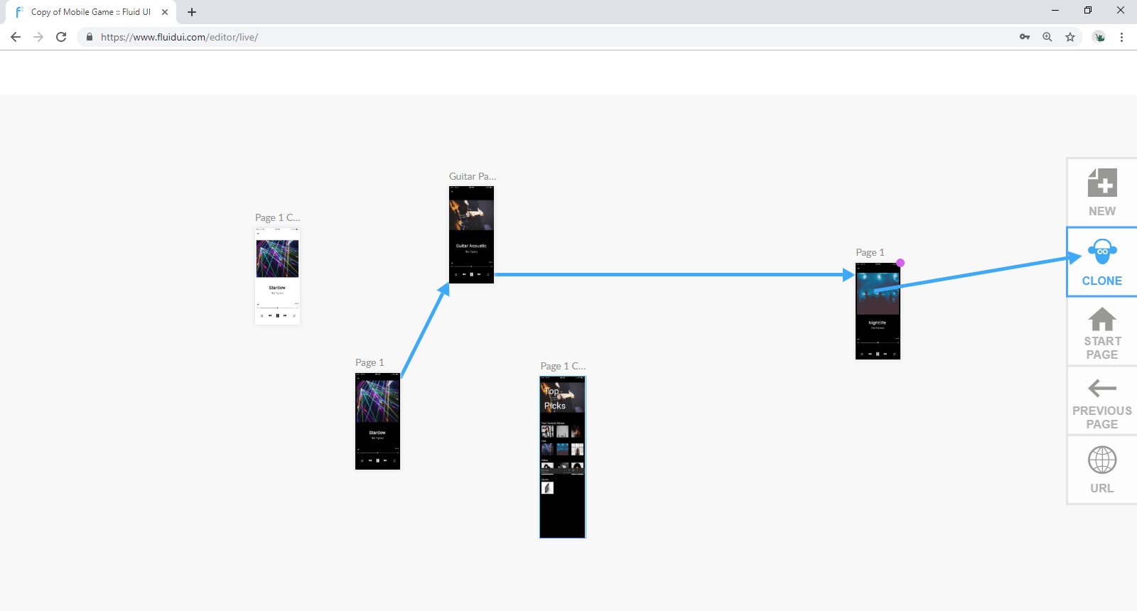
Select any widget or hotspot and use the blue ‘link’ icon on the right hand side of the widget menu. The screen will zoom out to your entire project. Click again to drop the link on the page you want to link to.
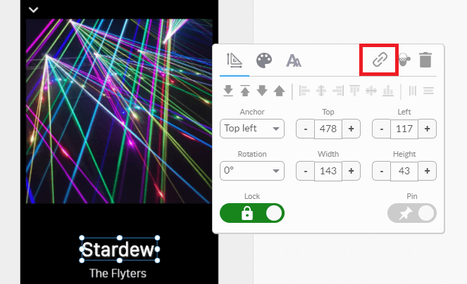
You can drop the link onto another page, or on the buttons that appear on the side of the canvas.
These include:
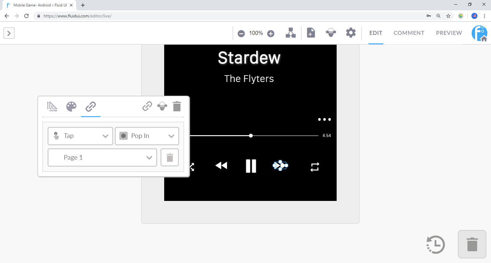
Once a link is created, you can click on the widget it is linked from and the link settings menu will appear in the tool bar. You can access the links gestures and transitions from here or alternatively, hover over a link and a circle with an arrow will pop up. If you click on this you will be given gesture and transition options as well.
Delete a link by clicking on the widget it is linked to. You’ll find a trash bin in the link settings which can be used to delete the link.
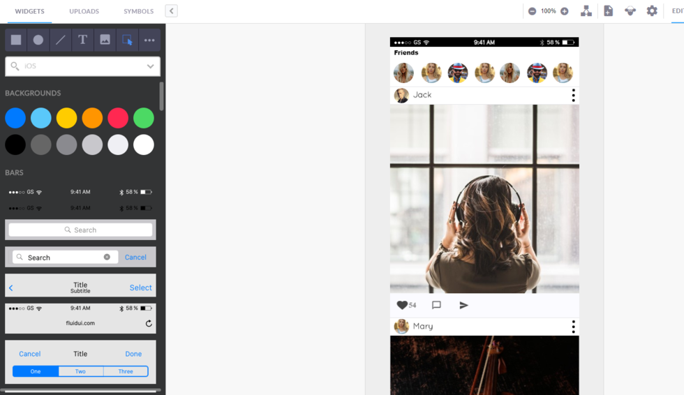
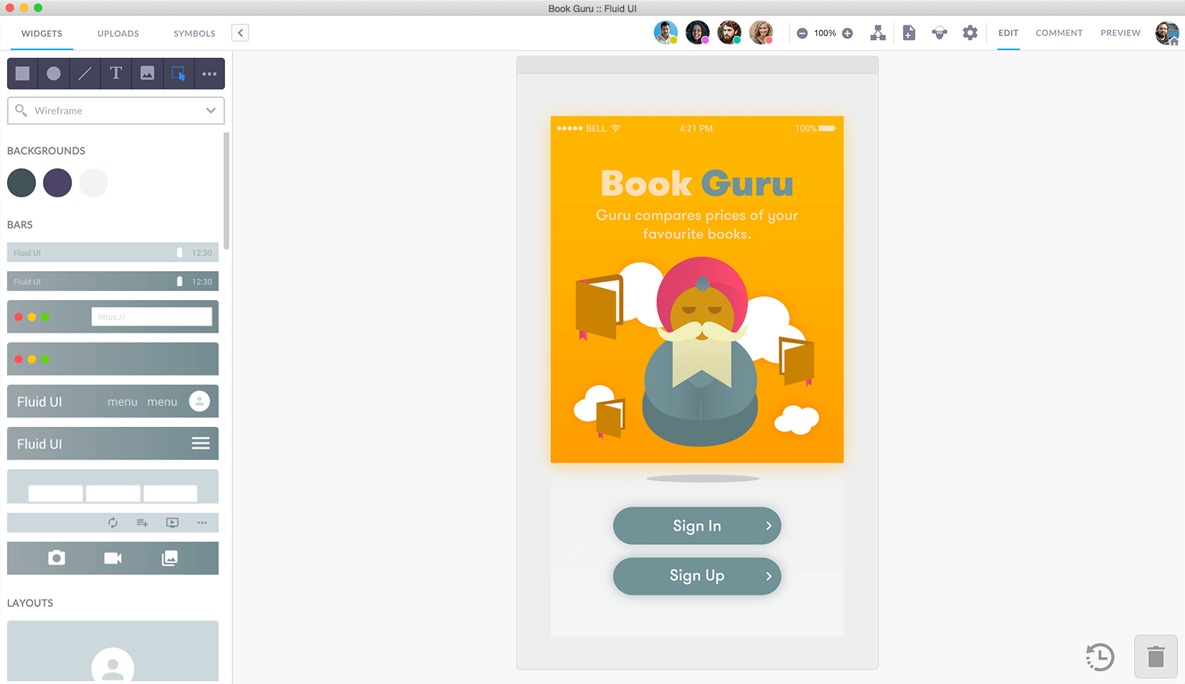
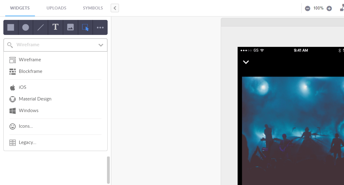
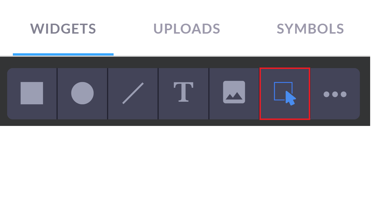
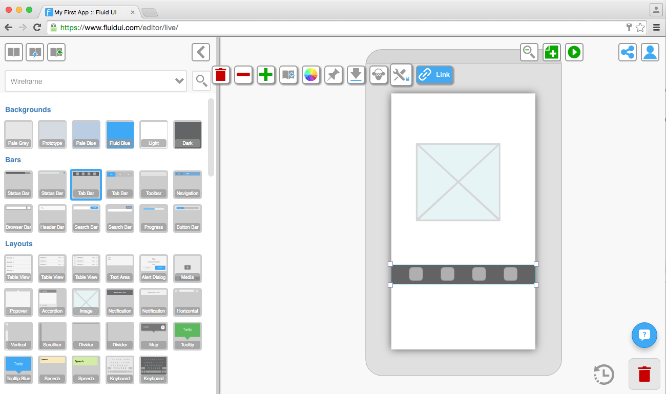
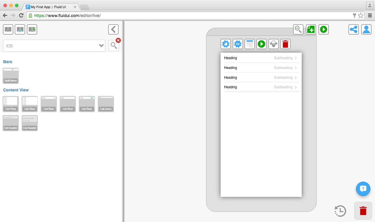
The library has 3 tabs:
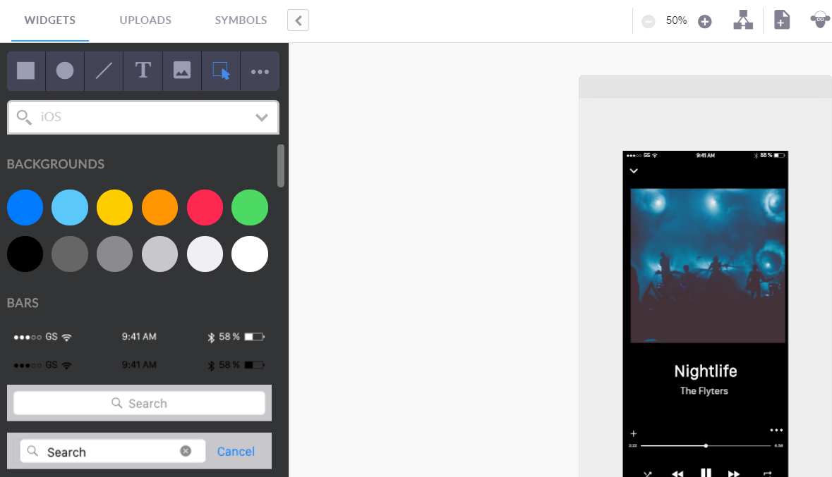
The widget libraries include dedicated libraries for iOS, Android, Windows, wearables and website wireframing.
By default the ‘wireframe’ library is selected, this is a good option if you don’t want to worry about the exact device you are prototyping for, but just want to get a good overall feel for how your app’s UI will flow.
To access the libraries, click on any page and the library will open on the left of the editor. Select your chosen library from the widget library drop-down menu and start designing.
Tip: You can close the widget library if you’re not using it to give yourself a bit more space.
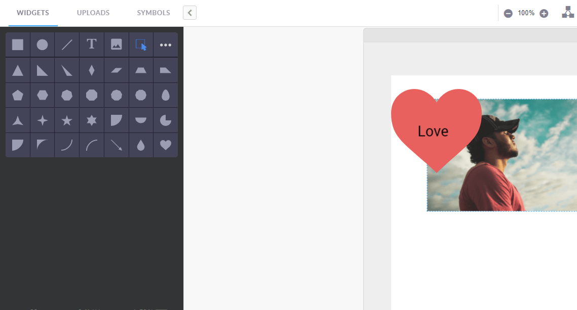
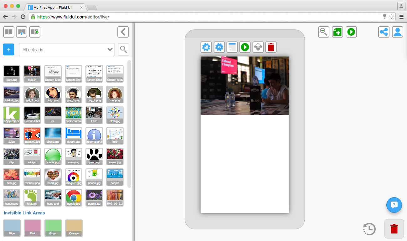
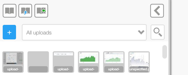
Upload your own images from Photoshop or the web and make high fidelity prototypes.
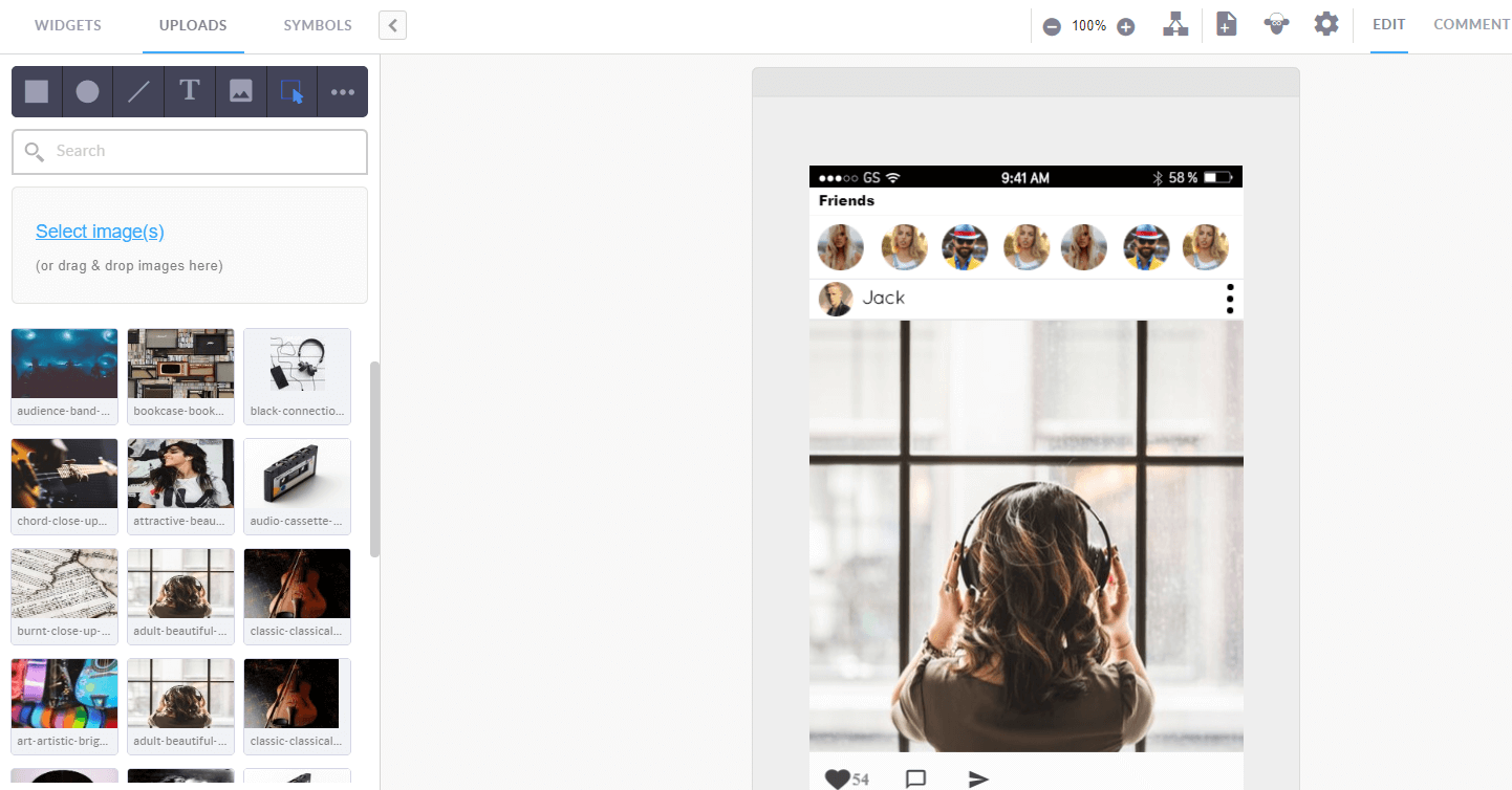
You can either drag and drop the images into the editor window, or use the ‘Select image’ button in the uploads section to search your computer’s hard drive for an image.
You should always make sure your images are ‘saved for web’ using a program like Photoshop or one of the free online image editors.
When you keep your image files as small as possible the editor will load quicker and previewing will be much quicker.
Edit and resize the images like any other widget.
Tip: You need to have a paid (solo) account in order to upload your own images.
Symbols will speed up your design process for every project.
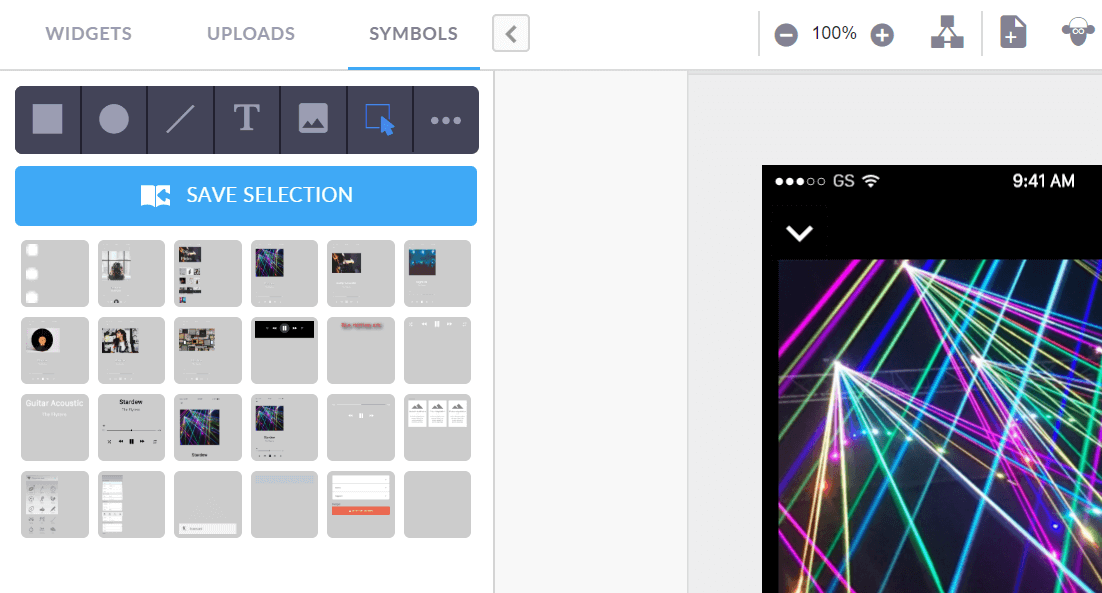
Reusable designs are stored in your symbol library.
Save whole screens and use them in other projects.
Save your customised widgets and cards ready for quick access when you need to mock up a similar project.
To delete a symbol, drag it to the red trash bin in the bottom right of the screen.
Tip: You can access all of your saved symbols from any project.
There are two ways to add widgets to you page:
1. A single click

A single click on a widget will add it to the selected page. The widget will automatically be placed on an area of the page that the editor predicts it belongs.
For example: A header item will go in the header section of the page. You can move it by dragging and dropping it somewhere else.
2. Drag and drop
Dragging a widget from the library and dropping it on any page (selected or not) will add that widget to the page at the location it is dropped.
The smart menu allows you to use shapes and symbols very quickly when designing. To use it click on a shape and click and drag on the page to create a new widget.
Use the smart menu to:
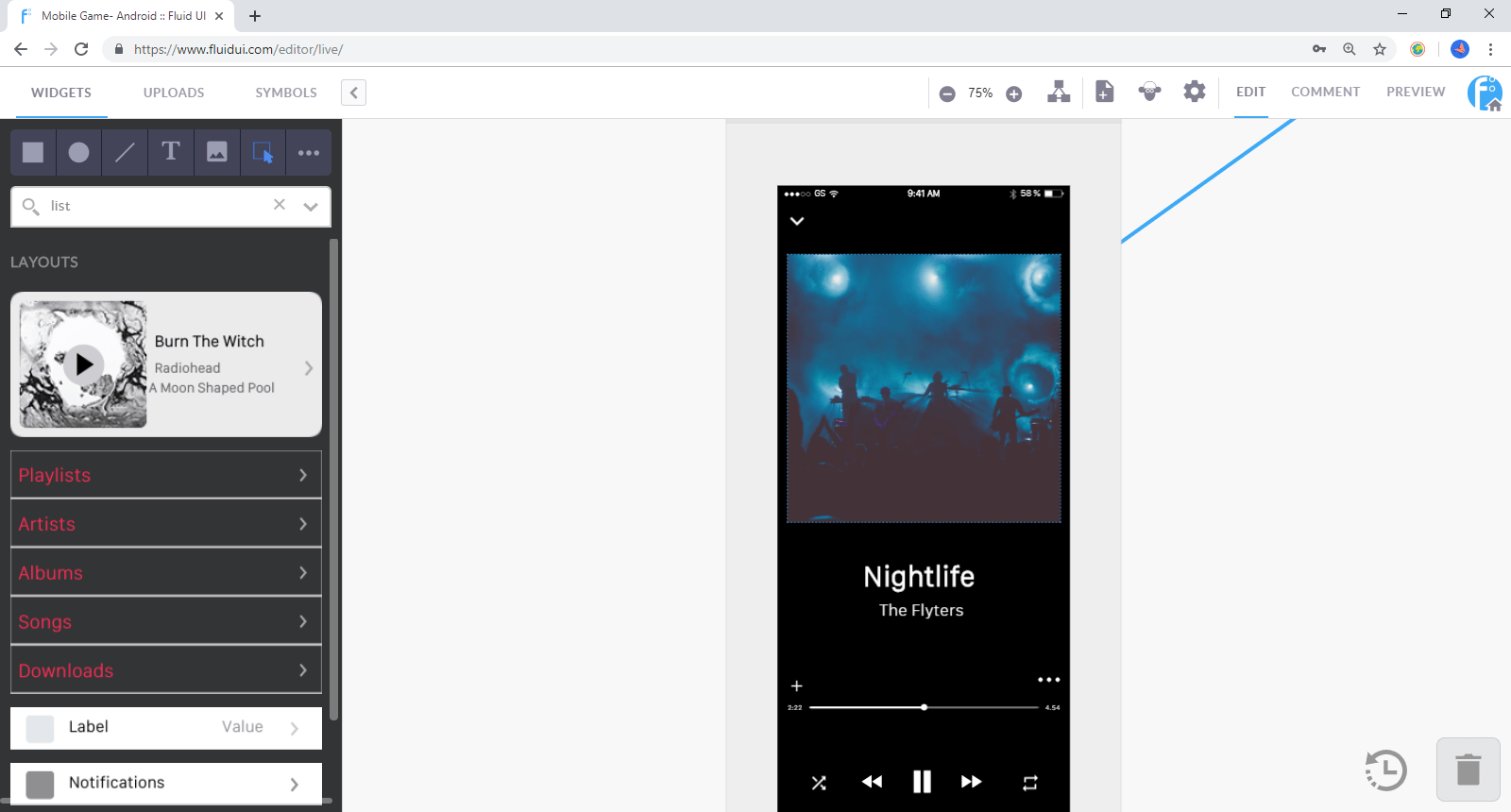
Use the library search function to find widgets by type. For example type ‘list’ into the search bar to bring up all of the list widgets in that library.
Selecting multiple widgets: Start dragging on the page frame (the dark grey area around the selected page) or on an area that does not already contain a widget other than the background.
All widgets that are contained in the blue box after dragging will be selected.
Use the group icon to create a group, and when a group is selected, you can ungroup them with the ungroup icon.
Tip: Groups will be clearly indicated by a border when selected. In order to edit widgets in a group, they must be ungrouped first.
##
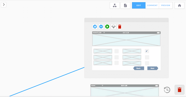
Hotspots are widgets that are visible on your page when creating your prototype, but don’t show in preview mode (unless you choose to show them in preview settings).
They let you link a particular part of an image to another page without having to chop up the uploaded image.
To use a hotspot, add one from the library and select the link button to add a link from that widget.
Hotspots are useful if you want to link from more than one area on an image. If you want to link from the whole image you can do this too with a normal link.
##
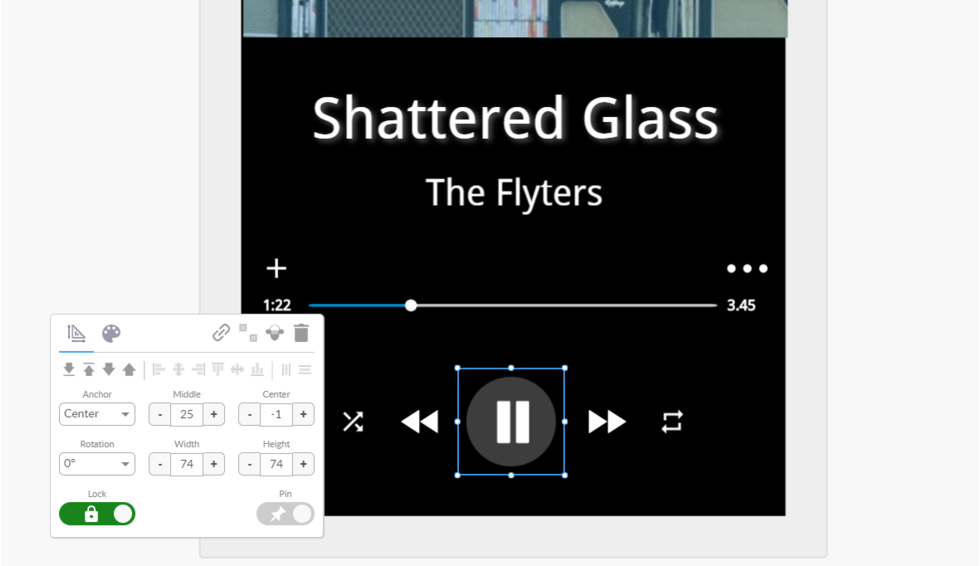
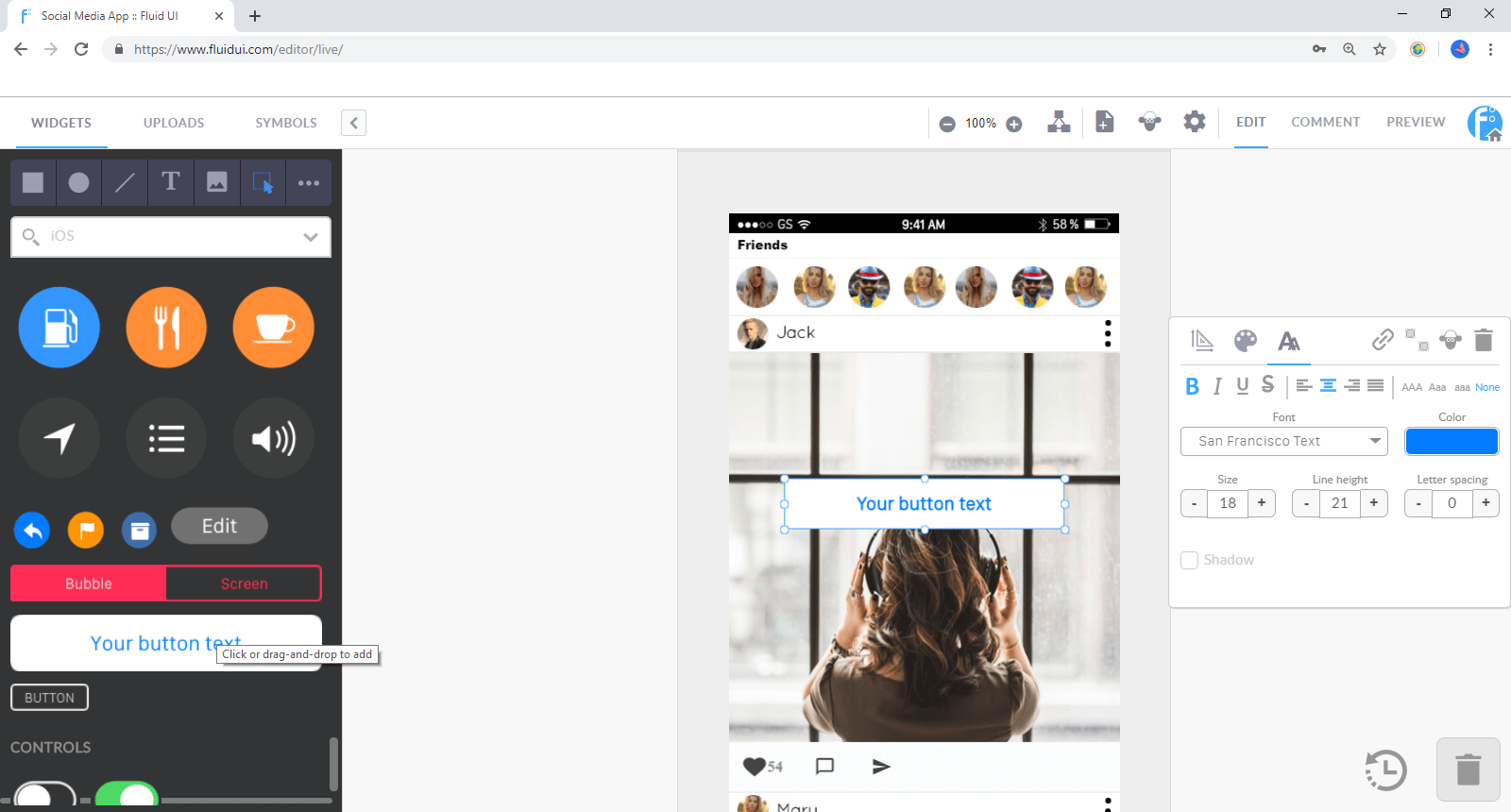
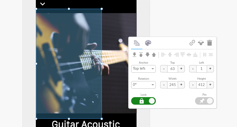
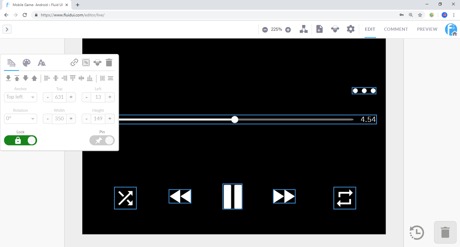
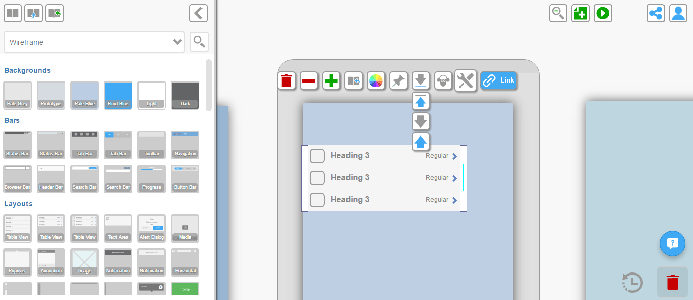
Click on a widget to access the widget menu.
Move the menu around your screen by clicking and dragging the white area of the menu.
The widget menu will always be visible on screen when a widget is selected. When no widget is selected the widget menu will be hidden.
Depending on the type of widget selected there are different tabs at the top of the menu which open general settings, colour settings and text settings.
Use the grid view in view settings to align widgets pixel by pixel. You can set the number of pixels in each square in the grid.
The snap to grid option will also help align widgets to the nearest pixel.
Use your keyboard’s arrow keys to align widgets by moving pixel by pixel.
Select two or more widgets and the vertical/horizontal align icons will appear in the widget menu.
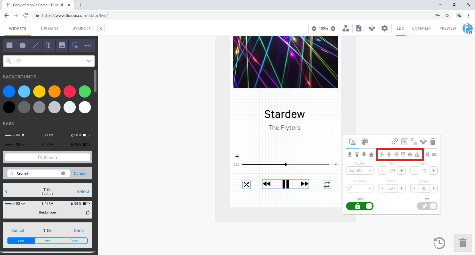
There are 6 options in total:
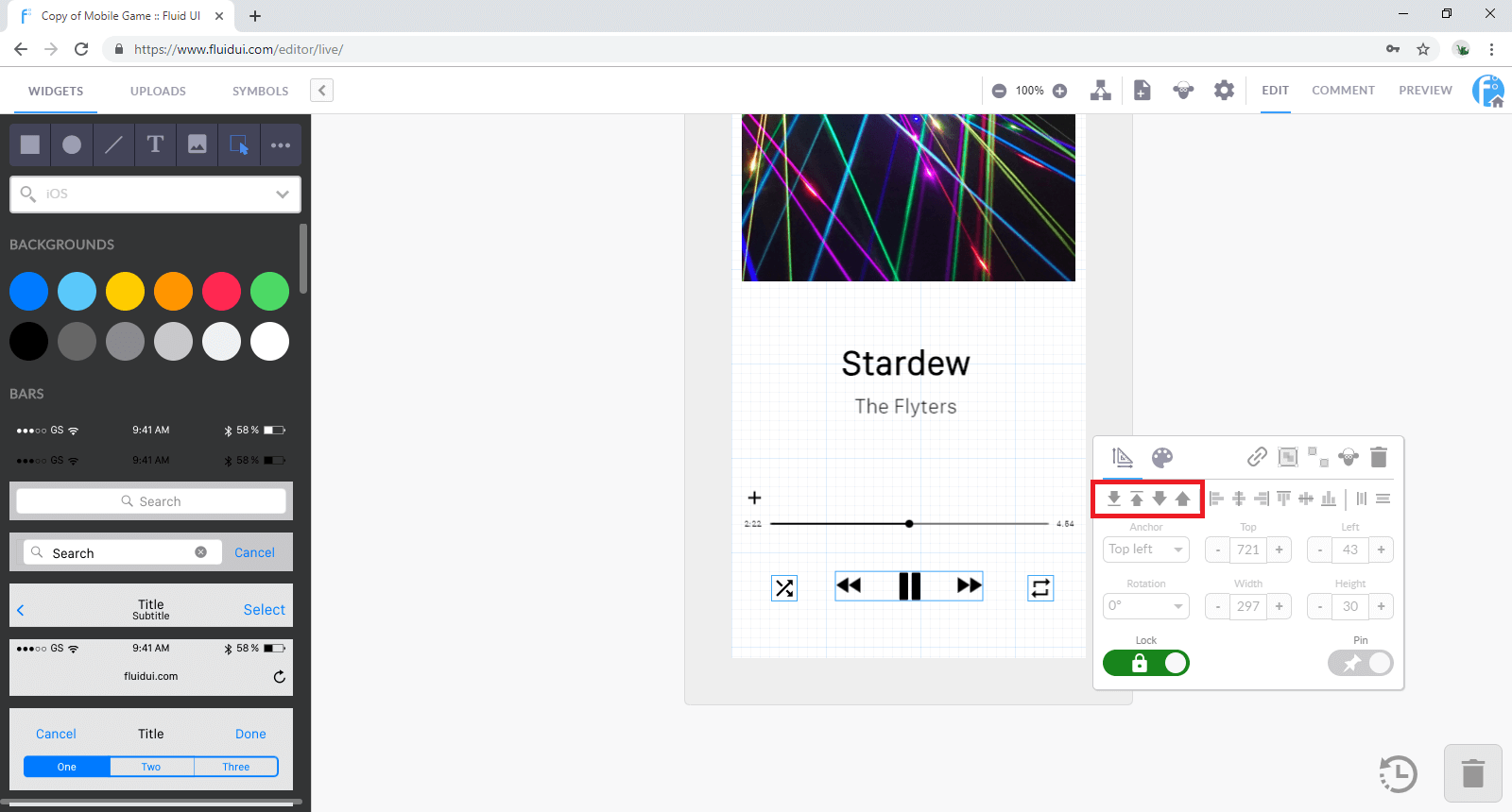
Select any widget or widget group and use the arrows to send them to front or back.
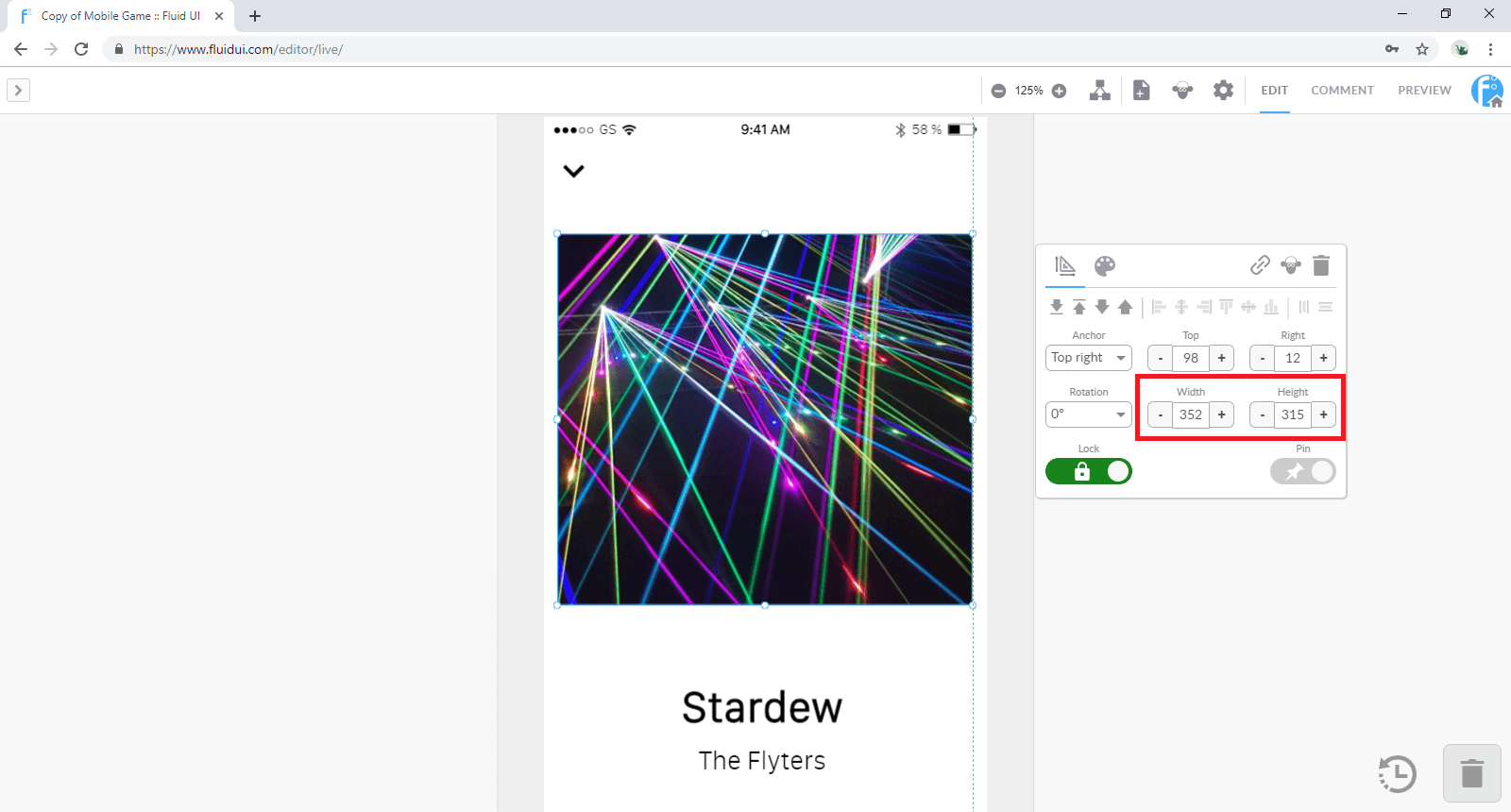
Widgets can be resized by dragging from one of the 4 corners or the sides of the widgets.
All resizable widgets have a clear box/outline indicator.
Holding down shift will maintain the aspect ratio of a widget while resizing it.
To get the size of your widget pixel perfect you can use the resizing tool. simply chose the height and width that you desire.
Tip: Some larger widgets cannot be resized as they are fitted to the size of your page and the device type you are designing for.
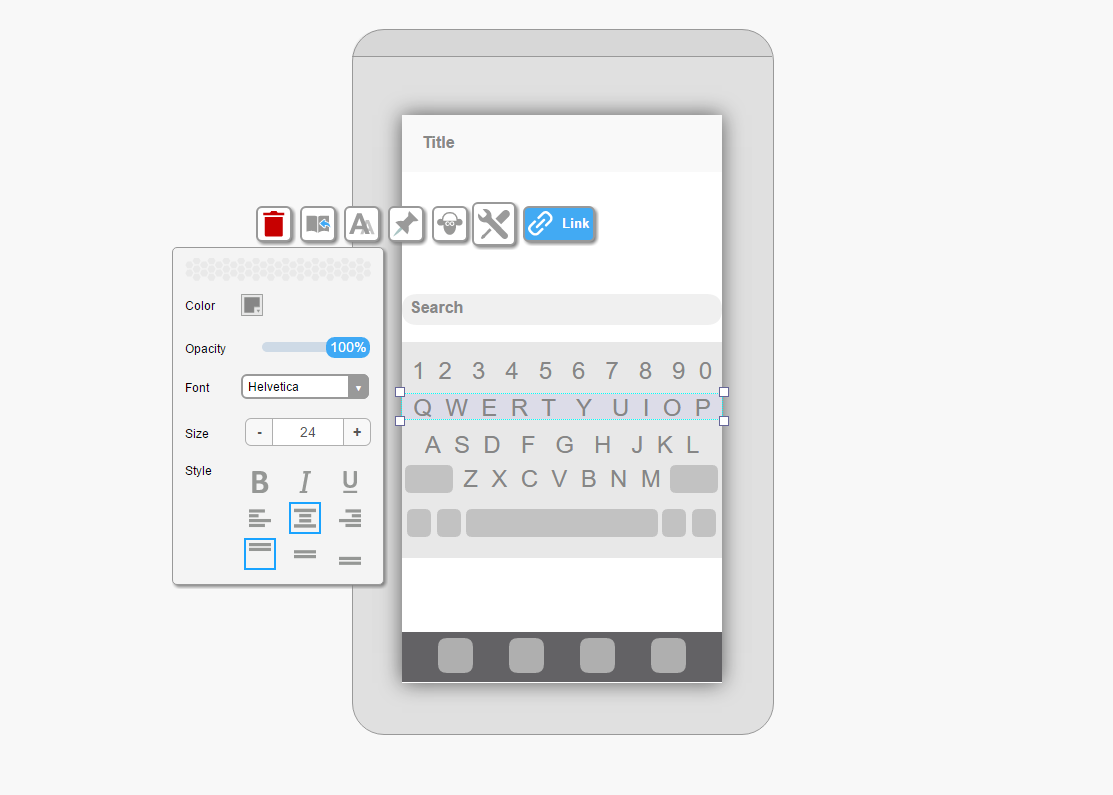
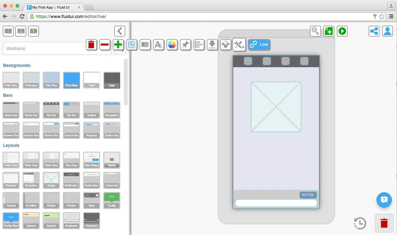
Click on any text to edit it. If you want to increase the size of the box that the text is contained in, drag from any of the box’s corners.
The text edit submenu is found in the widget menu and will appear as soon as you click on a piece of text. The menu lets you change the:
Tip: Remember to drag the text box as you make the text bigger so it is aligned as you want it to be. If you don’t make the box bigger some of text may be hidden.
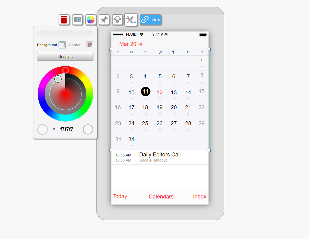
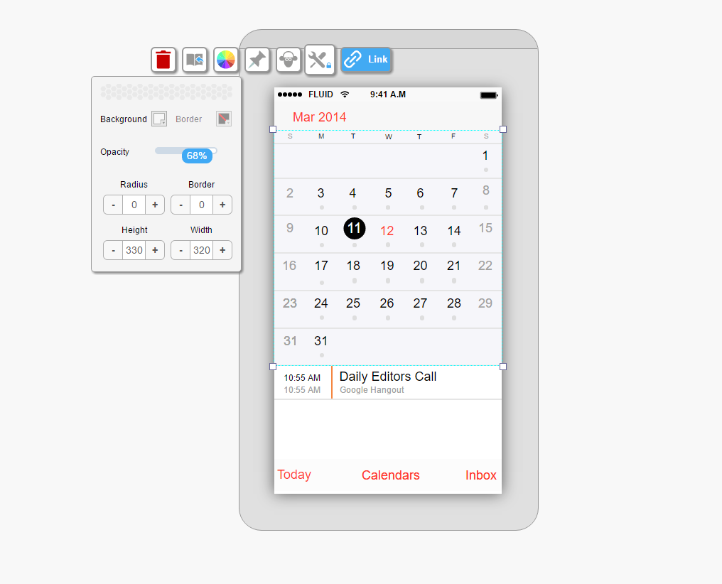
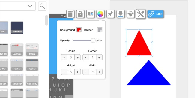
The background and border properties menu is used to set the non-text properties of a widget, including:
Tip: Different widgets have different customisation options. For example, you can change the colour of some widgets but not others and some of the larger card widgets cannot be resized.
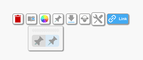
The pin/unpin button is in the widget menu.
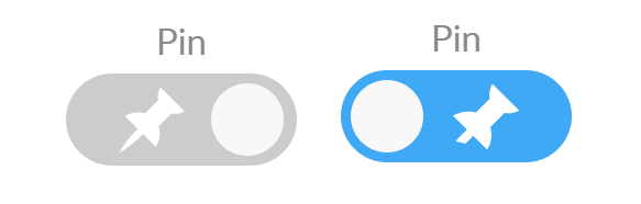
You may have created a scrolling page and you want to have a widget float over the page and stay in view while you scroll the page in preview mode. Use the pinned/unpinned option to control what moves with the page.
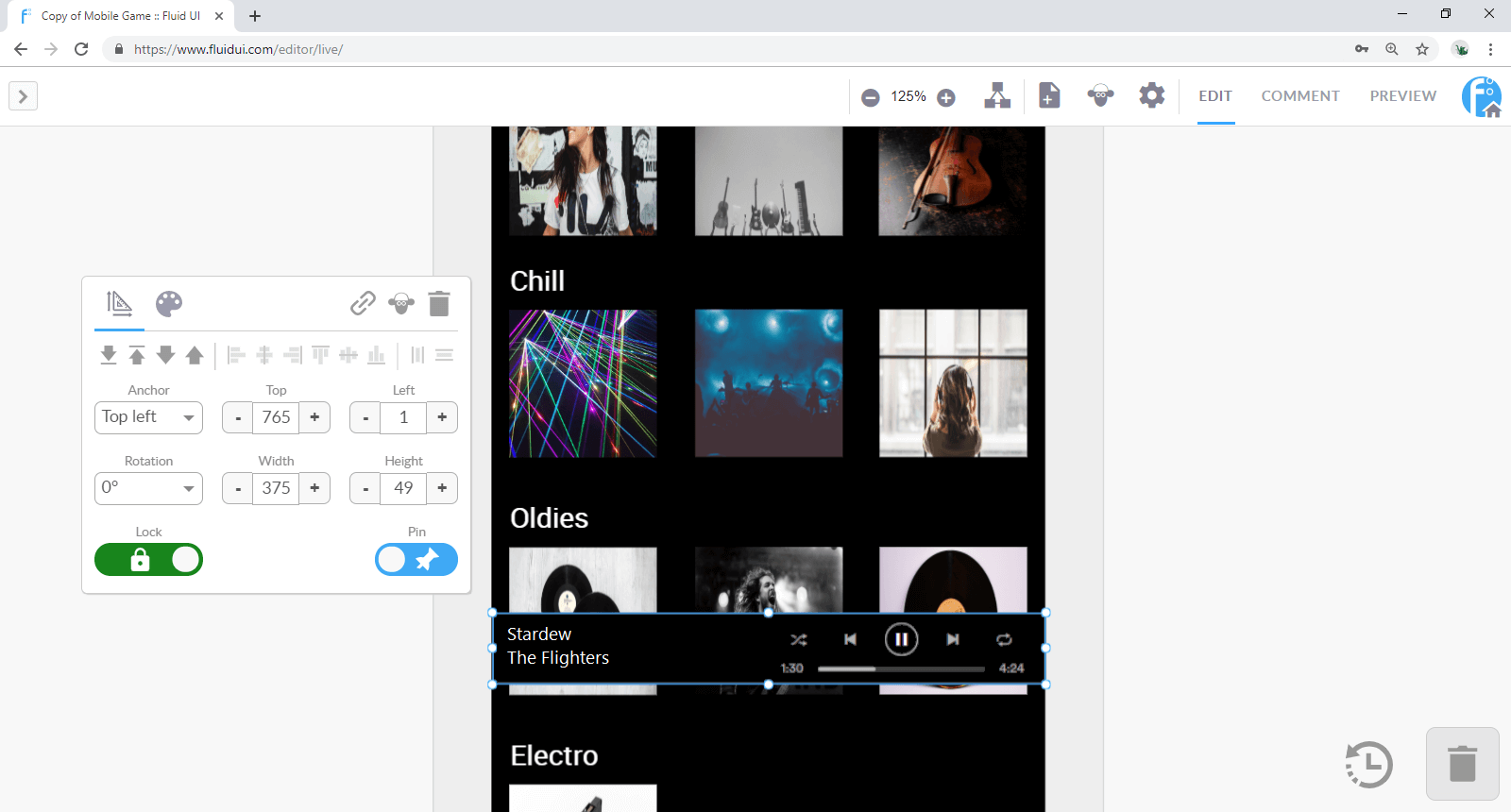
Any widget can be fixed on top of a long/scrolling page (‘pinned’) or allowed to move with the scrolled page (‘unpinned’).
There are 3 different zoom contexts - project, page and widget
Different options become available at each context. Learn how to navigate the canvas to make your workflow even more efficient.
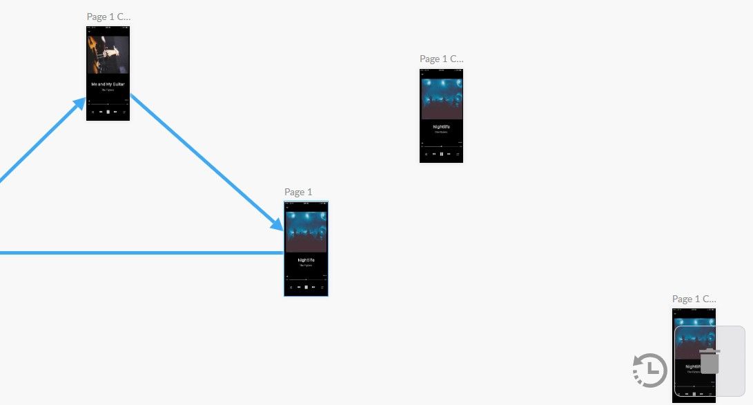
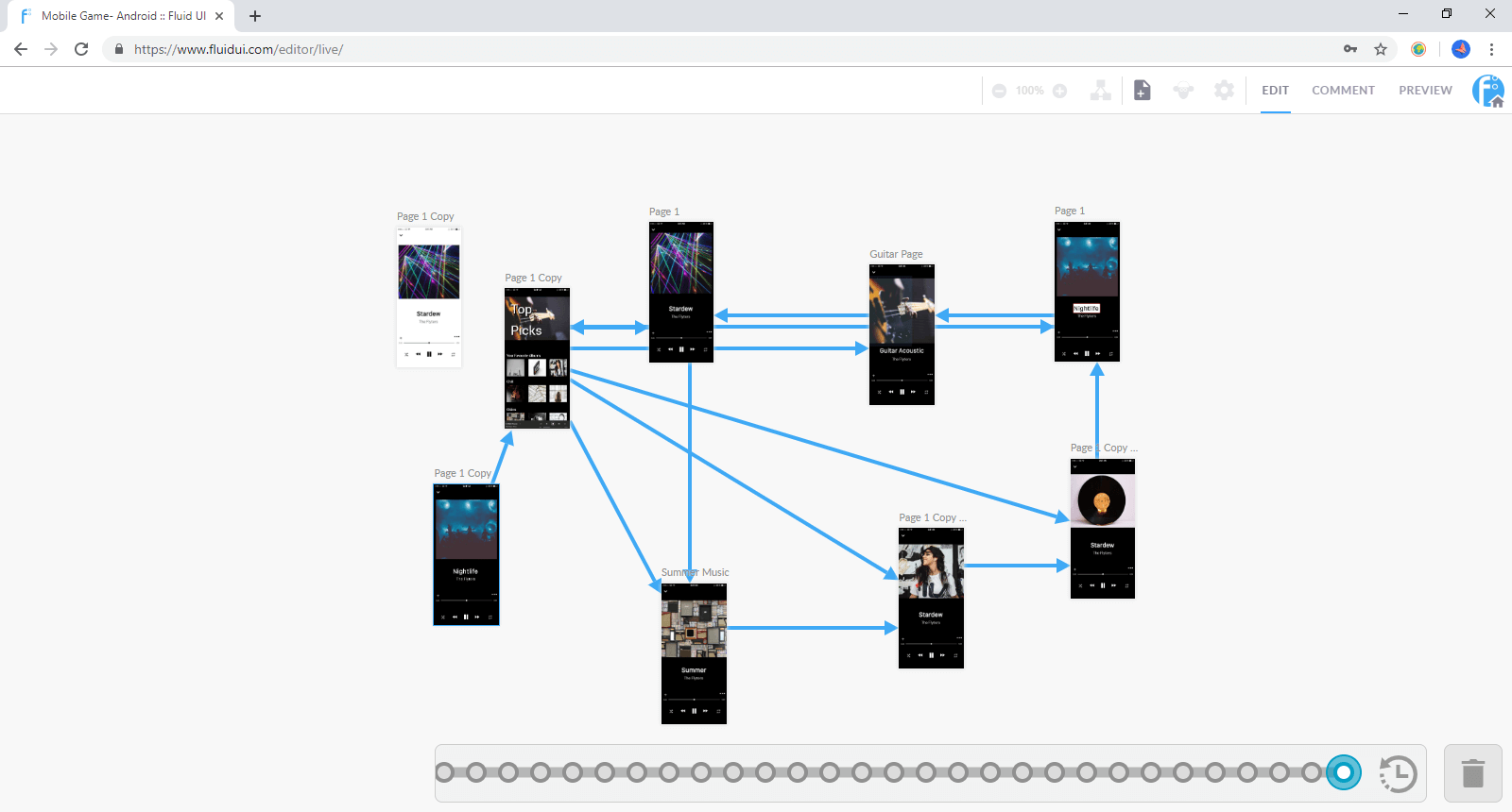
The project will be zoomed out to the maximum and all the pages and links in your project will be visible. You can use this mode to move pages around your project and get an overview of your entire project.
How to zoom to project context
Actions in project context
The page will be centred and the page menu will be visible. Here, you can manage the width and height of your pages, make page notes, set the start page, orientation and more.
How to zoom into a page
Navigating between pages
Tip: If you focus on a non active page that is already on screen, the canvas won’t move. This helps when editing multiple pages that are lined up closely.
Actions at page context
The widget menu will be visible and a widget or widgets will be selected. Use this level to change the look, feel, positioning and size of each widget.
Control-z (command-z on mac) will undo any action you take.
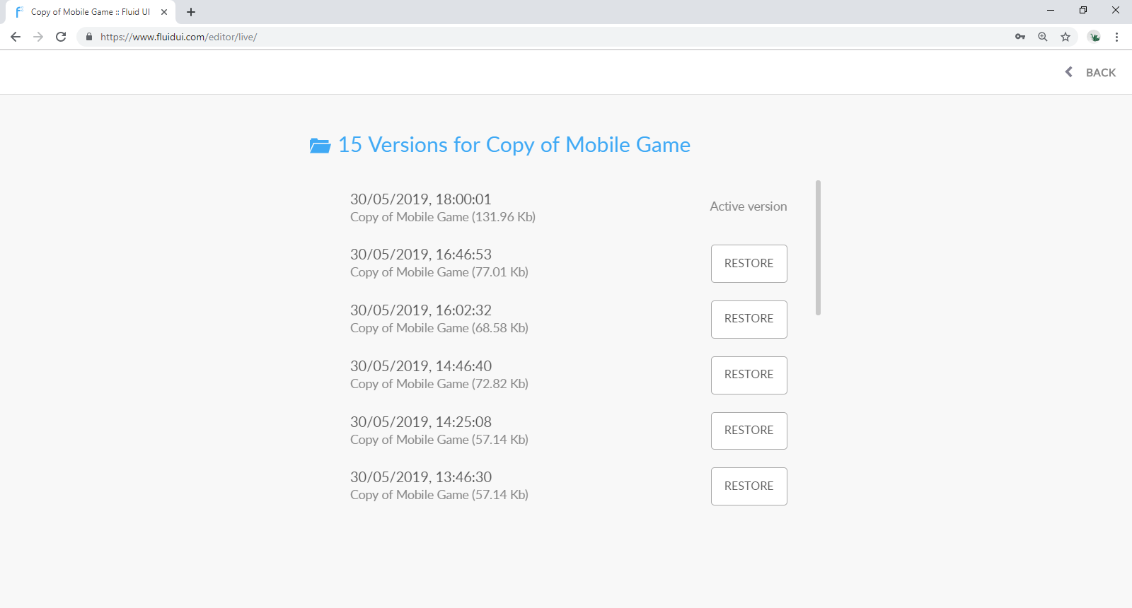
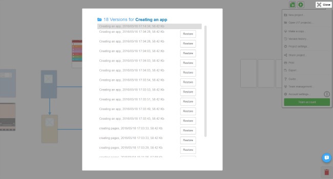
The timeline review in the bottom right corner (beside the bin) also has a full history of actions you’ve taken in the current session. You can use it to jump back to any previous state the project you’re working on.
Use version history to restore a different version of any project.
In general:
| P | Switch to project preview |
| C | Switch to comments mode |
| E | Switch to project editing |
| L | Open/close library |
| Escape | Close a menu or zoom out to project context |
| ⌘/CTR + + | Zoom out |
| ⌘/CTRL + - | Zoom in |
| ⌘/CTRL + 0 | Zoom to 100% |
| ⌘/CTRL + S | Save |
| ⌘/CTRL + Z | Undo |
| ⌘/CTRL + Y | Redo (Also ⌘/CTRL + Shift + Z) |
| ⌘/CTRL + A | Select all widgets on the active page |
| ⌘/CTRL + Mouse click | Add/remove to selection |
| Delete/Backspace | Delete selected widgets |
| Escape | Deselect selected widgets |
| ⌘/CTRL + C | Copy |
| ⌘/CTRL + X | Cut |
| ⌘/CTRL + V | Paste |
| ⌘/CTRL + D | Duplicate |
| ← ↑ → ↓ | Move widget |
| Shift + ← ↑ → ↓ | Move widget 10x |
| ⌘/CTRL + ← ↑ → ↓ | Increase size in the selected direction |
| ⌘/CTRL + Shift + ← ↑ → ↓ | Reduce size in the selected direction |
| ⌘/CTRL + Mouse resize | Maintain aspect ratio when resizing a widget |
| ⌘/CTRL + I | Make text italic |
| ⌘/CTRL + B | Make text bold |
| ⌘/CTRL + U | Underline text |
| ⌘/CTRL + Enter | Confirm text change |
| Escape | Cancel text change |
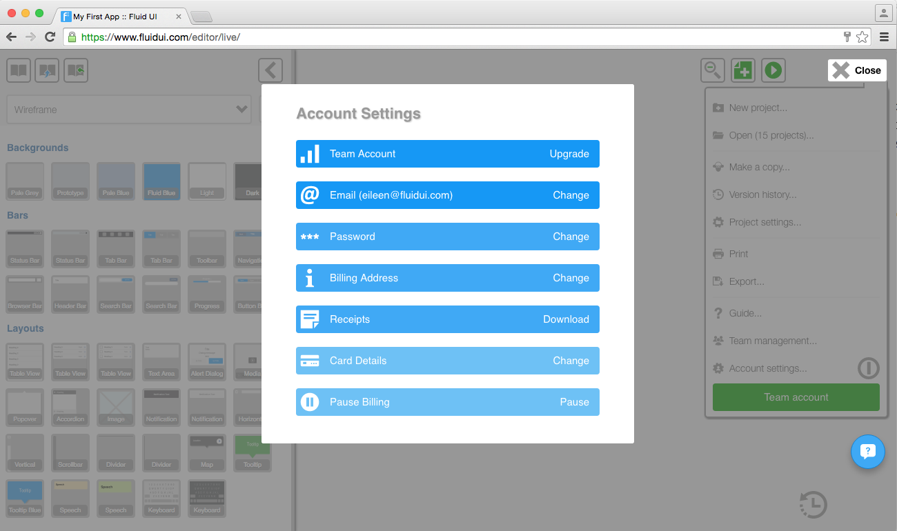
The accounts settings will allow you to manage all aspects of your Fluid UI account.
It is divided into four sections:
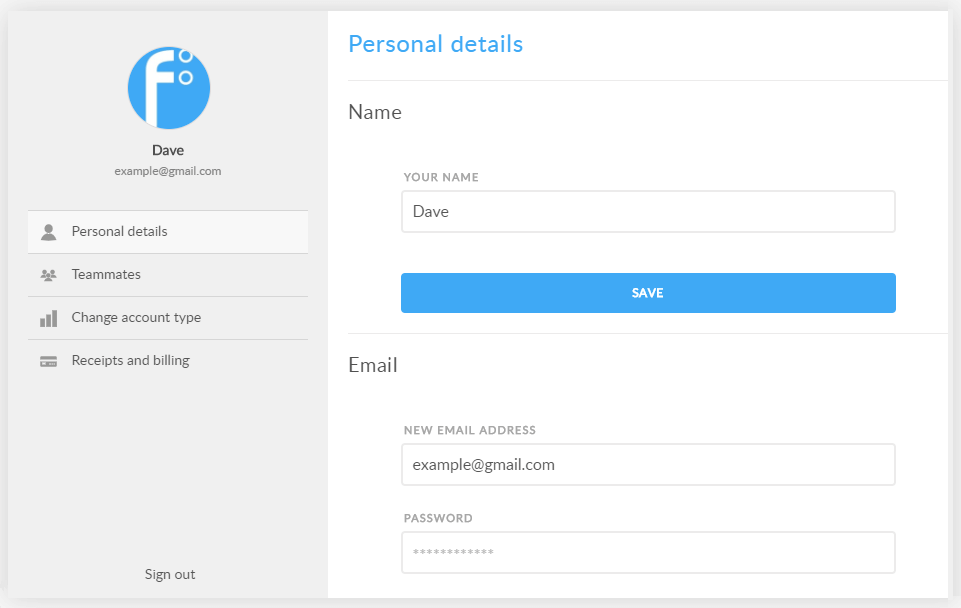
In this section you can do the following:
You can also upload an avatar or change an existing one.
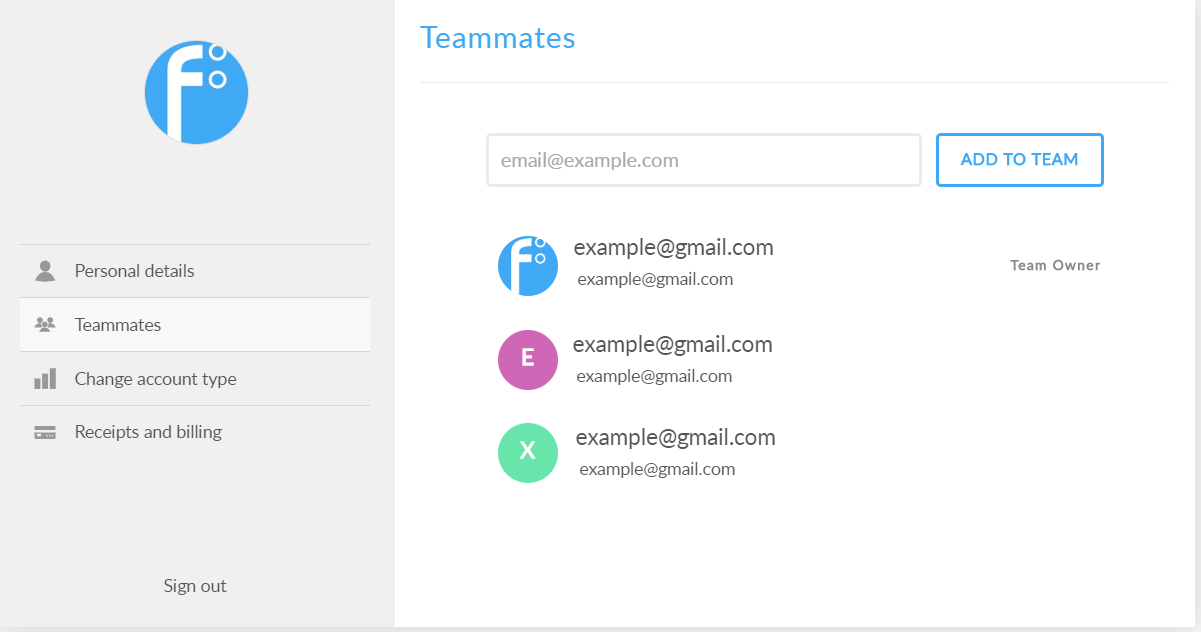
In this section you can add/ remove teammates and managed all aspects of your team. (Only available with team account)
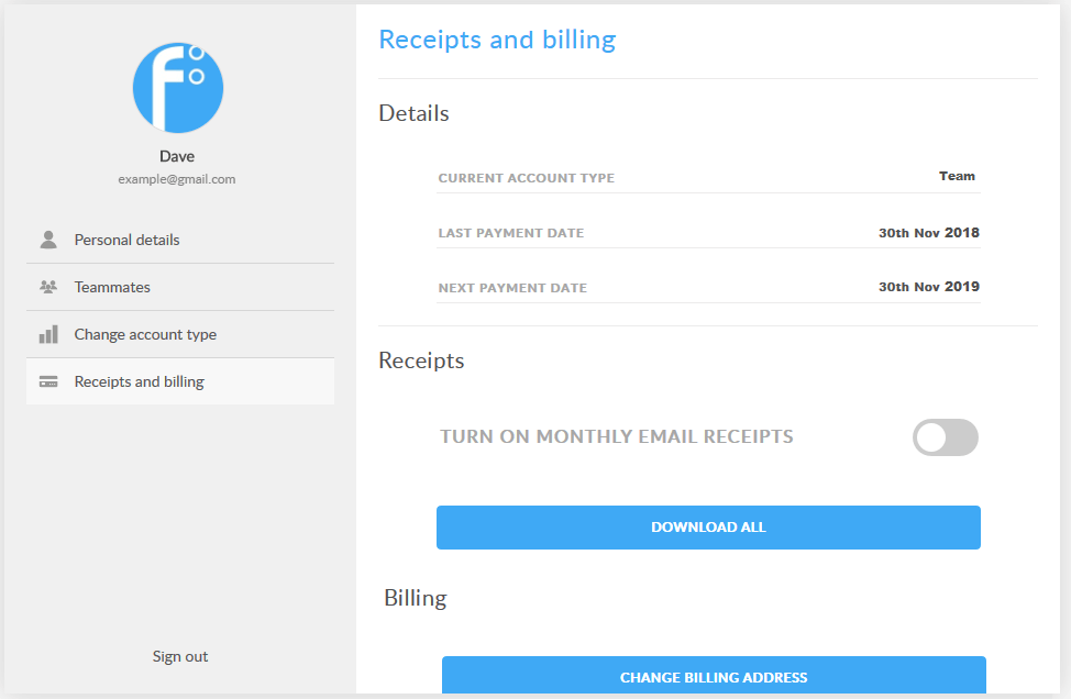
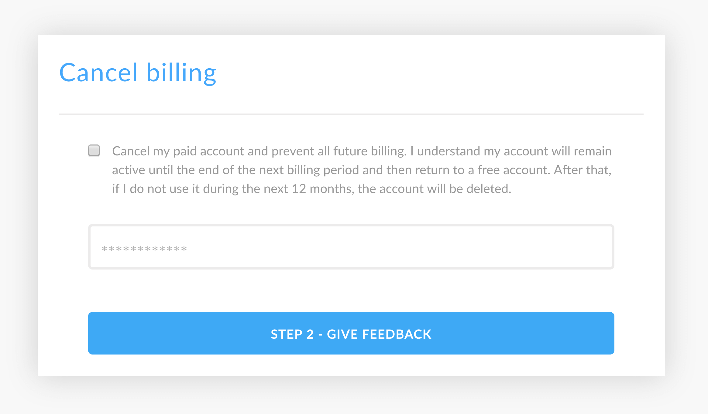
In this section you can manage your receipts and billing. Here you can:
Note: If you cancel billing all future billing will be cancelled but you will retain access to the premium features for the remainder of the current billing period.
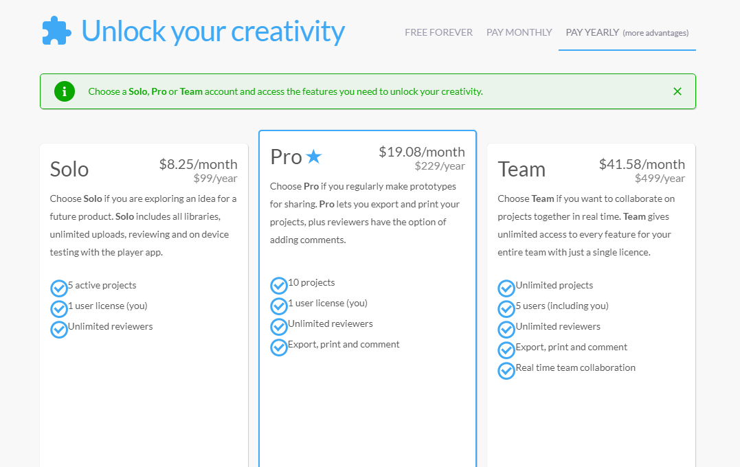
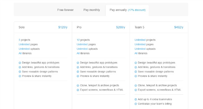
There are 4 account types. When you upgrade you can choose to pay per month or annually.
Choose Free Forever if you need to prototype a quick idea for a project and share it with others or if you are just learning how to design. With Free forever you have:
Choose Solo if you are exploring an idea for a future product. Solo includes all libraries, unlimited uploads, reviewing and on device testing with the player app. With Solo you have:
Choose Pro if you regularly make prototypes for sharing. Pro lets you export and print your projects, plus reviewers have the option of adding comments. With Pro you have:
Choose Team if you want to collaborate on projects together in real time. Team gives unlimited access to every feature for your entire team with just a single licence.
If you decide to upgrade to a different plan, for example from Solo to Pro please let us know via email or our in app chat so we can help arrange a refund for you.
You can download your receipts from the receipts section of the ‘Account Settings’ menu. If you need to have regular receipts sent to yourself or your accounts team, you can also set this up from there.
Payment details on your statement
The charge on your credit card statement will be from ‘Fluid Software Ltd’.
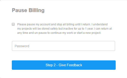
You’ll find cancel billing in the account settings inside the main menu. Billing will stop as soon as you pause your account.
Click on the comment tab in the top bar. Here you can add your own comments and view comments made by collaborators.
To add a comment:
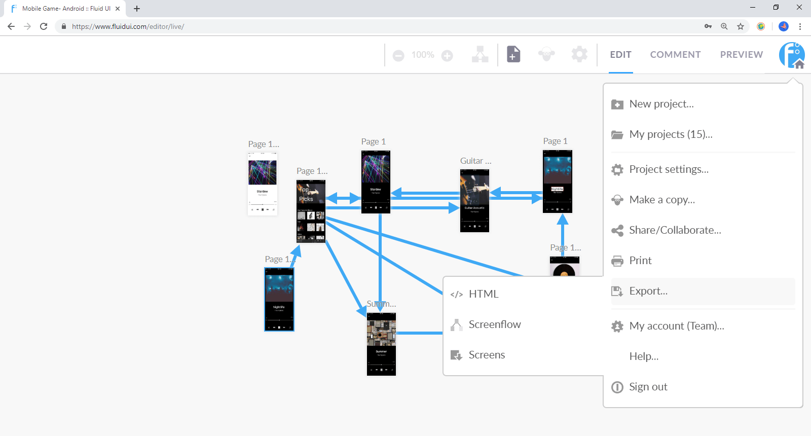
Find the export options in the home menu. Options you can use include:
##
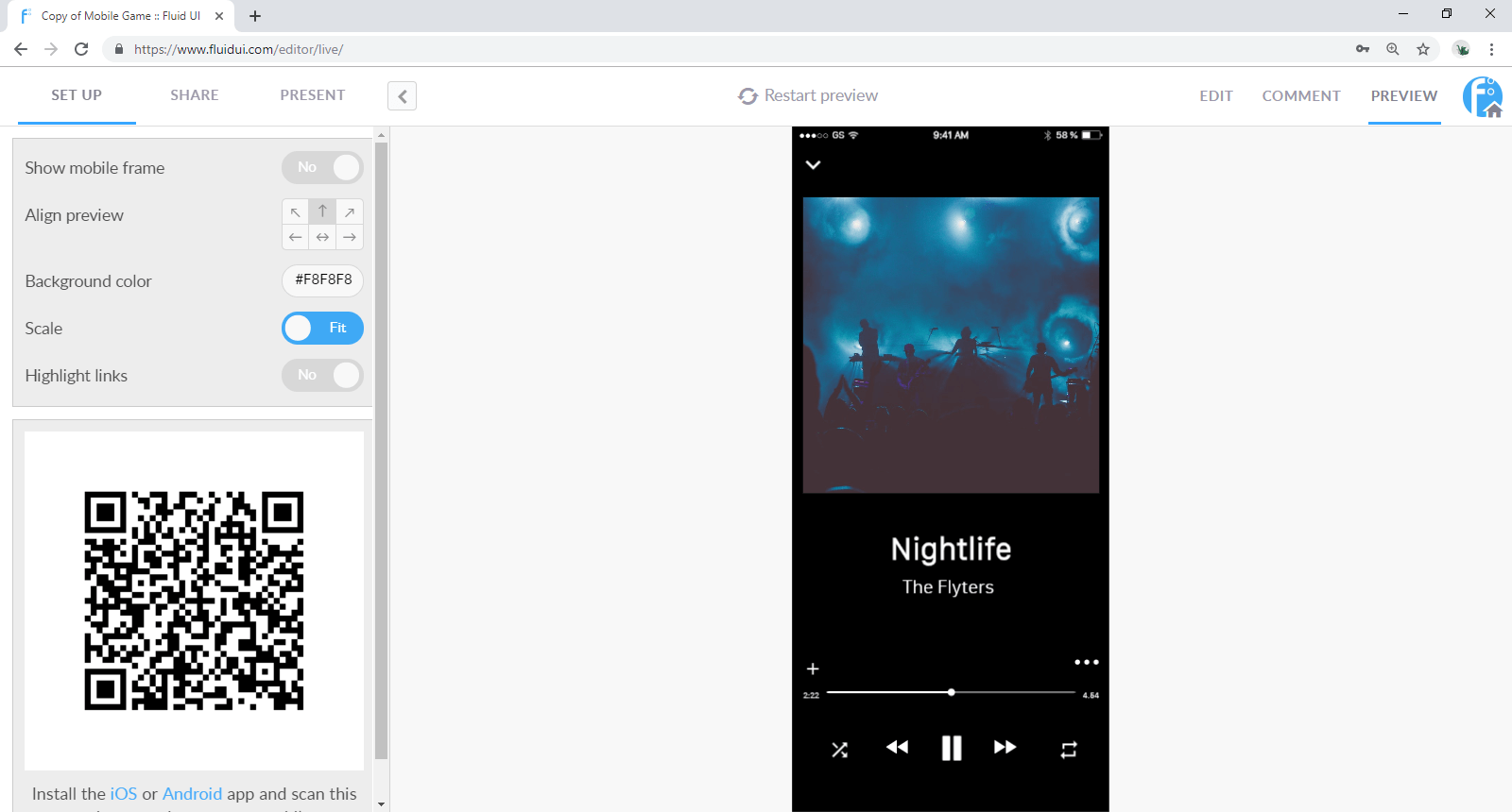
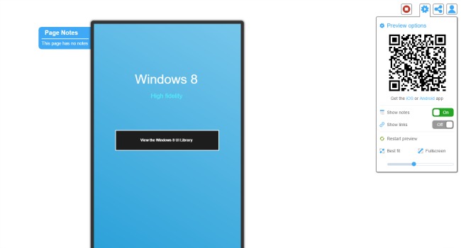
You can access the preview set up menu when you click on the Preview tab. The preview set up menu contains options that give you a greater level of control over how your preview plays:
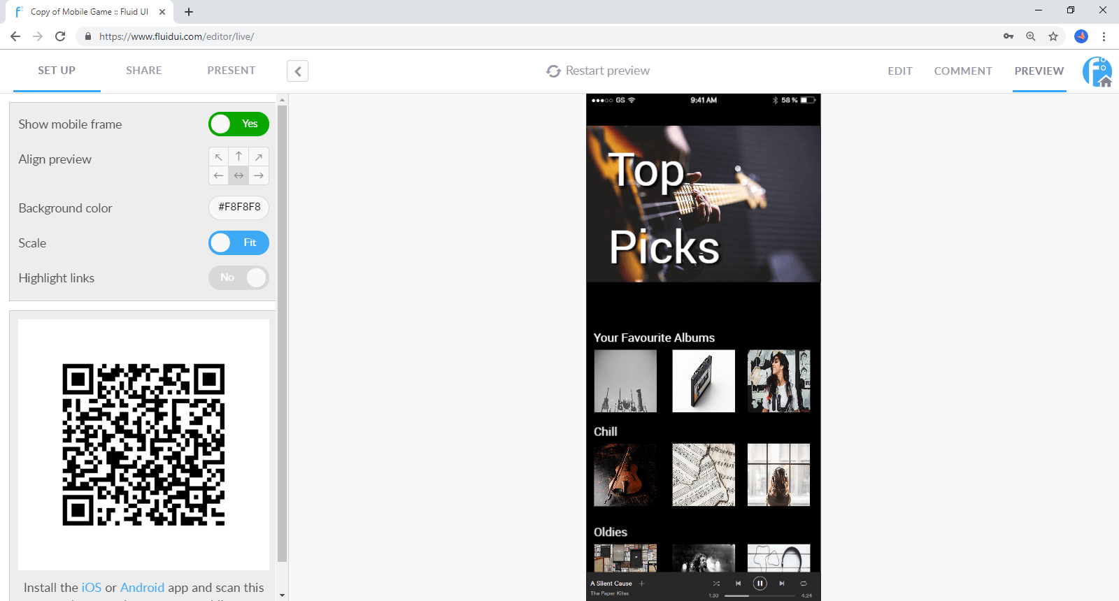
You can decide to highlight the links on each screen if you want to give users a hint as to where they should click. Or just turn it off if you want to test the usability of your design.
You can choose to Show mobile frame or not. You can also align the design to one side or the other and change the background colour.
It is simple to restart the preview at any stage by clicking on Restart Preview.
Test your design via any mobile device by scanning the QR code or signing into your Fluid account in the app.
When you are finished previewing, click the Edit tab to return to Editing Mode and get back to your design.
Tip: Use your keyboard’s arrow keys to navigate through the pages of a prototype in preview.
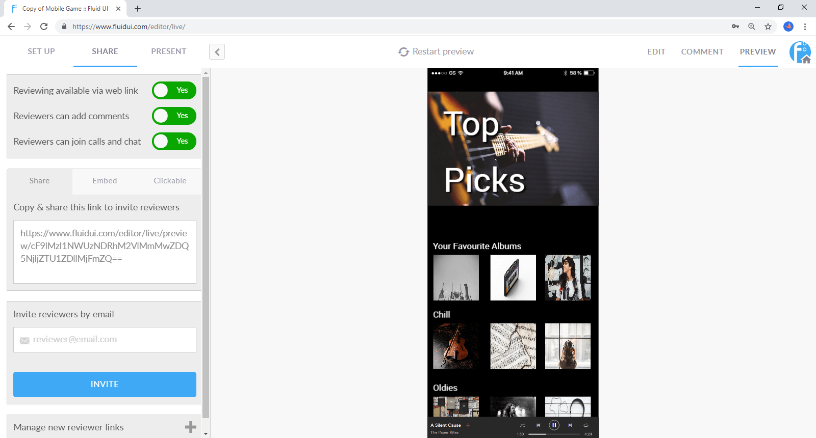
To invite people to review and comment on your project go to the share tab in Preview mode.
Here you can:

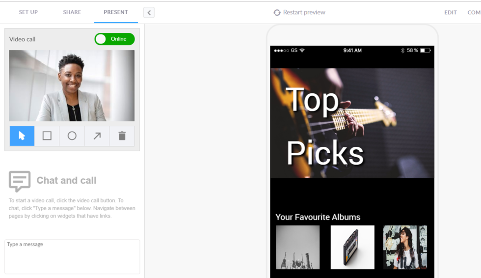
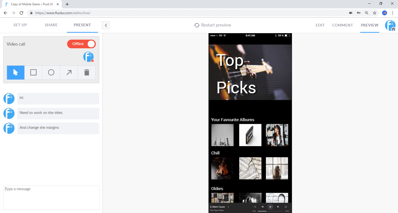
Use the Present tab to chat with reviewers. You can start a video call by clicking the video call button.
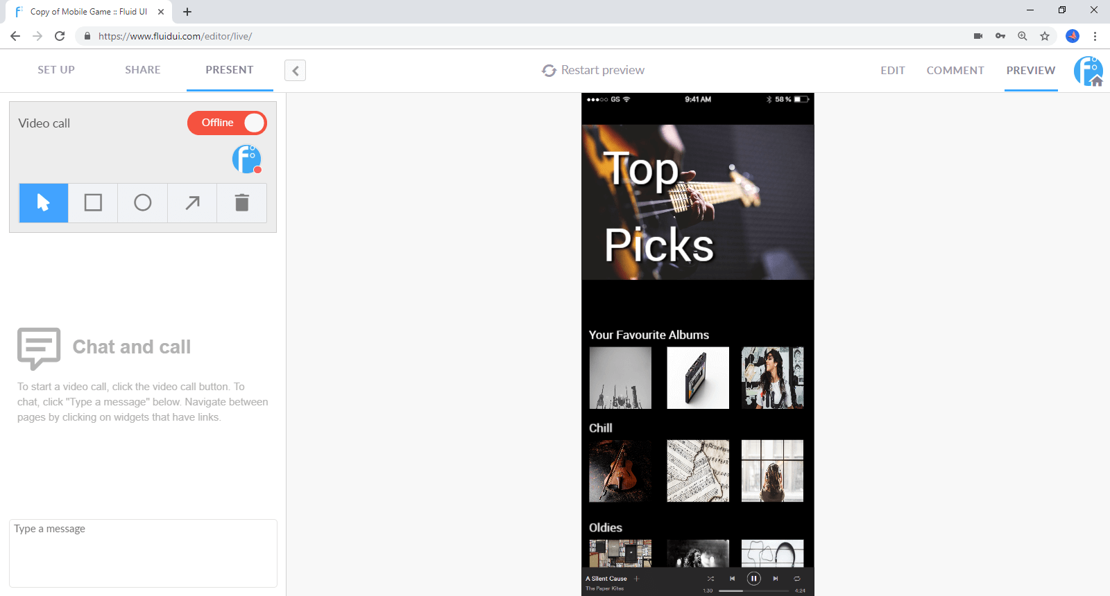
You will be able to annotate the screens using the quick bar. To move on to the next screen, click the screen.
To make text comments type in the comment section where all users will be able to take part in the discussion.
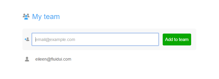
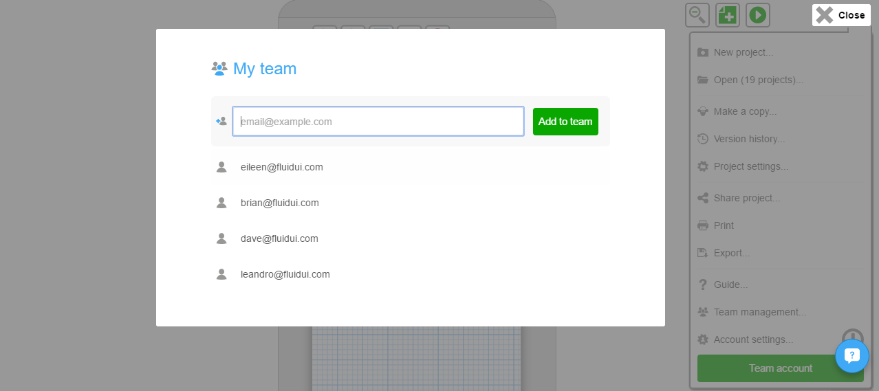
With Fluid UI you can collaborate in real time with your teammates. There are a few simple steps to set this up.
First, you need to assemble your team:
Type in the email of the colleague that you wish to add to your team and click ‘Add to Team’.
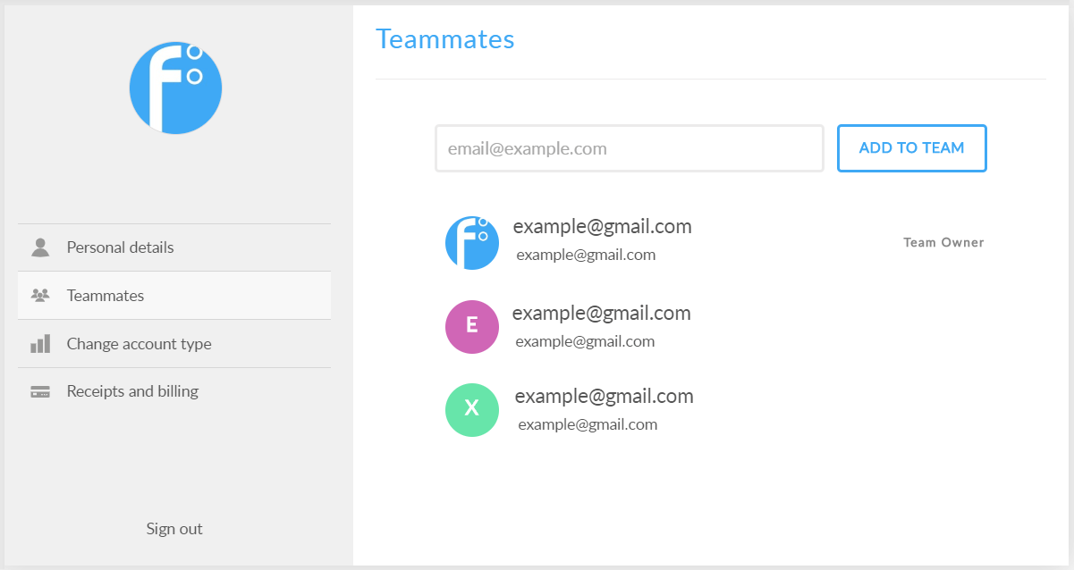
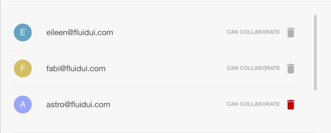
You can also remove teammates by clicking the Remove which becomes visible when you hover over their name.
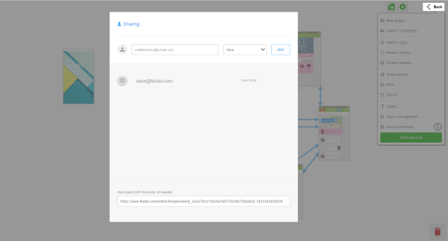
Once you have assembled your team, you need to invite individual members of the team to collaborate on your project. All team members do not automatically get access to your projects; they need to be invited. You can do this via the Share Menu, by clicking the toggle.
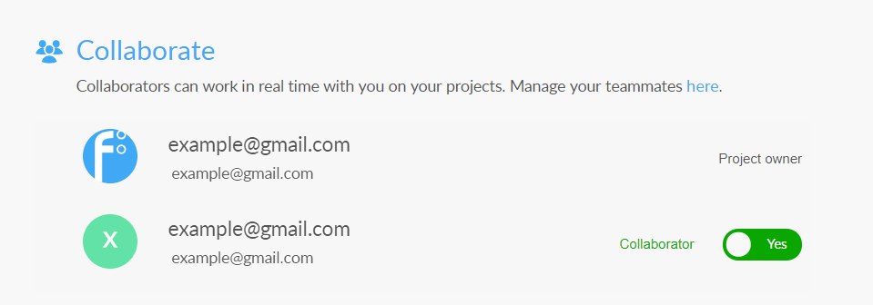
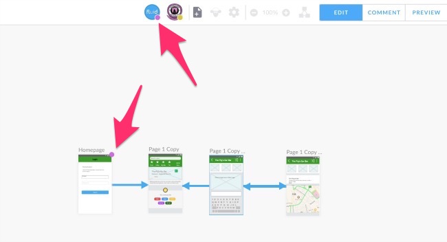
They will then be able to collaborate with you and anyone else you have invited in real time. You will be able to see your teammates as they are making changes, and your teammates will be able to see any changes that you are making. All in real time.
If you want to remove them later, you can also do this via the same menu. Just toggle them off again.
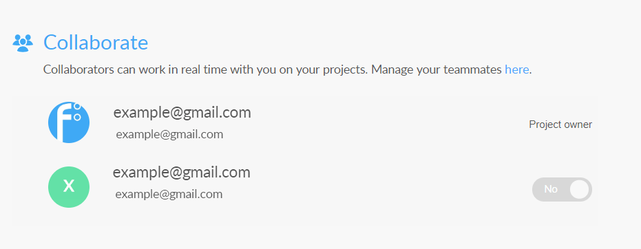
When you are in edit mode, you can see all of the avatars of your team along the Top bar. The colour of dot under each avatar will help you to identify who is working on a page at any given moment. The same dot will appear on the page.
With the Team Plan you can have a maximum of 5 on the team. You do not have to have the same 5 at all times.
Note : If you have a bigger team, contact us and we can put a customised plan together for you.
Previewing designs on your mobile or tablet is great for testing with users and showcasing your design to clients and stakeholders.
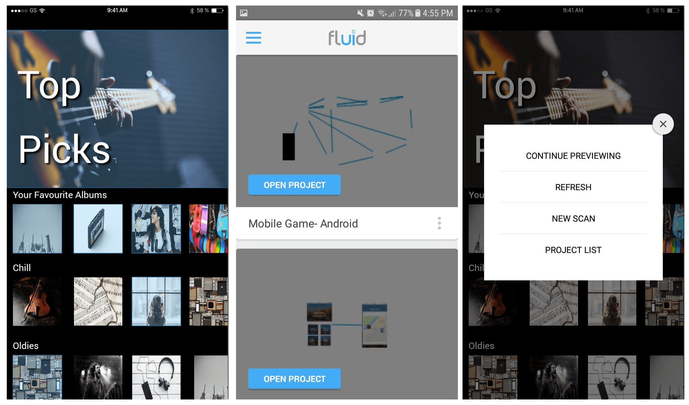
Tip: To see the menu in the mobile preview open recent apps screen or exit and re-enter the app. From here you can refresh the preview, scan a new QR code, and view your project list.
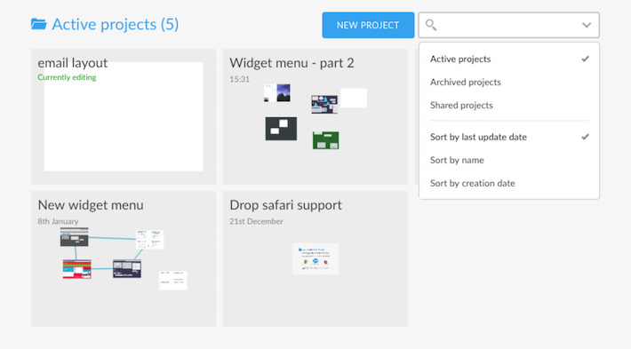
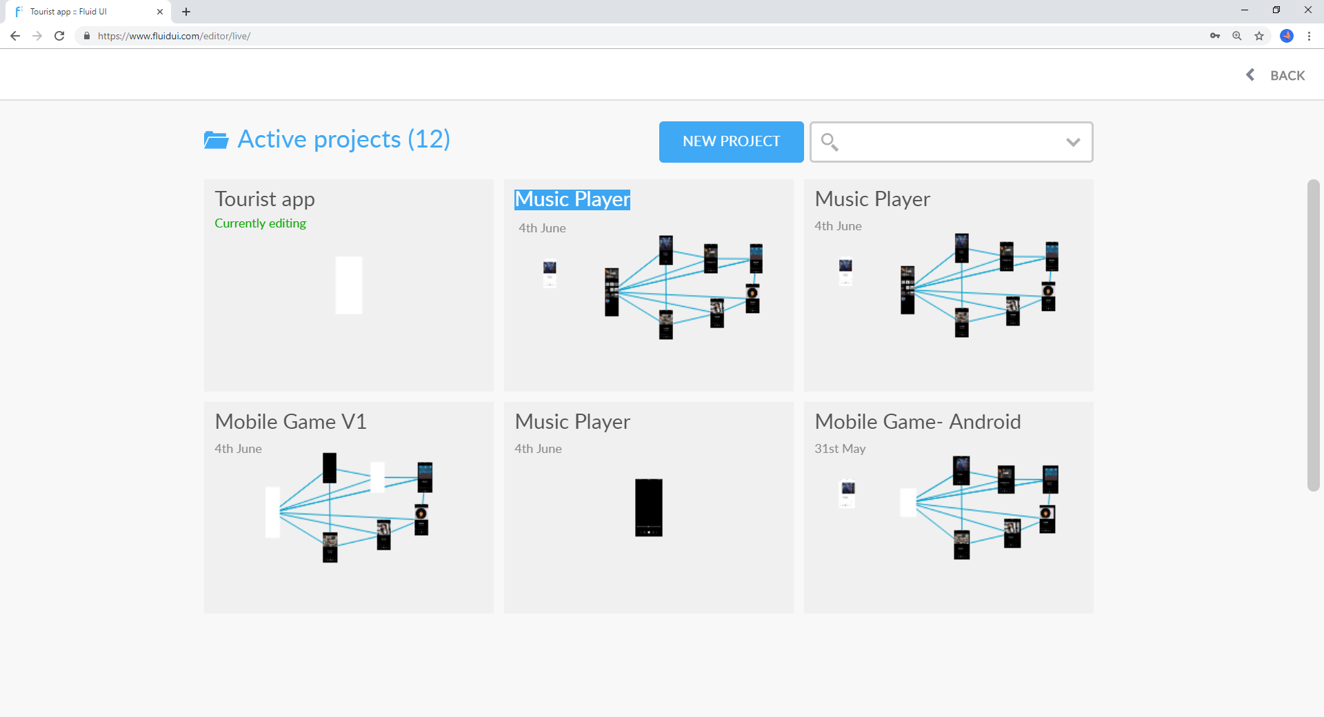
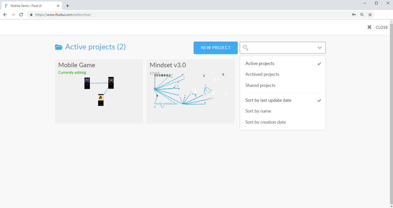
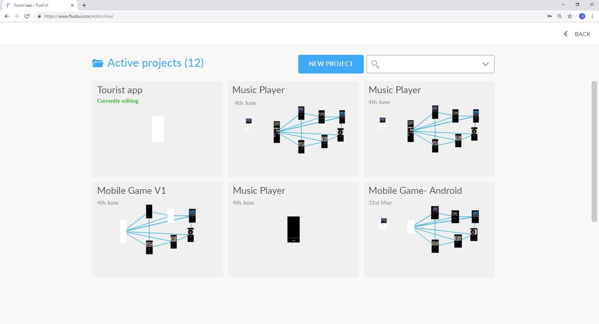
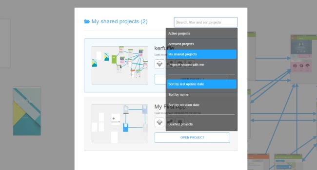
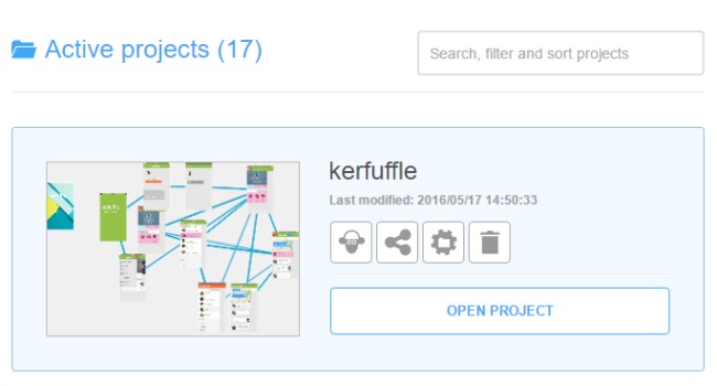
View all of your projects via clear thumbnails.
See when your projects were last revised.
Each thumbnail will contain an overview of your project screenflow.
Search through your active, archived and shared projects.
Sort your projects by name, last update and creation date.
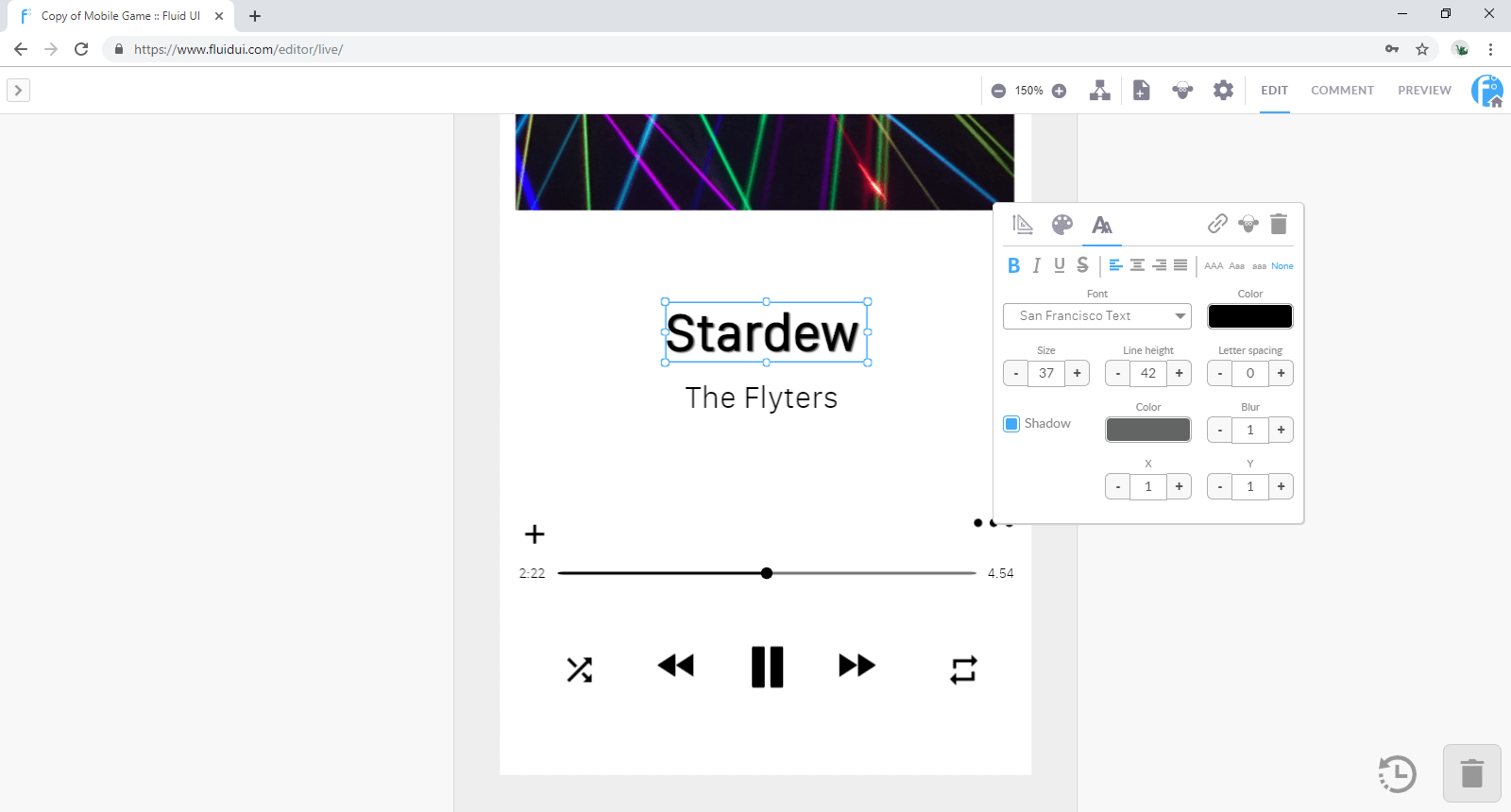
The text editing menu allows you to control all aspects of the text style.
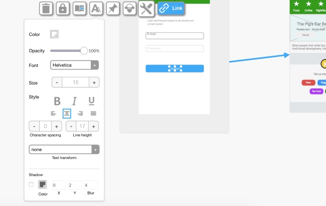
The standard features can be found in this menu:
There are also advanced text editing features which allow you to enhance your design.
To add shadow to your text you need to click the box beside Shadow and then chose the colour that you would like to use.
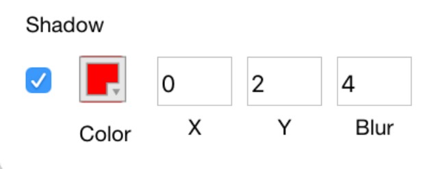
You can also move the shadow along the x/y axis simply by adjusting those specific settings.
You can then also add more or less blur by placing a value for blur.
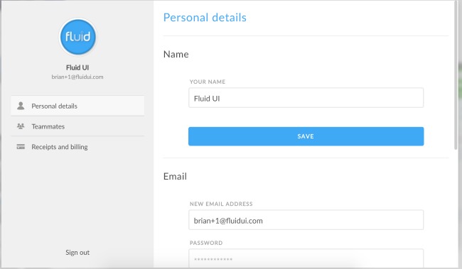
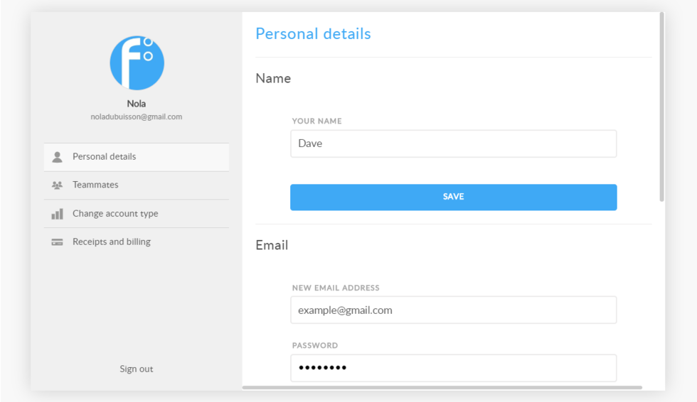
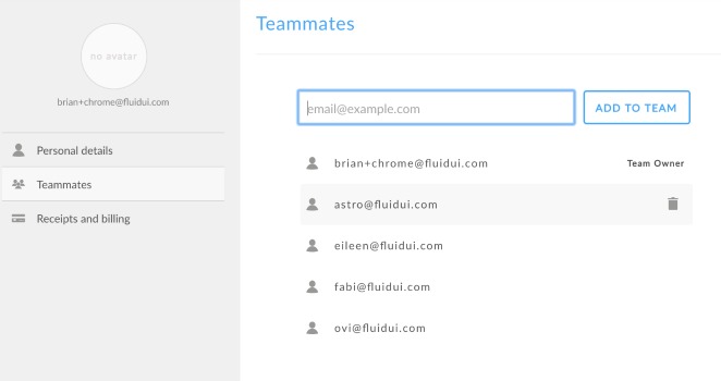
The accounts settings will allow you to manage all aspects of your Fluid UI account.
It is divided into three sections:
Personal details
In this section you can do the following:
You can also upload an avatar or change an existing one.
Teammates

In this section you can add/ remove teammates and managed all aspects of your team account.
Receipts and billing
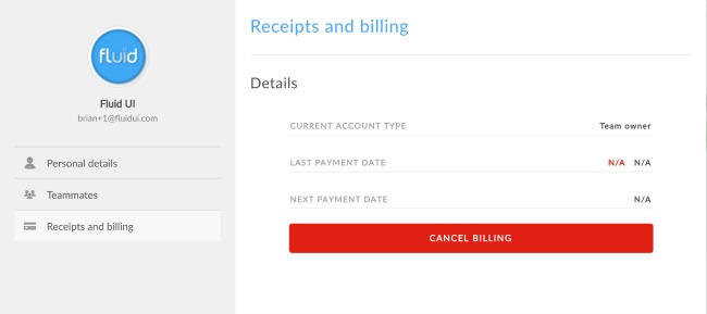
In this section you can manage your receipts and billing.
Note
If you cancel billing all future billing will be cancelled but you will retain access to the premium features for the remainder of the current billing period.
With Fluid UI you can now collaborate in real time with your team mates. There are a few simple steps to set this up.
First, you need to assemble your team:
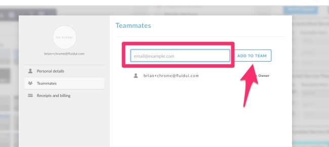
Just type in the email of the colleague that you wish to add to your team and click ‘Add to Team’.
You can also remove teammates by simply clicking the thrash icon which becomes visible when you hover over their name.
Once you have assembled your team, you can share your project with them. They will then be able to collaborate with you and anyone else you have invited in real time. You will be able to see your teammates as they are making changes, and your teammates will be able to see any changes that you are making. All in real time.
Once you have assembled your team. You need to invite individual members of the team to collaborate on your project. All team members do not automatically get access to your projects; they need to be invited. You can do this via the Share Menu:
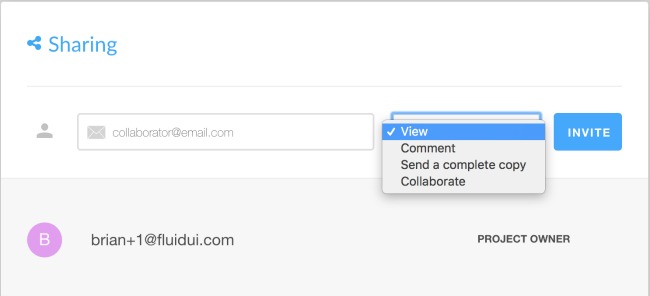
Simply type in the name of your teammate and chose Collaborate from the dropdown.
If you want to remove them later, you can also do this via the same menu. Click on the thrash icon beside their name to remove them from having access to the project.
When you are in edit mode, you can see all of the avatars of your team along the Top bar. The colour of dot under each avatar will help you to identify who is working on a page at any given moment. The same dot will appear on the page.
With the Team_5 Plan you can have a maximum of 5 on the team. You do not have to have the same 5 at all times.
With the Team_10 you can have a maximum of 10 on the team.
Note
If you have a bigger team, just contact us and we can put a customised plan together for you.
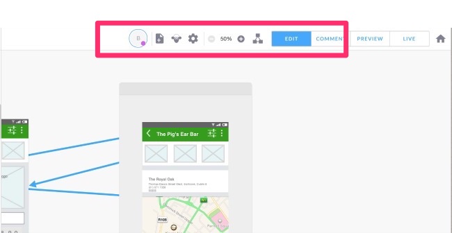
The top bar which is found at the top of the editor contains a number of features.
The page settings allows you to control all features related to the page you are working on.
Sharing your preview with colleagues, stakeholders, users and investors is now easier than ever with Fluid UI.
We will show you how to achieve this in a few easy steps.
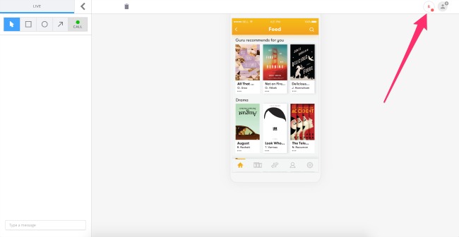
To share a live preview you simply open your project and in the top right corner you will see a tab marked ‘Live’. Just click on this tab to open Live presentation.
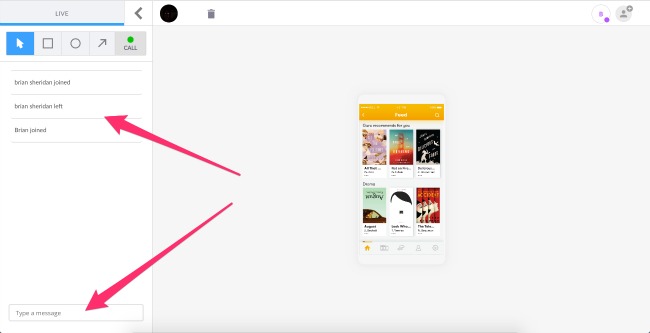
When you click on Live you will be taken into the Live Preview. You will be able to annotate the screens using the quick bar in the top left corner. To move on to the next screen you simply click the screen.
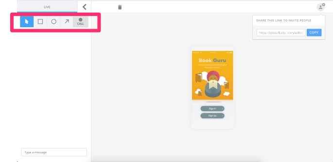
Once in Live Preview you will be able to click through the prototype. Simply click on the screen to move through the flow.
You can also invite others to the Live Preview by clicking on the Live Preview URL:
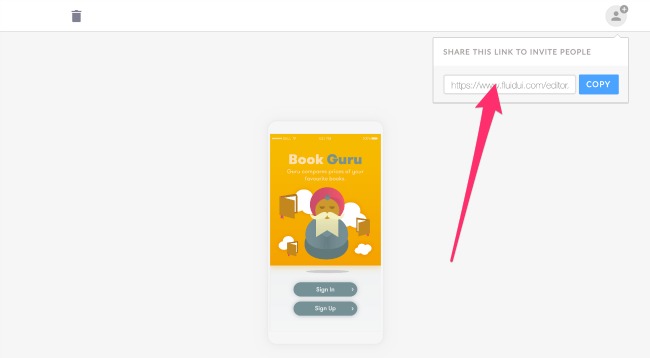
When your audience clicks on the URL they will be asked to join the presentation after entering a user name and email. Your audience do not need to have Fluid accounts to view and take part in the presentation but this allows you to identify them when they are making contributions:
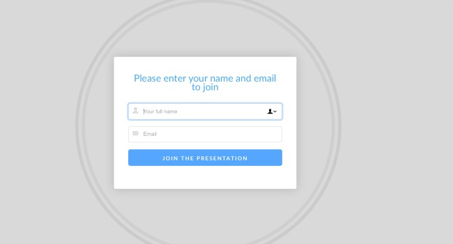
When the user enters their details they will be visible in the top of the preview and will be able to view all of the interactions and to chat with you and others.
To make text comments simply type in the comment section where all users will be able to take part in the discussion.
Article tbc.
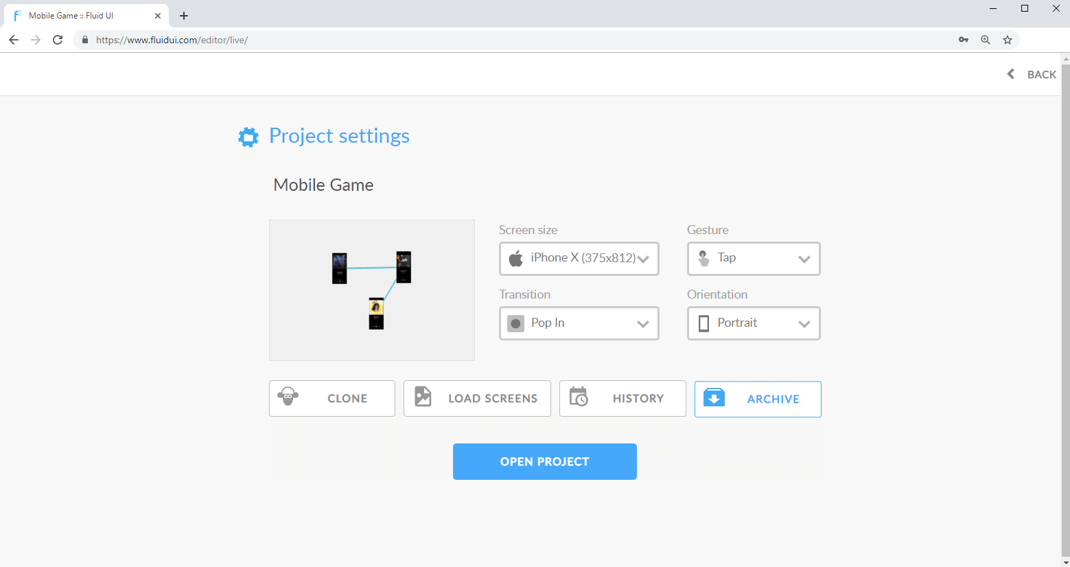
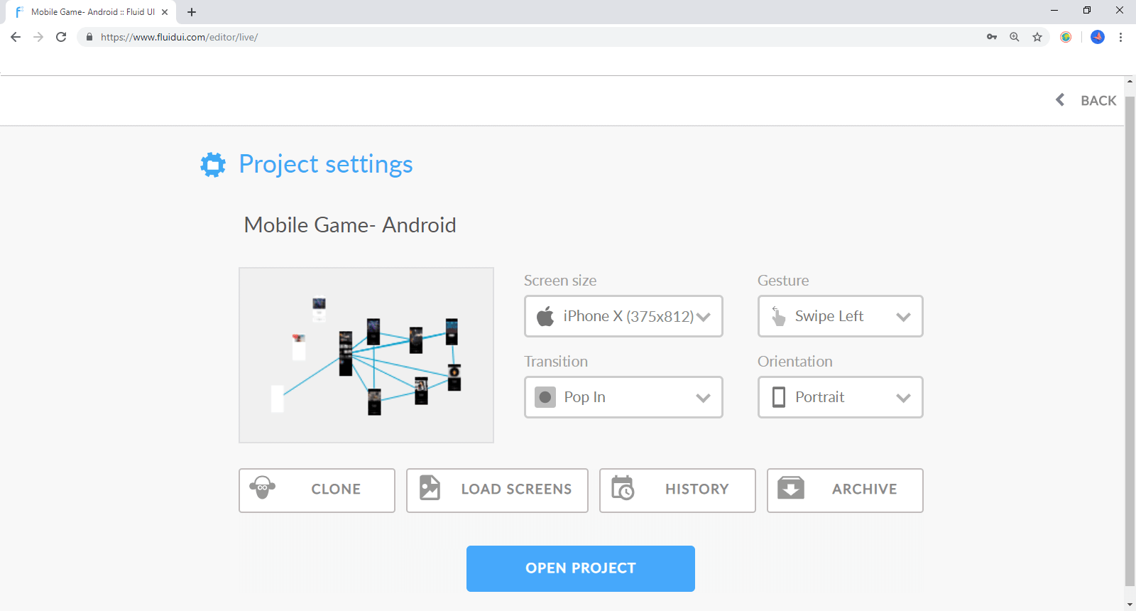
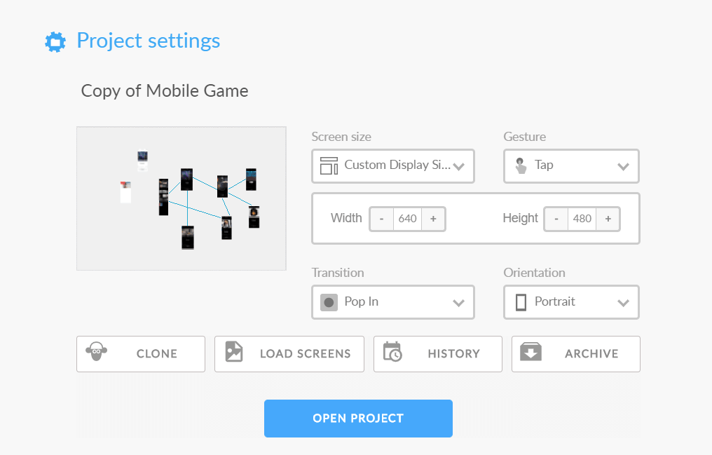
The project settings allows you to control all areas of your project from setting the resolution of each screen to cloning projects to managing your projects.
You will locate the Project settings in the Home menu. Simply click on the Home menu and select Project settings.
Once you select project settings you will be taken to the Project settings dialogue screen. From this dialogue you will be able to control all settings as they relate to your project.
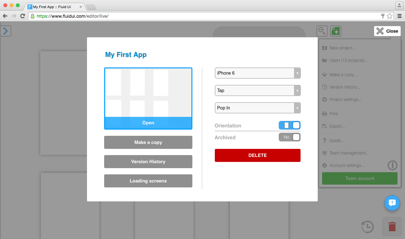
You will be able to perform simple edits, such as changing the name of the project:
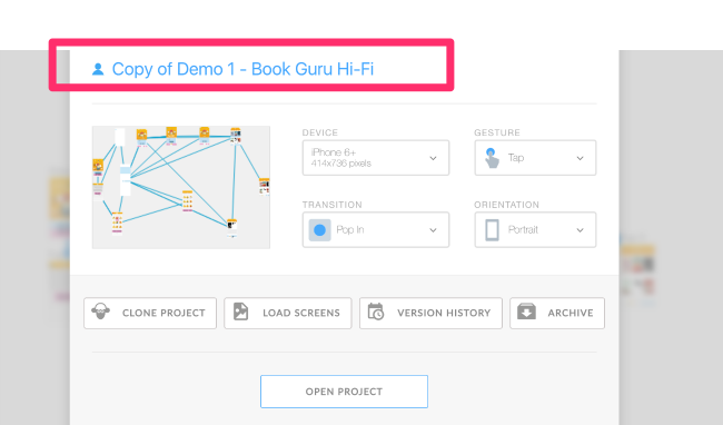
You will be able to set and alter all of the settings related to your project:
Want to write apps that integrate the Fluid UI editor or previews? The Fluid UI API documentation will launch Q3 2016.
1) login [POST]
2) listProjectsExtended [POST]
3) export [GET]
4) previewMail [POST]
Fluid UI does not do app development, but unsurprisingly, we know a lot of people who do. If you have a meaningful budget for app development, feel free to contact us in the chat widget here or in the editor and we can look to partner you with a suitable company that we recommend.
You’ll find cancel billing in the account settings inside the main menu. Billing will stop as soon as you pause your account.
If you chose to downgrade your account to free then you will not lose any of your work but you will be restricted to the features that are available in the Fluid UI free plan.
You can upgrade again at any time to use the premium features once more.
If you don’t plan on using Fluid UI in a given month, you can choose ‘Cancel Billing’ from the account settings menu.
We store your projects free of charge for up to a year. (We will send a warning email to sign back in after a year of inactivity before we delete any of your data).
You can download your receipts from the receipts section of the ‘Account Settings’ menu (accessible from the top right ‘Fluid’ menu button). If you need to have regular receipts sent to yourself or your accounts team, you can also set this up from there.
The charge on your credit card statement will be from ‘Fluid Software Ltd’.
If you decide to upgrade to a different plan, for example from Solo to Pro please let us know via email or our in app chat so we can help arrange a refund for you.
With Fluid Teams it’s easier than ever to share projects and get feedback from your team members.
In Fluid UI you are able to edit projects with your colleagues in real time.
You start by creating your team.
Simply add your colleagues email and then add them to the team.
You can add up to 5 team collaborators (this can be extended for larger teams).
Fluid Teams is great for companies that want team licences and have more then one person working on a design project.
One person can buy the team licence and then invite their colleagues to work on projects together.
We are currently working on finalising the live collaboration feature so your team can work simultaneously on a project. You will need to send the project to each team member. They can then edit it and send back to you.
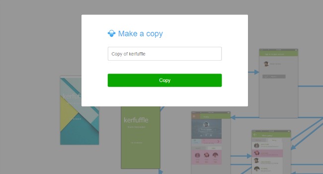
If you need to test out another direction with your app but don’t want to have to redo all of your work just clone the whole project and keep the old version while you work on the new.
This is great for when you want to send a version to a client or colleague but need to keep working on it in the mean time.
Next: Find out how all about validating your concept with users.
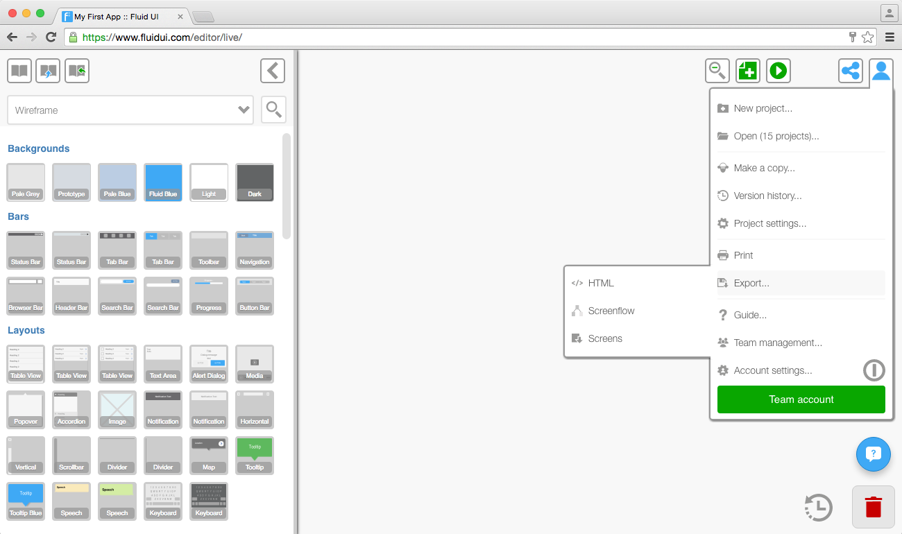
Find the export options in the home menu. Options you can use include:
A HTML interactive mockup can be downloaded and viewed offline. (This HTML is not suitable for use in app development).
A screenflow SVG image will show you an overview of your entire project including all the links between pages.
All of your project screens can be downloaded as PNG images.
Print lets you print all of your screens.
The most obvious change you will notice when you sign in is the new mode menu which gives you three options: Edit, Comment and Preview.
The comments mode is the single most important and exciting part of this release. All of those conversations with users, stakeholders, developers can now be done in real time in the Fluid editor.
You will be able to comment and reply to comments directly in the editor. You can also do this in real time so there are no costly time delays when important decisions need to be made.
Previewing designs on your mobile or tablet is great for testing with users and showcasing your design to clients and stakeholders.
Download the iOS and Android player apps
Open up the app from the Fluid UI icon on your phone’s homescreen.
Tip: Click on the small QR code button to expand the actual QR code for scanning.
When you are ready to preview your app in the browser, click on the Preview tab in the editor and the preview will start.
You can access the preview settings menu when you click on the Preview tab. The preview settings menu contains options that give you a greater level of control over how your preview plays:
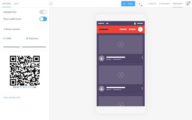
You can decide to highlight the links on each screen if you want to give users a hint as to where they should click. Or just turn it off if you want to test the usability of your design.
You can choose to Show mobile frame or not.
It is simple to restart the preview at any stage by simply clicking on Restart Preview.
Zoom in and out with ease via the zoom ruler.
Test your design via any mobile device by scanning the QR code.
Make sure you have selected your app’s starting page from the page settings so that your app runs as you would expect it to.
Download the iOS and Android player apps.
Use the player app to scan the QR code and test on your mobile or tablet.
Highlight links is set to hidden by default. Toggle on/off as you require.
Restart preview - return to the start page of your preview
Best fit - Chose best fit to fit the preview to your screen or chose your own size.
Fullscreen - Fits the preview to the maximum available space, use the slider to adjust the size of the preview screen manually.
Sharing the preview with anyone is simple. Just click Copy preview link and share away.
When you are finished previewing, click the stop icon to return from Preview Mode to Editing Mode and get back to your design.
Tip: Use your keyboard’s arrow keys to navigate through the pages of a prototype in preview.
In general:
| P | Switch to project preview |
| C | Switch to comments mode |
| E | Switch to project editing |
| L | Open/close library |
| Escape | Close a menu or zoom out to project context |
| ⌘/CTR + + | Zoom out |
| ⌘/CTRL + - | Zoom in |
| ⌘/CTRL + 0 | Zoom to 100% |
| ⌘/CTRL + S | Save |
| ⌘/CTRL + Z | Undo |
| ⌘/CTRL + Y | Redo (Also ⌘/CTRL + Shift + Z) |
| ⌘/CTRL + A | Select all widgets on the active page |
| ⌘/CTRL + Mouse click | Add/remove to selection |
| Delete/Backspace | Delete selected widgets |
| Escape | Deselect selected widgets |
| ⌘/CTRL + C | Copy |
| ⌘/CTRL + X | Cut |
| ⌘/CTRL + V | Paste |
| ⌘/CTRL + D | Duplicate |
| ← ↑ → ↓ | Move widget |
| Shift + ← ↑ → ↓ | Move widget 10x |
| ⌘/CTRL + ← ↑ → ↓ | Increase size in the selected direction |
| ⌘/CTRL + Shift + ← ↑ → ↓ | Reduce size in the selected direction |
| ⌘/CTRL + Mouse resize | Maintain aspect ratio when resizing a widget |
| ⌘/CTRL + I | Make text italic |
| ⌘/CTRL + B | Make text bold |
| ⌘/CTRL + U | Underline text |
| ⌘/CTRL + Enter | Confirm text change |
| Escape | Cancel text change |
Control-z (command-z on mac) will undo any action you take.
The timeline review in the bottom right corner (beside the bin) also has a full history of actions you’ve taken in the current session. You can use it to jump back to any previous state the project you’re working on.

Use version history to restore a different version of any project.
By default, Fluid UI tries to show your pages and widgets at 100% size. This reduces the amount of movement needed to edit your mockup and provides a better overall experience.
For screens that don’t fit in your browser window, Fluid UI provides two options to manage how you design your pages - Smart Zoom and Fixed Zoom. Each of them are useful in different contexts.
The options to change your camera settings are in the view settings which you’ll find in the page menu.
You can change the zoom on a page level by selecting view setting and adjusting it to your liking.
Tip: This mode is best when dealing with landscape pages on small monitors and when you frequently want to be able to view all the parts of a page in one go.
In fixed camera mode, clicking a page will automatically zoom you in fully to the widget scale without any intermediate zoom steps.
The page will center on the area you clicked, meaning you can quickly zoom in and out of big pages and target different parts of the screen you are working on.
Since you have already zoomed in to the widget zoom level, no additional zooming will be needed to work on widgets in that part of the screen.
Tip: This mode is best when you’re doing a lot of fine detailing work and want to skip quickly between project and widget zoom levels with less overall screen movement or when dealing with long screens full of content.
You can decide what scale to zoom in to when a widget is selected. The default is 100%. This can be set to any number especially for projects that require a finer level detail.
Setting the zoom scale gives you fine grain control over how far you want to zoom in to individual widgets.
Large widgets can sometimes be difficult to view completely on a small monitor. Set the zoom scale to 50% or 75% to be able to view those widgets.
If you are using mouse wheel zoom and zooming is happening too often, try turning down the sensitivity for scroll actions in your computer’s settings or turning off mouse scrolling in the view settings.
Different options become available at each context. Learn how to navigate the canvas to make your workflow even more efficient.
The project will be zoomed out to the maximum and all the pages and links in your project will be visible. You can use this mode to move pages around your project and get an overview of your entire project.
How to zoom to project context
Actions in project context
The page will be centered and the page menu will be visible. Here, you can manage the width and height of your pages, make page notes, set the start page, orientation and more.
How to zoom into a page
Navigating between pages
Zoom out to the project level and click a new page to focus on that page.
Click a non active page at page level to focus on that page.
Click any link to follow that link to its destination page.
Use the arrow keys to navigate backwards and forwards between pages in preview mode.
Tip: If you focus on a non active page that is already on screen, the canvas won’t move. This helps when editing multiple pages that are lined up closely.
Actions at page context
The widget menu will be visible and a widget or widgets will be selected. Use this level to change the look, feel, positioning and size of each widget.
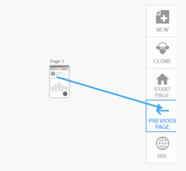
Select any widget or hotspot and use the blue ‘link’ icon on the right hand side of the widget menu. The screen will zoom out to your entire project. Click again to drop the link on the page you want to link to.
You can drop the link onto another page, or on the buttons that appear on the side of the canvas. These include, new, clone, start page, previous page and URL.
Once a link is created, you can click on the widget it is linked from and the link settings menu will appear in the tool bar. You can access the links gestures and transitions from here or alternatively, hover over a link and a circle with an arrow will pop up. If you click on this you will be given gesture and transition options as well.
If you started linking by accident, just drop that link anywhere on the canvas, the editor will automatically refocus on your original page and delete the link.
Clicking on a link when zoomed in will bring you to the link’s source or destination depending on which direction the link is pointing towards.
The default gesture and transition can be set in project settings.
When previewing, links will work as an interactive prototype, allowing you to click through your mockup.
Select any widget or hotspot and use the blue ‘link’ icon on the right hand side of the widget menu. The screen will zoom out to your entire project. Click again to drop the link on the page you want to link to.
You can drop the link onto another page, or on the buttons that appear on the side of the canvas. These include, new, clone, start page, previous page and URL.
Once a link is created, you can click on the widget it is linked to and the link settings menu will appear in the tool bar. You can access the links gestures and transitions from here or alternatively, hover over a link and a circle with an arrow will pop up. If you click on this you will be given gesture and transition options as well.
If you started linking by accident, just drop that link anywhere on the canvas, the editor will automatically refocus on your original page and delete the link.
Clicking on a link when zoomed in will bring you to the link’s source or destination depending on which direction the link is pointing towards.
The default gesture and transition can be set in project settings.
When previewing, links will work as an interactive prototype, allowing you to click through your mockup.
Select any widget or hotspot and use the blue ‘link’ icon on the right hand side of the widget menu. The screen will zoom out to your entire project. Click again to drop the link on the page you want to link to.
You can drop the link onto another page, or on the buttons that appear on the side of the canvas. These include, new, clone, start page, previous page and URL.
Once a link is created, you can click on the widget it is linked from and the link settings menu will appear in the tool bar. You can access the links gestures and transitions from here or alternatively, hover over a link and a circle with an arrow will pop up. If you click on this you will be given gesture and transition options as well.
If you started linking by accident, just drop that link anywhere on the canvas, the editor will automatically refocus on your original page and delete the link.
Clicking on a link when zoomed in will bring you to the link’s source or destination depending on which direction the link is pointing towards.
The default gesture and transition can be set in project settings.
When previewing, links will work as an interactive prototype, allowing you to click through your mockup.
The pin/unpin button is always visible in the widget menu. Click it to get the dropdown options.
You may have created a scrolling page and you want to have a widget float over the page and stay in view while you scroll the page in preview mode. Use the pinned/unpinned option to control what moves with the page.
Any widget can be fixed on top of a long/scrolling page (‘pinned’) or allowed to move with the scrolled page (‘unpinned’).
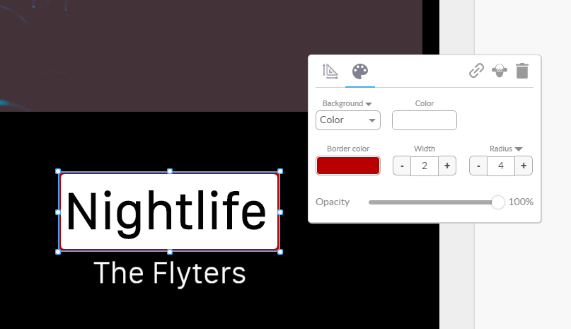
The background and border properties menu is used to set the non-text properties of a widget, including:
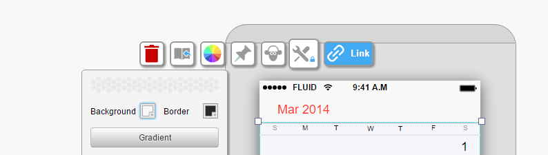
Tip: Use the background and border icons to toggle between color editing and all of the other editing options.
Using the widget menu to edit your widgets
Click on a widget to access the widget menu.
Use the tool icon inside the menu to move the menu around your screen.
Clicking the widget menu tool icon will expand/collapse the menu
Some buttons on the widget menu can be expanded to show even more options.
The widget menu will always be visible on screen when a widget is selected. When no widget is selected, the page menu will be showing and the widget menu will be hidden.
The first time you drag the widget menu it will move to the location you choose.
Dragging it a second time will cause it to switch to best guess mode. This will make it centre over whatever widget you have selected.
Drag it once again and it will stay in the location you chose. You’ll see the little blue lock icon on it when it is in locked mode. It won’t move around unless you drag it again.
You can change almost anything about your widgets and make unique designs to reuse over and over. Discover all of the options available in the widget menu.
The background and border properties menu is used to set the non-text properties of a widget, including:
Tip: Different widgets have different customizable options. For example, you can change the color of some widgets but not others and some of the larger card widgets cannot be resized.
Use the background and border icons to toggle between color editing and all of the other editing options.
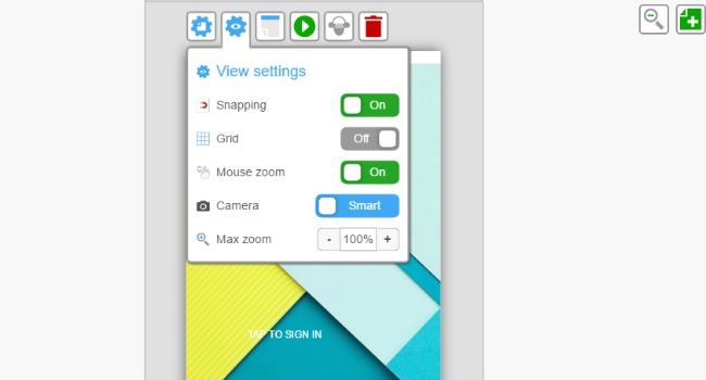
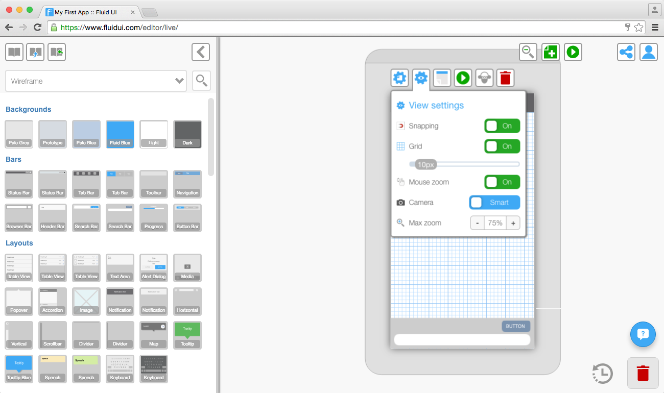
Turn snapping on or off: snapping is useful for automatically aligning widgets.
Turn the grid on or off: use the grid’s slider to change the number of pixels in each square of the grid.
Turn the magic mouse zoom on or off: magic mouse zoom lets you use the mouse to zoom in on pages when in project mode (zoomed out to view all pages together). Place the pointer over a page and scroll the mouse to zoom in on that page.
Select your Fluid UI camera settings: set the camera controls to either smart or fixed.
Change the zoom level to suit the size of your monitor’s screen. 100% will fit the page to your screen.
Next: Read about the Fluid UI camera controls and how to use them to speed up your workflow.
Next: Have a look at how to use hotspots to create high fidelity mockups.

Find the controls for snapping and grid in view settings accessible from the page menu.

Use the grid to align your widgets to the nearest pixel. Change the size of the grid’s squares to the right number of pixels for your project.
Next: Read about changing the view settings and managing the Fluid UI camera controls to speed up your workflow.
The terms we use in Fluid UI to reference the different menus, modes and contexts in the editor.
Editing: Where you edit your project. The project canvas and screenflow is visible and pages can be clicked on.
Previewing: Where your project can be previewed. Accessed by clicking the preview button or loading a project in preview mode. The prototype can be clicked through as an actual app complete with gestures and transitions.
Project context: When the project is fully zoomed out and the library is hidden. All your pages and links can be seen in this view.
Page context: When the page is focused but no widget is selected. You can click on any widget to select it and move to widget context and the page menu and library are visible allowing you to add more widgets to the active page..
Widget context: When a widget is selected. The widget menu is visible.
Widget context: When a text widget is being edited. Double click on text to enter this mode.
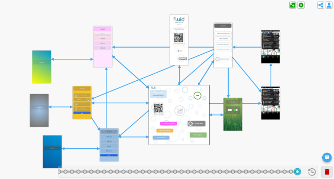
The canvas is the background in which you create and position your pages. A Fluid UI projects starts off with a blank canvas. When zoomed in to page or widget context, clicking on the canvas will zoom you back out to the project context. By creating pages and linking them together, you create a storyboard for your design.
The active page is the page currently selected when in page context. It is surrounded by the page frame. Only one page can be active at a time - when clicking on widgets in the library, they are added to this page.
The page frame is the grey area around the active page which contains the page menu. Clicking on the page frame will bring you to the page context. You can also start a drag select from the page frame to select multiple widgets, which will bring you to the widget context.
Trash is the bin in the bottom right corner of the editor.
Use the grid to align your widgets to the nearest pixel. Change the size of the grid’s squares to the right number of pixels for your project.
Next: Read about changing the view settings and managing the Fluid UI camera controls to speed up your workflow.
Find the controls for snapping and grid in view settings accessible from the page menu.

Start dragging on the page frame (the dark grey area around the selected page) or on an area that does not already contain a widget other than the background.
All widgets that are contained in the blue box after dragging will be selected.
You can now align, copy, paste and group everything inside the selection.

Use the group icon to group or ungroup selections of widgets.
The group/ungroup icon will become available once you have selected more than one widget.
Groups will be clearly indicated by a border when selected.
In order to edit widgets in a group, they must be ungrouped first.
Symbols will speed up your design process for every project.


Tip:
You can access all of your saved symbols from any project.
Select any widget or widget group and use the arrows to send them to front or back.
Send to Front - places the selected widget behind all others on the page.
Send to Back - places the selected widget in front of all others on the page.
Send Backwards - moves a widget behind the previous widget.
Send Forwards - moves a widget in front of the one above.
You can change the transparency of widgets to get some cool effects.
Uploading your own images and using invisible links
Hotspots are widgets that are visible on your page when creating your prototype, but don’t show in preview mode (unless you choose to show them in preview settings).
They let you link a particular part of an image to another page without having to chop up the uploaded image.
To use a hotspot, add one from the library and select the link button to add a link from that widget.
Hotspots are useful if you want to link from more than one area on an image. If you want to link from the whole image you can do this too with a normal link.
My uploads and introducing invisible links
You can either drag and drop the images into the editor window, or use the plus button in the uploads section to search your computer’s hard drive for an image.
You should always make sure your images are ‘saved for web’ using a program like Photoshop or one of the free online image editors.
When you keep your image files as small as possible the editor will load quicker and previewing will be much quicker also.
There are two ‘Autoscaling’ of images options, this will help you fit images to your screens quickly and easily. These options will appear in the widget menu as soon as you click on an image that you have uploaded.
‘Expand to Fit’ allows you to expand a small uploaded image to the width/height of the page you’re working on.
‘Display 100%’ will resize an image widget to the original size of the uploaded image file.
Tip:
You need to have a paid (solo) account in order to upload your own images.
Click on any text to edit it. If you want to increase the size of the box that the text is contained in, drag from any of the box’s corners.
The text edit submenu will appear as soon as you click on a piece of text. The menu lets you change the:
Tip: Remember to drag the text box as you make the text bigger so it is aligned as you want it to be. If you don’t make the box bigger some of text may be hidden.
Widgets can be resized by dragging from one of the 4 corners or the sides of the widgets.
All resizable widgets have a clear box/outline indicator.
Holding down shift will maintain the aspect ratio of a widget while resizing it.
To get the size of your widget pixel perfect you can use the resizing tool. simply chose the height and width that you desire.
Tip: Some larger widgets cannot be resized as they are fitted to the size of your page and the device type you are designing for.
Use the grid view in view settings to align widgets pixel by pixel. You can set the number of pixels in each square in the grid.
The snap to grid option will also help align widgets to the nearest pixel.
Use your keyboard’s arrow keys to align widgets by moving pixel by pixel.
Automatic alignment
Select two or more widgets and the vertical/horizontal align icons will appear in the widget menu.
There are 6 options in total:
Align Left - aligns the widgets/groups to the left.
Align Right - aligns the widgets/groups to the right.
Align Center - aligns the widgets/groups to the center.
Align Top - aligns the widgets/groups to the top of the selection.
Align Middle - aligns each widget to the middle of the selection.
Align Bottom - aligns the widgets/groups to the bottom of the selection.
Select any widget or widget group and use the arrows to send them to front or back.
Send to Front - places the selected widget behind all others on the page.
Send to Back - places the selected widget in front of all others on the page.
Send Backwards - moves a widget behind the previous widget.
Send Forwards - moves a widget in front of the one above.
You can define the alignment and z-depth for a widget from the widget menu and in using pinned widgets (often used in conjunction with scrolling pages)
Click on widgets to select them.
Select components of widgets and edit them, such as text or boxes inside a menu widget.
Widgets can be grouped to move/copy/paste/align them together.
Start dragging on the page frame (the dark grey area around the selected page) or on an area that does not already contain a widget other than the background.
All widgets that are contained in the blue box after dragging will be selected.
Use the group icon to create a group, and when a group is selected, you can ungroup them with the ungroup icon.
Tip: Groups will be clearly indicated by a border when selected. In order to edit widgets in a group, they must be ungrouped first.
There are two ways to add widgets to you page:
1. A single click
A single click on a widget will add it to the selected page. The widget will automatically be placed on an area of the page that the editor predicts it belongs.
For example: A header item will go in the header section of the page. You can move it by dragging and dropping it somewhere else.
2. Drag and drop
Dragging a widget from the library and dropping it on any page (selected or not) will add that widget to the page at the location it is dropped.
Use the library search function to find widgets by type. For example type ‘tables’ into the search bar to bring up all of the table widgets in that library.
Tip: You can close the widget library if you’re not using it to give yourself a bit more space.
1. Pre-built widgets
The widget libraries include dedicated libraries for iOS, Android, Windows, wearables and website wireframing.
By default the ‘wireframe’ library is selected, this is a good option if you don’t want to worry about the exact device you are prototyping for, but just want to get a good overall feel for how your app’s UI will flow.
2. Uploaded widgets
Upload your own images from Photoshop or the web and make high fidelity prototypes.
3. Saved design patterns
Save design patterns, screens and customized widgets to use again and again.
Tip: To access the libraries, click on any page and the library will open on the left of the editor. Select your chosen library from the widget library dropdown menu and start designing.
Fluid UI contains over 2,500 different widgets available in 16+ libraries for iOS, Android, Windows and wireframe. They are accessed from the library on the left of your screen after you click on a page.
Click on a widget in the library. It will be added to the active page in a suitable location.
Drag a widget from the library to a page. It will be added to the page where you drop it.
Widgets on pages can be cloned (ctrl-d/cmd-d) and copied/pasted (ctrl-c/ctrl-v) to the same page or to different pages.
Select any widget on any page by clicking it. The widget menu will be visible and will allow you to edit the widget’s properties.
Shift+click will add or remove a widget from a selection.
Click-dragging from the page frame or page background to select multiple widgets at once.
Ctrl-a or cmd-a selects all widgets on the active page.
Some widgets are comprised of multiple parts. A second click will select the sub-part which can be edited and styled independently.
See moving, resizing and aligning widgets for how to get widgets where you want them. You may also want to turn on snapping or the grid in the page settings.
Check out backgrounds and borders and editing text for more on building these parts of your design. Once you are happy with your widgets, consider saving them to your custom design patterns for future reuse.
Widgets can be grouped. Widgets added from your save patterns library will be grouped by default.
See how to upload your own images.
Select your widget(s) and press delete (backspace on Mac), or click delete on the widget menu or drag them to the trash.
Not too exciting this section, but some widgets have unique features associated with them to help you build your prototype, and it’s worth documenting how they work:
Backgrounds automatically expand to fill the background. They don’t get selected by default in an area-select (though they can be click-selected). They can’t be moved either.
Tables can have segments added and removed from them.
Hotspots are special widgets that show in a translucent colour when editing, but are invisible when previewing. You can add links to them and the links will work correctly. See more about using hotspots.
Text widgets are widgets that have text in them. The text can be edited by double clicking the widget. See more about editing text widgets.
Finished adding all the widgets you want to your pages? Add links, gestures and transitions to make your prototype interactive - or just continue with the introductory tutorial.
Learn how to share and collaborate with your team. Share projects and project copies, export projects and use notes.
When we talk about screens in Fluid UI we are talking about the device screen you are designing for. You can read all about choosing the right screen resolution for your app design here.
You can choose which device screen resolution you are designing for when you create a new project and by choosing project settings in the home menu.
A page in your project corresponds to a page in the app you are designing. You can change the page’s height, width, orientation and set it as the starting page for when you’re previewing your app prototype.
Next: Read about managing page settings in your projects.
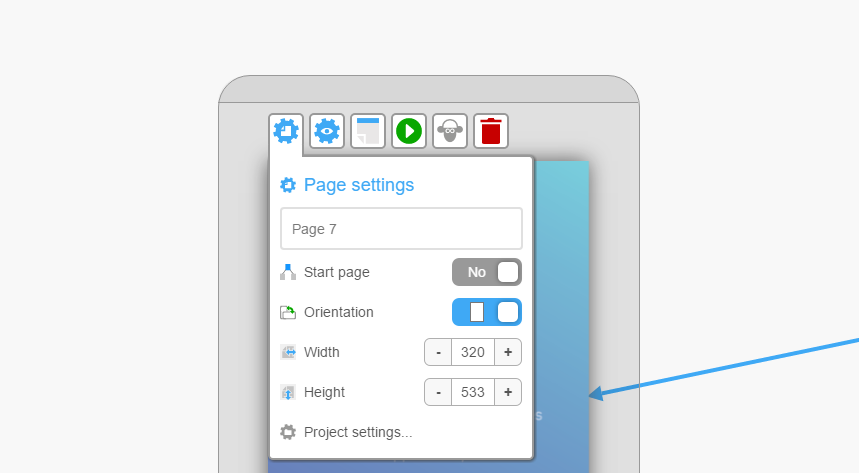
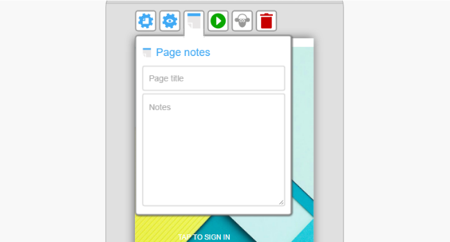
Chose a title for your page which will show up on the canvas in edit mode. You can change this title as many times as you like.
Choose the start page for your project, this will automatically start your app preview on this page.
Choose the page orientation, portrait or landscape.
Set the width and height of your page and make scrolling pages.
You can also access project settings from page settings.
Next find out about changing project settings.
Increasing the page width or height in the page menu will automatically cause any pages to scroll (horizontally, vertically or both) when you preview.
The dashed blue and white screen boundary marker will indicate where the page will start scrolling.
Pinned widgets are frequently used with scrolling pages to make some content static while other content scrolls.
You may also want to know more about changing your resolution/device type or the difference between the screen size and page sizes to set your project up to your liking.
Choose your default screen orientation and resolution when you are creating a new project. You can also choose a custom size if your size is not in the presets.
Use project settings which is in the home menu to change the device orientation as well as the default gestures and transitions for your project.
Next: Find out more about managing your project settings and managing your page settings.
You can set any page in your prototype to the start page by focusing on that page and clicking the “Start page” switch in the page settings menu. Only one page can be the start page.
You can also the preview button on any screen to preview starting with that particular page so you don’t need to navigate from the start page each time (this option is available once the page has widgets on it).
See more about the page settings, setting up the Fluid UI camera the way you want it or how to add page titles and page notes.

Next, have a look at the other preview settings and options.
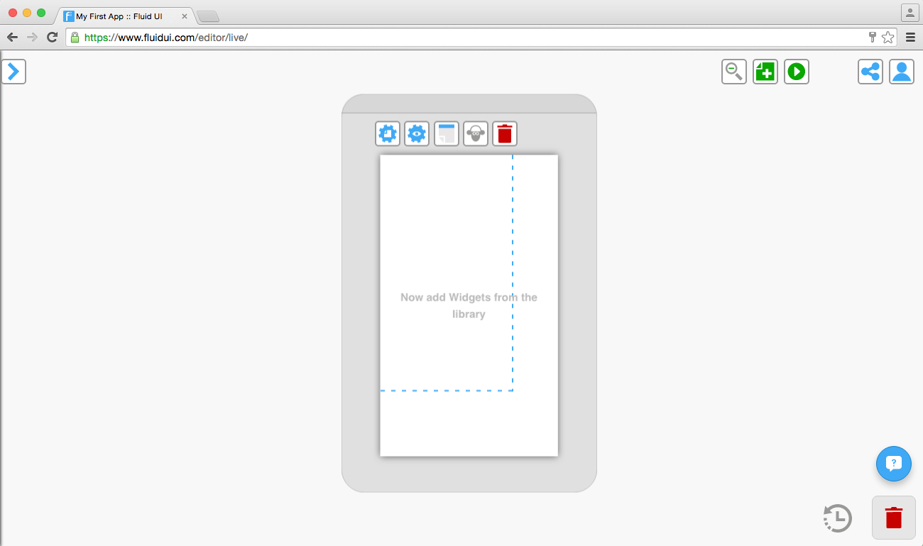
There are 3 ways to create a page with Fluid UI:
Double click anywhere on the canvas when zoomed out to create a page at that location.
Use the add page icon when zoomed out.
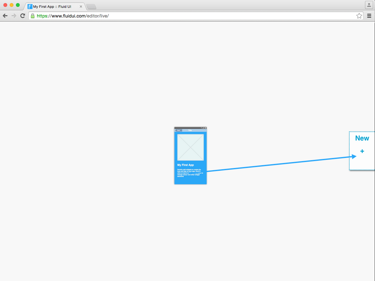
Create a link from one of your widgets and drop it on “New +”.
Once created, pages can be moved around the canvas to create a storyboard for your prototype.

Cloning pages
You can clone a page by clicking the sheep in the page menu.
Deleting a page
You can delete a page by focusing on it and clicking delete in the page menu or by dragging it to the trash in project context.
Next, add widgets to your pages. People often also frequently ask how to set the start page and how to make pages scroll when previewing.
Learn more about how you can validate your product ideas using Fluid UI, making sure you get real customer feedback. Once you are happy with your concept, learn how you can integrate your results into your company and how you can get your app developed.
You’ll find the options for uploading your own splash screen and icon in the project settings menu.
Click on the home menu icon to access project options and settings.
From here you can:
Use project settings to:
All of the common phone resolutions are listed, as well as several desktop/browser resolutions.
Scroll to the end of the device options to find the custom screen size options. You can add in your own height and width here.
Selecting the correct resolution for the device you will be testing on will dramatically improve the quality and speed of the prototype.
You can choose the orientation for the app you are designing.
Set the transition and gesture you want to have in your app. This will mean that each new link you create will automatically be set to the default transition and gesture you have chosen.
You can also change the gestures and transitions for individual links:
Changing gestures and transitions for individual links
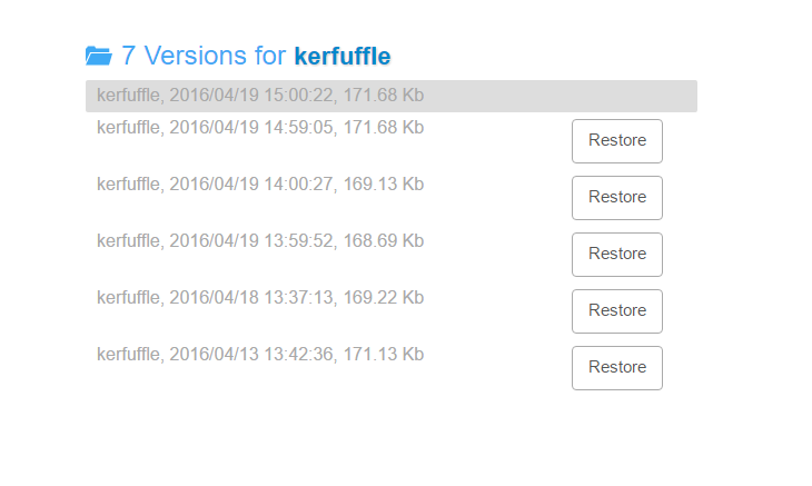
Any version of a project can be restored though the version history section of the home menu. Older versions are stored for up to 2 weeks for all premium accounts, and for a limited period for free accounts.
If you are moving between computers, please ensure you are logged out before logging in to a different machine. Logging in to the same account at the same time from multiple locations is not currently supported.
You can also clone a whole project to make a backup. Sharing this version with a client will allow you to take feedback while continuing to work on the existing project.
If you have sent a link to a project and you no longer want that person to have access just clone the project, archive the old project, then delete it forever and the link will be made obsolete, just make sure you clone the original project first.
There are two ways to delete your project. Click on open in the home menu and you can view all of your projects and delete them by clicking on the bin beside them. There is the option of restoring a project if you delete it by accident by using the deleted projects search filter.
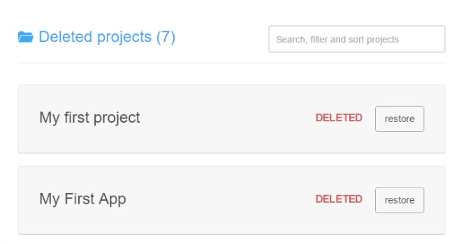
The other way to delete a project is by opening project settings in the home menu. This will give you options for the project you are currently working on. Click on the bin to delete the project.

Archive your active projects to free up more space, you can then manage your archived projects, delete or restore them in the future.
Click on project settings in the home menu and then click on archive to archive the project you’re currently working on.
Archive projects so you can start new ones if you don’t have a pro account. (there is a project limit on the other account types)
Keep your projects safe and make sure you don’t delete them or overwrite them.
Go to open projects and then use the filter in the search bar to find all of your archived projects.
The original and copied projects are now in your active projects. The copy will automatically open and your original can be accessed in ‘active projects’ by selecting ‘open’ in the home menu.
Fluid UI automatically saves your work both locally and online every few minutes as well as every time you click the preview button - there is no need to specifically save or manage projects.
The only way your data will be deleted is if you ask us to delete it. We store data for inactive accounts for up to a year. After a year of an account being inactive you will receive an email warning you that your account is going to be deleted. If the account is active it will not be deleted ever.
Your first project will be created and already open when you sign up.
To create a second or further project:
You can change the screen resolution, create custom screen resolutions and change your default orientation (you must finish creating your project first to do this).
You may also wish to duplicate an existing project, delete a project, manage project settings and view and restore previous versions your projects.
Once your project is created the next step is to add pages.
Manage your account: See our plans page, then if necessary upgrading to a different account type, pausing (cancelling billing), getting receipts and managing the rest of your team.
It’s not always obvious why you should stop and prototype your ideas before developing them - especially if you have the ability to “jump right in” and start coding yourself.
But prototyping is an integral part of all successful software projects. It reduces costs and massively improving the chances of your project succeeding. It helps you get your idea from idea to customer in the shortest, least painful way possible:
Let’s face it, there’s no point in building software that no-one will ever use. Prototyping is the best way to validate whether your concept has real resonance with real people before investing in a long, potentially risky development phase. To start validating your ideas, use the 5 step framework for validating product ideas and match your solution to your customer’s needs.
If you are a developer, it’s night on impossible to design and develop at the same time. If you try, the quality of your product will suffer badly as a result. You owe it to yourself to give your product the best chance to succeed.
Agile development delivers software solutions quickly. User-centered design and prototyping identifies what problem to solve in the first place. Combined, they they help you build the right product faster.
If a picture is worth a thousand words, then a prototype is worth a thousand pictures. Prototyping give you the means to communicate interactive software requirements in a way that your team can understand. Before long, your project managers, developers and all of your stakeholders will be insisting on a prototype before starting development.
Mobile design is full of complexities. Prototyping lets you focus on your user’s needs first and avoid having to think about technical complexities like pixels, points and resolutions and the mobile screen sizes that quickly cloud your path when you start to code.
Prototyping lets you get feedback from all the stakeholders in your organisation quickly and effectively.
Finally, prototyping helps you integrate user feedback right into your company roadmap. For maximum win!
Have we convinced you yet? Check out our introductory tutorial and Sign up now.
Learn all about navigating the canvas using the Fluid UI camera controls. Use view settings to turn on/off snapping and grid. Find out what keyboard shortcuts are available in Fluid UI.

Receive a preview link lets you send a preview link to an email address.
Receive a complete copy sends the whole project to another Fluid UI user’s account. They can open this project and edit it, this is good for team work on a project. Users can send versions back and forth and work on the same project.

Tip: The sharing button is next to the home menu, it will be visible once you make a page and add a widget.
Fluid UI uses an infinite canvas to provide incredible flexibility when creating prototypes. The camera defaults to the best settings for most projects, though at times you may want to take control of how the three zoom levels work for your project. This section explains how the canvas and zooming works and how to change the settings to improve your productivity for specific projects.
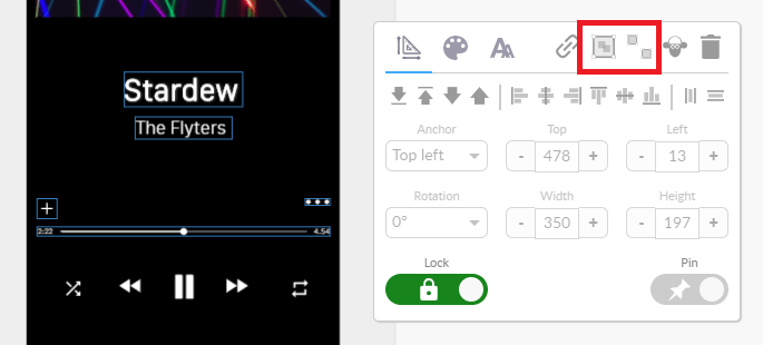
There are two ‘Autoscaling’ of images options, this will help you fit images to your screens quickly and easily.
These options will appear in the context menu as soon as you click on an image that you have uploaded.
![]
‘Expand to Fit’ allows you to expand a small uploaded image to the width/height of the page you’re working on.
‘Display 100%’ will resize an image widget to the original size of the uploaded image file.